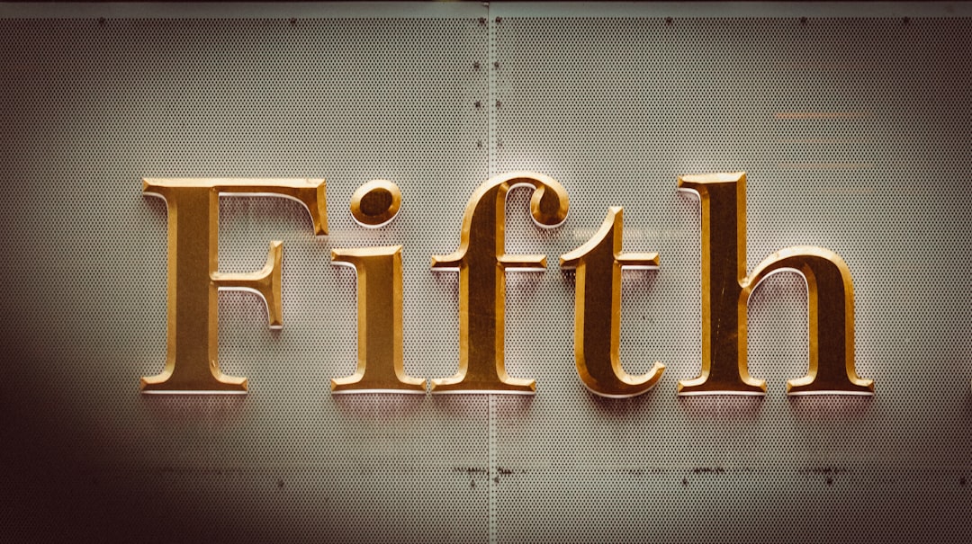
Best Luxury Fonts (Free & Premium)
Luxury typography is built on restraint, contrast and space. The best luxury fonts are usually high-contrast serifs (thick verticals, hairline thins) or refined, generously spaced sans-serifs that signal craftsmanship and exclusivity. The governing principle is elegance through subtraction: fewer weights, more whitespace, and careful letter-spacing do more for a premium feel than any decorative flourish.
What makes a good luxury font?
Look for high stroke contrast, elegant proportions and crisp, refined terminals, qualities found in Didone serifs like Bodoni and Didot, or in classical engraved capitals like Cinzel and Trajan. Generous letter-spacing, especially in all-caps settings, reads as confident and expensive. Thin and light weights amplify sophistication when there is enough size and whitespace to support them. Avoid heavy, cramped or trendy faces that feel mass-market.
Best luxury fonts
This selection blends free Google Fonts that punch above their price with premium foundry classics used by fashion and beauty houses.
| Font | Best for | Price |
|---|---|---|
| Cormorant | Delicate display headings | Free (OFL) |
| Cinzel | Engraved capital logos | Free (OFL) |
| Libre Bodoni | Fashion-contrast headlines | Free (OFL) |
| Playfair Display | Editorial elegance | Free (OFL) |
| Marcellus | Refined classical titles | Free (OFL) |
| Montserrat (Thin/Light) | Modern spaced sans | Free (OFL) |
| Cardo | Heritage body text | Free (OFL) |
| Didot | Couture fashion logos | Paid |
| Trajan | Prestige film & spirits | Paid |
| Optima (or Optima-likes) | Elegant humanist sans | Paid |
1. Cormorant
Cormorant is a free, OFL display serif inspired by Garamond but drawn with extra-fine, elegant detail. Best used large for headings, its delicate strokes and graceful italics give a refined, editorial feel that rivals premium faces, especially with airy spacing.
2. Cinzel
Cinzel is a free Google Font (OFL) based on classical Roman inscriptional capitals. Its engraved, monumental letterforms make it ideal for luxury logos, certificates and spirits labels where heritage and prestige matter. Use it in all-caps with generous tracking.
3. Libre Bodoni
Libre Bodoni is a free OFL revival of Bodoni’s high-contrast Didone serif. Its dramatic thick-thin contrast is the signature look of fashion and beauty branding, perfect for headlines and wordmarks when set large enough to protect the hairlines.
4. Playfair Display
Playfair Display is a free, OFL transitional serif with high contrast and an unmistakably editorial tone. It bridges classic and modern, making it a dependable luxury heading face for boutiques, magazines and premium e-commerce. See more options in our best serif fonts guide.
5. Marcellus
Marcellus is a free OFL serif with refined, slightly classical capitals and an understated elegance. It feels expensive without shouting, working well for hotel, spa and lifestyle brands that want quiet sophistication rather than high drama.
6. Montserrat Thin / Light
For a modern luxury look, the thin and light weights of Montserrat (free, OFL) read as sleek and minimal when letter-spaced in all-caps. This proves luxury is not only about serifs, a precise, airy geometric sans can feel equally premium.
7. Cardo
Cardo is a free OFL serif designed for scholarly text, with classical proportions and excellent readability. Use it for refined body copy beneath a high-contrast display serif to keep long passages elegant and legible.
8. Didot
Didot is the quintessential couture serif, the face of countless fashion magazines and luxury houses. Its extreme contrast and hairline serifs define high fashion. It is a paid, licensed typeface (available via Adobe Fonts and foundries), and worth it for flagship beauty and fashion brands.
9. Trajan
Trajan, based on Roman column inscriptions, is the prestige choice for film posters, spirits and heritage brands. A paid Adobe Fonts classic, its all-caps grandeur signals timeless authority. Cinzel is the closest free alternative if budget is tight.
10. Optima (and Optima-likes)
Optima is an elegant humanist sans with subtle stroke modulation, bridging serif refinement and sans cleanliness. It is paid (via Monotype/Adobe), favored by beauty brands for its soft sophistication. Free alternatives exist but rarely match its precise warmth.
Free vs premium luxury fonts
Free OFL fonts like Cormorant, Cinzel and Libre Bodoni can absolutely deliver a high-end feel and are fully commercial-safe. Premium faces like Didot, Trajan and Optima buy exclusivity and that exact “couture” character free revivals approximate but don’t perfectly replicate. As always, avoid DaFont fonts marked “free for personal use” for commercial luxury branding, check terms in our font licensing guide first.
How to use luxury fonts well
Embrace whitespace and restraint. Set high-contrast serifs large enough that hairlines survive, and add generous letter-spacing to all-caps titles for a confident, expensive rhythm. Limit your palette to one display serif and one quiet companion (a light sans or a calm body serif). Avoid clutter, bold colors and too many weights, luxury is communicated by what you leave out. Test your headlines at the exact size they will appear, because Didone hairlines that look stunning on a poster can vanish or break up at small web sizes or in print on uncoated stock. When in doubt, increase the size and the surrounding space rather than the boldness. For minimal pairings, see our best minimalist fonts guide.
Frequently Asked Questions
What font do luxury brands use?
Many luxury brands use high-contrast Didone serifs like Bodoni and Didot, or engraved capitals like Trajan, often customized into a bespoke wordmark. Fashion houses favor Didot’s hairline elegance, while heritage brands lean on Trajan. Free alternatives like Libre Bodoni and Cinzel can achieve a similar premium effect.
Are there free luxury fonts?
Yes. Cormorant, Cinzel, Libre Bodoni, Playfair Display and Marcellus are all free on Google Fonts under the SIL Open Font License and fully commercial-safe. With careful spacing and whitespace, these free serifs can look just as elegant as premium faces for most projects.
What makes a font look expensive?
High stroke contrast, refined thin terminals, classical proportions and generous letter-spacing all read as expensive. Restraint matters most: using a single elegant serif with plenty of whitespace and light weights signals luxury far more than decoration. Cramped, heavy or trendy type tends to feel cheaper.
Should luxury fonts be serif or sans-serif?
Both work. High-contrast serifs like Bodoni and Didot are the classic luxury choice and dominate fashion and beauty. But a sleek, light, generously spaced sans like Montserrat Thin or Optima reads as modern luxury. The brand’s personality, classic versus contemporary, should guide the choice.
Is Bodoni a good font for a luxury brand?
Yes. Bodoni’s dramatic thick-thin contrast is a defining luxury and fashion look. Use it large to protect the hairline strokes and add letter-spacing for elegance. The free Libre Bodoni revival is OFL-licensed and commercial-safe, making it an accessible way to get the Bodoni aesthetic.


