What Font Does Jack Daniel’s Use?
Few labels are as instantly recognizable as that square black bottle, so it is no surprise designers keep asking what the jack daniels font actually is. The honest answer is that there is no one font: the label is a piece of bespoke Old West engraving, layered with curls, banners and tightly drawn capitals. Understanding the style, though, lets you recreate the mood legally with free alternatives. For more brand breakdowns, see our famous brand fonts hub.
What font is the Jack Daniel’s logo?
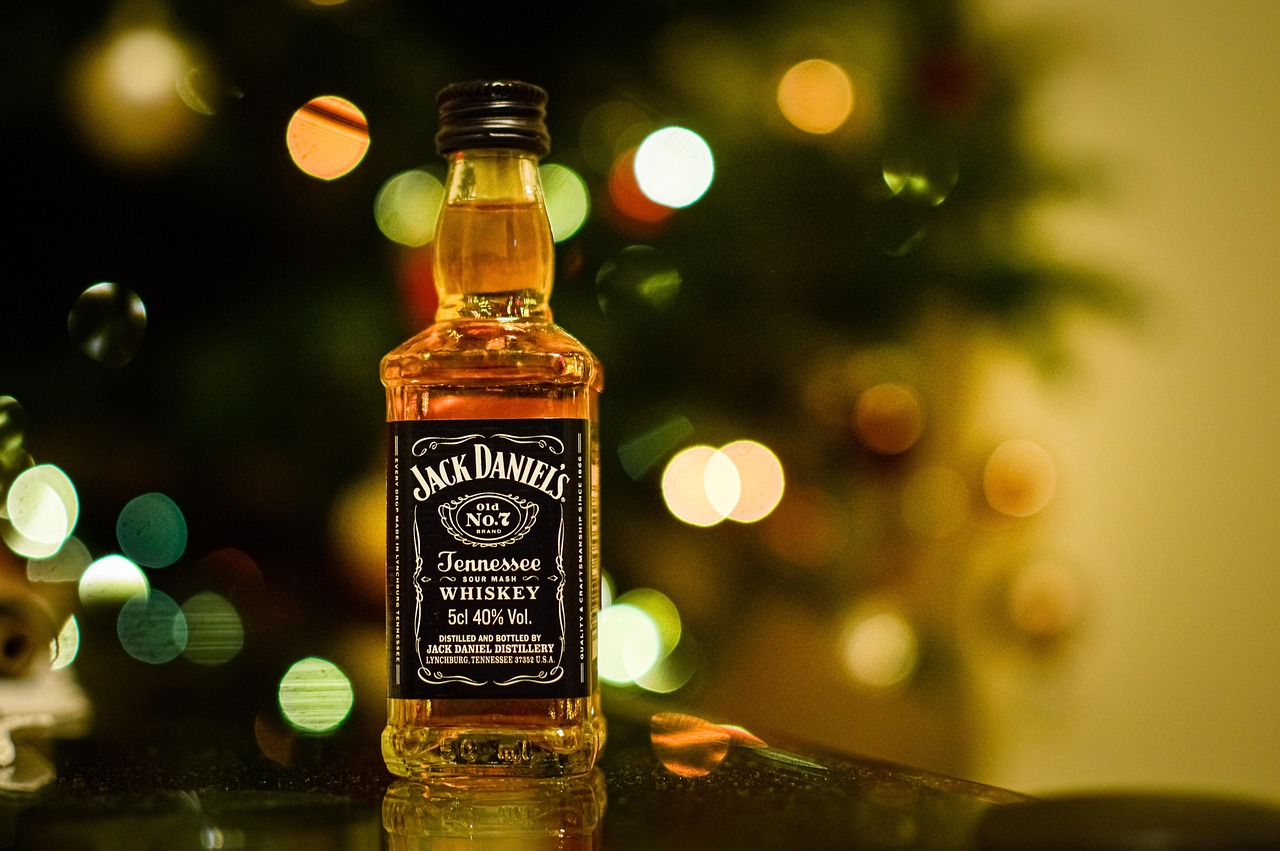
The primary “Jack Daniel’s” signature and the surrounding “Old No. 7 Brand” type are custom-drawn artwork that dates back to late-1800s American label engraving. The lettering blends a flowing script signature with rigid, condensed serif capitals and elaborate filigree borders. These letterforms were never released as a retail font, so the wordmark is best described as hand-built Victorian display lettering with Tuscan-style serifs (those flared, pointed spurs on the stems). It is trademarked artwork, not a downloadable family.
Look closely and the label is actually several typographic registers stacked together. The brand name itself behaves like a personal signature, all loops and confident strokes, while the supporting words sit in tight, upright capitals that feel stamped rather than written. Between them run hairline rules, scrolls and curlicues that frame the type the way a banknote frames its denomination. That mix of script intimacy and engraved formality is exactly what makes the label feel handmade, and it is almost impossible to reproduce with any single installed font.
What is Jack Daniel’s brand typeface?
Beyond the central label, Jack Daniel’s marketing tends to reach for sturdy, heritage-flavored typography: condensed serifs, slab serifs and rugged display faces that echo distillery signage and old Americana. Reports of the exact families vary by campaign and region, so treat any single named font as unconfirmed. The consistent thread is a 19th-century, frontier-engraving aesthetic rather than a clean modern sans. If you want that look, lean toward our picks in the best vintage fonts roundup.
What is worth noting is how disciplined the brand is about contrast. The black label keeps the type density high and the palette stripped to black, white and the occasional cream or amber, which lets the ornate lettering carry all the visual interest. When Jack Daniel’s stretches into modern touchpoints, billboards, merchandise, digital, it tends to borrow the same condensed, high-impact serif energy rather than chasing trends. That restraint is why the typography still feels coherent more than a century after the original label was drawn.
Free fonts that look like the Jack Daniel’s font
You cannot legally lift the trademarked label artwork, but you can build a similar antique-distillery feel with free, open-license display and serif fonts. Match the texture (condensed, ornamented, high-contrast) rather than trying to clone any single glyph.
| Use case | Jack Daniel’s uses | Free alternative |
|---|---|---|
| Logo / wordmark | Custom Victorian filigree + Tuscan serif lettering | Rye (vintage Tuscan display) |
| Headlines | Condensed heritage serif display | Old Standard TT or a condensed slab |
| Body / label | Engraved serif small caps | EB Garamond (small caps) |
Why does Jack Daniel’s use this kind of type?
The typography is a deliberate signal of age, place and craft. By preserving lettering that looks pulled straight from a 19th-century Tennessee distillery, the brand sells continuity: the implication is that nothing has changed since the original recipe. The density of the ornament also does practical work, filling the small label with detail that reads as premium and hard to counterfeit. In a category where heritage equals trust, frontier-era engraving is a strategic asset, not just decoration.
There is also a recognition payoff. Because the label is so visually specific, it stays legible even when shrunk to a bottle cap or blown up on a poster, and customers identify it by silhouette alone. Few competitors are willing to commit to ornament this dense, which makes the look hard to imitate convincingly and easy for Jack Daniel’s to own. The lettering, in other words, is doing brand-protection work as much as decoration.
Can I use the Jack Daniel’s font for my own project?
No. The Jack Daniel’s wordmark, label artwork and the “Old No. 7” lockup are protected trademarks and copyrighted designs, so copying them for your own product or branding invites legal trouble. What you can freely borrow is the genre: pair an open-license Tuscan or Victorian display face with a classic serif and add restrained ornament. Before you ship anything commercial, check the embedding and resale terms in our font licensing guide.
Frequently Asked Questions
Is the Jack Daniel’s font a real downloadable font?
No. The signature and label type are custom artwork created from 19th-century engraving traditions, never released as a retail typeface. Any “Jack Daniel’s font” download you find online is a fan-made imitation, not the official lettering, and using it commercially carries trademark risk.
What style of lettering is on the Jack Daniel’s label?
It is ornate Victorian display lettering with Tuscan-style serifs, a flowing script signature, decorative banners and dense filigree borders. The overall effect is condensed, high-contrast and antique, echoing American distillery and apothecary labels from the late 1800s rather than any modern font family.
What free font looks most like Jack Daniel’s?
For the ornamental display feel, Rye is the closest free match thanks to its Tuscan serifs and old-poster character. Pair it with EB Garamond or Old Standard TT for body and supporting text to capture the heritage layering of the original label without copying it.
Why does Jack Daniel’s keep such old-fashioned typography?
The antique lettering communicates authenticity and a long, unbroken history. Whiskey buyers often equate visual age with quality and tradition, so preserving the Victorian label style reinforces the story that the product is made the same careful way it always has been.
Can I recreate the Jack Daniel’s look for a mockup?
For private practice or non-commercial mockups, combining free vintage display and serif fonts gets you a convincing tribute. For anything public or commercial, avoid reproducing the trademarked wordmark and ornament, and confirm each font’s license allows your intended use.