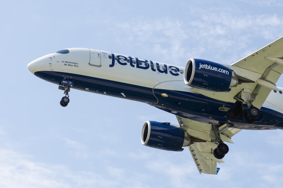
What Font Does JetBlue Use?
Among U.S. carriers, JetBlue went out of its way to feel less corporate and more human, and the jetblue font is a big part of that. Where most airlines shout in all caps, JetBlue whispers in friendly lowercase, splitting the word into “jet” and a capitalized “Blue” to keep the brand name front and center. This guide unpacks the wordmark, the supporting typeface, and the free fonts that recreate the vibe. For more airline and brand breakdowns, browse our famous brand fonts hub.
What font is the JetBlue logo?
The “jetBlue” logotype is custom lettering rather than a stock typeface. It uses a rounded, humanist lowercase sans with generous curves and open counters, giving it a relaxed, conversational tone. The single capital on “Blue” is the only flourish, a small typographic trick that turns one word into a memorable two-beat name. The strokes are even and friendly, avoiding the rigid, mechanical feel of a pure grotesque. Because it is bespoke and trademarked, you cannot download the exact letterforms.
What is JetBlue’s brand typeface?
For its wider system, including web, app, and signage, JetBlue appears to use a clean humanist sans-serif chosen to extend that warm, accessible logo personality across body copy and interfaces. The airline is reported to have commissioned custom type to keep the brand voice distinct and consistent. As always, treat specific font names as reported rather than officially confirmed; the practical point is that JetBlue favors humanist sans-serifs, the friendlier cousins of grotesques, with slightly more calligraphic, human-shaped letters. The consistency matters because a passenger may encounter the brand a dozen times in one journey, on the booking site, the confirmation email, the boarding pass, the gate screen, and the seatback display, and a unified humanist voice makes each of those touchpoints feel like the same friendly company.
Free fonts that look like the JetBlue font
You can get convincingly close with free, openly licensed humanist sans options. The table maps each role to a strong substitute.
| Use case | JetBlue uses | Free alternative |
|---|---|---|
| Logo / wordmark | Custom friendly lowercase sans | Mulish or Inter (lowercase, slight rounding) |
| Headlines | Humanist sans (commissioned, reported) | Source Sans Pro |
| Body / UI | Clean humanist sans | Inter or Mulish |
Mulish leans soft and approachable, which best echoes the lowercase logotype, while Source Sans Pro is a reliable workhorse for paragraphs. If you want to weigh other humanist options side by side, our roundup of the best sans-serif fonts covers the field.
Why does JetBlue use this kind of type?
JetBlue built its whole proposition on being the friendlier, more comfortable way to fly, with leather seats, free snacks, and seatback screens when rivals were cutting back. The typography had to match that promise. A humanist sans in relaxed lowercase reads as approachable and modern rather than stiff and institutional, the opposite of the formal all-caps serif a legacy carrier might choose. The lowercase styling also feels native to the web and mobile era, where JetBlue does much of its customer interaction, reinforcing a brand that wants to feel like a helpful companion rather than a faceless airline. Humanist letterforms carry small, deliberate signals of warmth: slightly varied stroke weights, open curves, and a rhythm closer to handwriting than to engineering. Those cues add up to a brand that feels designed by people, for people, which is exactly the emotional territory JetBlue wants to own in a crowded and often impersonal market.
Can I use the JetBlue font for my own project?
No. The “jetBlue” wordmark is a registered trademark, and the underlying custom type is not licensed for public use. Reproducing it, especially in a way that suggests endorsement, would create legal risk. The smart move is to capture the friendly, lowercase, humanist feeling with a free alternative such as Mulish, Inter, or Source Sans Pro, then make the design your own. Check our font licensing guide to confirm your chosen face covers desktop, web, and app embedding for your use.
Frequently Asked Questions
What font is the JetBlue logo?
The JetBlue logo is custom lettering, a rounded, humanist lowercase sans with one capital “B” in “Blue.” It is bespoke, trademarked artwork rather than a downloadable typeface, so free substitutes such as Mulish or Inter will get you close to the friendly tone without matching it exactly. Tighten the spacing slightly to mimic the logotype.
Why is the JetBlue logo lowercase?
The lowercase styling makes the brand feel approachable, modern, and conversational, distancing JetBlue from the stiff, all-caps formality of legacy carriers. The single capital on “Blue” keeps the brand color and name memorable. This soft, human tone aligns with JetBlue’s positioning as the friendlier, more comfortable way to fly, especially across web and mobile.
Can I download the JetBlue font for free?
No. The custom logotype and brand typeface are not distributed publicly, and the wordmark is trademarked. For free, look-alike results, download Mulish, Inter, or Source Sans Pro from open-source font libraries. These humanist sans-serifs reproduce the friendly, rounded feel without any licensing or trademark concerns for your own projects.
What is the best free alternative to the JetBlue font?
Mulish is the closest free match for the lowercase wordmark thanks to its soft, rounded, humanist shapes. For body text and interfaces, Inter or Source Sans Pro offer the same clean, approachable readability. All three are free and openly licensed, making them safe drop-ins for personal and commercial design work.
How does JetBlue’s font compare to other airlines?
JetBlue is unusually warm and lowercase, whereas carriers like American lean on neutral grotesques and British Airways uses a refined, traditional serif. JetBlue’s humanist sans signals friendliness and comfort, while serif-driven airlines aim for premium heritage. The choice always reflects the brand’s core promise to its passengers.