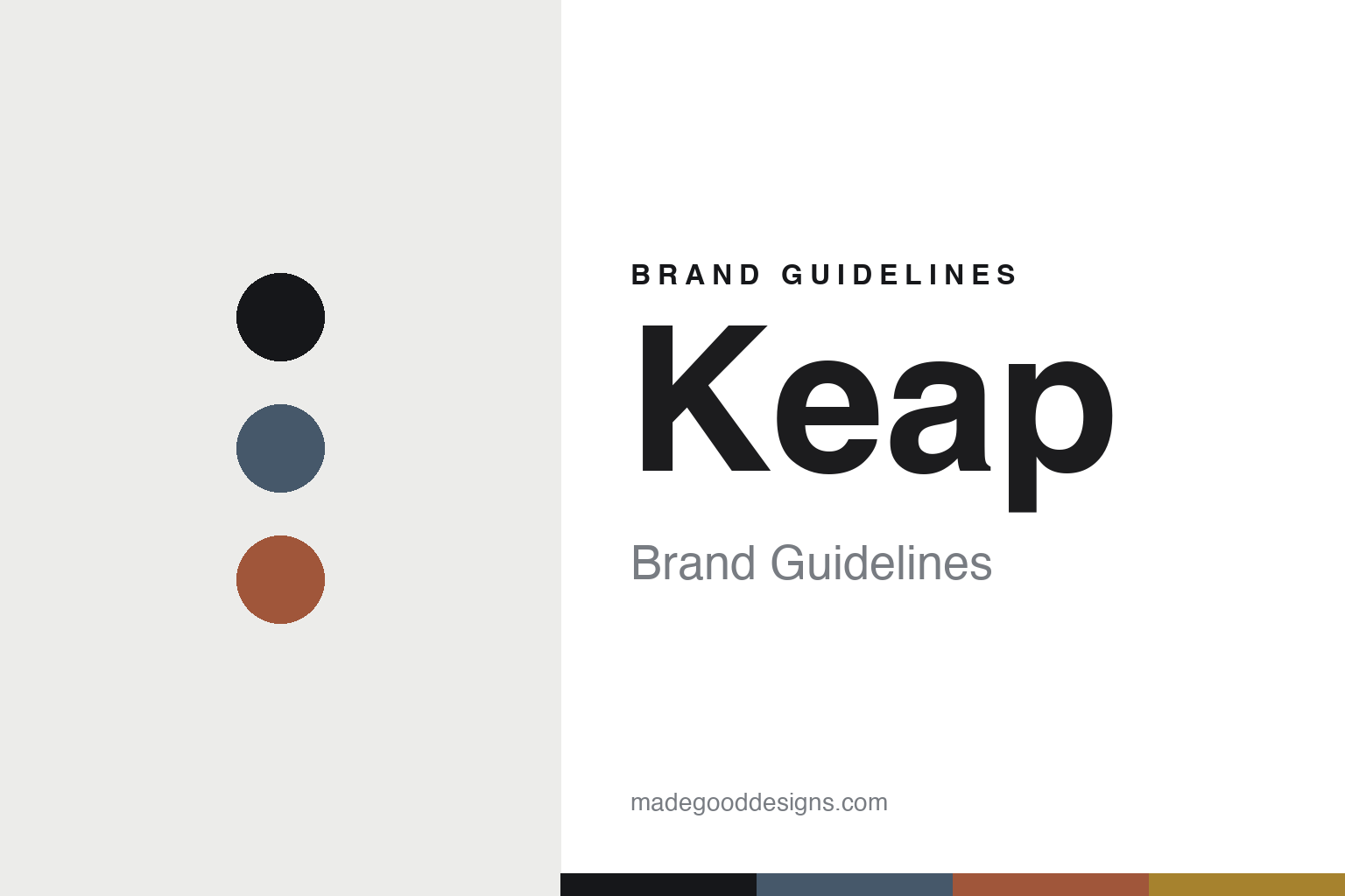
Keap Brand Guidelines
The minimalist candle.
Aa
Two constants: a clean-slate palette and a minimal sans register. Abstract homage — not the Keap labels or packaging.
The minimalist candle
Keap keeps the line small and clean.
Keap is a lesson in restraint as the identity. Founded in 2015 in Brooklyn by Stephen Tracy and Harry Doull — two former Google colleagues — it makes a deliberately small, minimalist line of coconut-wax candles, launched on Kickstarter.
Its identity is the minimalist candle. Keap hand-pours a tight range of scented coconut-wax candles in reusable tumblers, with a “smell before you buy” sampler of mini tealights, all in clean, restrained packaging. Fewer, better candles. Editing as a feature.
(Honest notes: Keap was founded in 2015 by Stephen Tracy and Harry Doull — two ex-Google colleagues, not a solo founder — and launched via Kickstarter; the name comes from Keap Street in Brooklyn. Its wax is a coconut/plant wax (we don’t repeat an unverified “beeswax earlier” claim), and its “smell before you buy” idea is the mini-tealight sampler set — not a “waxed paper” product, which we couldn’t verify. Its candles are now hand-poured in Kingston, New York (it began in Brooklyn), so we say Kingston. Its sustainability claims — plant-based, compostable packaging, B Corp, 1% for the Planet — are its own account. It is independent and founder-led. There’s no official brand hex, and we reproduce no label or logo — these tones are an unofficial interpretation. This is design commentary and does not promote any product.)
Colour
Keap lives in a clean-slate palette. Click a swatch to copy the hex.
Keap’s identity is clean, restrained and modern — a slate, an ink, a clay, an ochre, and a chalk. The palette leans clean slate — the register of a minimalist, considered candle. It signals restraint and calm rather than novelty. The honest caveat: with no published brand hex, these tones are an original, unofficial interpretation, not first-party values.
The lesson is a clean slate signals a minimalist candle brand. Keap’s world is a spare, well-edited object. For designers, it is a reminder that restraint — a small line, a quiet palette, a reusable vessel — can itself be the pitch, and that letting people sample before buying is a design decision as much as a sales one. Because a mid slate can fail as small text, keep type dark and let the colour live in the accents, palette and band. The takeaways: keep the line small; make it reusable; let people sample; and treat any single hex as unofficial.
Typography
The register is a minimal sans — clean, modern, understated.
Keap’s identity carries a clean, modern, understated spirit — a spare, well-edited object. A friendly geometric sans captures the mood: it is calm and contemporary, the register of a considered maker. Set in a clean-slate palette, the minimal sans feels clean and modern — exactly the personality Keap carries. It is understated rather than loud, mirroring a restrained label. (Keap’s real labels and wordmark are works we describe but do not reproduce, and the exact typeface is not ours to use.) Because it is not ours to use, the honest description is “a minimal sans spirit,” shown here in a stand-in. The type behaves like the brand: clean, modern and understated.
Aa
A minimal sans spirit — clean and modern. (Specimen set in Figtree, a friendly geometric sans STAND-IN; NOT the Keap packaging.)
Restraint as identity
Keap stands for the minimalist candle.
Keap is a lesson in making restraint the identity. A clean-slate palette, a minimal sans and a small, reusable candle make editing the whole brand — clean, restrained, modern. The restraint is the differentiator. The differentiator is a deliberately small line, sampled before you buy, in a reusable vessel.
Put to work, the identity is subtraction as strategy. A designer building in this spirit would resist proliferation — few scents, one vessel, a quiet palette — and turn the constraints into the story, so “we make fewer, better things” reads on every surface. The lesson Keap teaches is that a small, disciplined range is legible and trustworthy in a category prone to endless SKUs: a reusable tumbler and a try-before-you-buy sampler signal confidence in the product, and the founders’ tech background shows in treating the buying experience itself as something to design. Doing less, and saying so plainly, becomes the brand.
For designers and brand-builders, Keap offers a clear takeaway: make editing the pitch. The lessons: keep the line small; make it reusable; let people sample; and be honest about the story. It is also a reminder to stay accurate: it was founded in 2015 by Stephen Tracy and Harry Doull, its candles are coconut-wax and now poured in Kingston, New York, and it is an independent B Corp — the palette here is an unofficial interpretation. And it is a reminder that a small line is a promise you have to keep: the discipline only reads as confidence if the brand resists the constant pressure to add scents, because the moment the range sprawls, “fewer, better” stops being true and becomes just another tagline. Keap made restraint the brand — proof that doing less can be the difference.
Explore & save
Keep Keap’s identity on hand — save it to a board in the Made Good inspiration library.
Keap identity set
Pin the clean-slate palette and the minimal-sans register to your own board.


