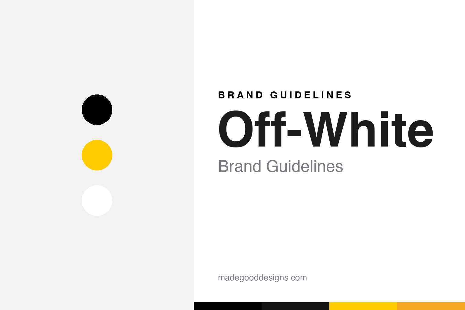
Off-White Brand Guidelines
“QUOTATION MARKS,” Helvetica and hazard stripes — Virgil Abloh made industrial signage into luxury.
Aa
Two constants: a stark black-and-white system with industrial caution yellow, and Helvetica. Abstract homage — not the Off-White arrows, stripes or wordmark.
Design as commentary
Off-White’s most famous device is a pair of quotation marks — turning every object into a caption.
Off-White™, founded by Virgil Abloh, made its name with a set of typographic devices rather than a single crest. The signature move is the quotation-mark device: objects literally labelled in quotes — “SHOELACES,” “SCULPTURE,” “AIR” — a knowing, ironic act of naming-the-thing that reads as commentary on the object itself. Add the industrial “c/o Virgil Abloh” and ™ / “PRODUCT” label styling, and the whole identity is design-as-caption. The name itself is a gloss: Abloh called “off-white” “the grey area between black and white as a colour.”
There are two graphic marks too. The crossing-arrows logo (four arrows converging) — and here’s a key correction — is not from Florence’s Uffizi, a widely-repeated myth; Diet Prada traced it to Glasgow Airport wayfinding signage designed in the mid-1960s by Kinneir, Calvert & Associates (Margaret Calvert and Jock Kinneir, the UK road-sign team). The second is the diagonal hazard stripes (industrial caution striping, often rendered white). Off-White began as Pyrex Vision (2012), rebranded to Off-White in Milan, 2013; the Nike “The Ten” collab (2017) made it inescapable. Abloh died on 28 November 2021.
Colour
Off-White’s palette is black, white and hazard yellow. Click a swatch to copy the hex.
The core is black and white (fitting for a brand literally named after the space between them), with a signature industrial caution yellow/orange on tags, straps, tape and warning-label graphics. Off-White never released a formal colour spec, so treat any value (a high-vis safety yellow around #FFCC00) as approximate rather than a codified Pantone. The palette is borrowed wholesale from industrial signage and hazard tape — the language of construction sites and warning labels, recontextualised as luxury streetwear.
The lesson is recontextualising an existing visual language. Off-White didn’t invent caution yellow, hazard stripes or Helvetica; it lifted the grammar of industrial signage and put it on $500 hoodies, and the meaning came from the transfer. That’s Abloh’s whole method: familiarity made surprising. As with any accent, the yellow is a highlight against black-and-white, not body text. The takeaway for designers: originality can come from context rather than invention — take a known, everyday visual system (safety signage) and move it somewhere unexpected (luxury fashion), and you create something that feels both instantly legible and completely new.
Typography
The typeface is Helvetica — plus quotation marks. That’s the whole system.
Off-White’s dominant typeface is Helvetica (Bold) — Abloh explicitly praised its neutral, unifying “mindset” — and there’s no proprietary custom face: Helvetica plus quotation marks IS the identity. Setting an object’s name in plain, neutral Helvetica and wrapping it in quotes turns typography into conceptual art: the caption becomes the design. It’s a brilliant, replicable system — neutral type + a single rhetorical device (the quotes) + industrial signage motifs — that made Off-White instantly recognisable without a traditional logo. Sometimes the most powerful identity is a way of using type, not a new typeface at all.
“AA”
Neutral Helvetica, wrapped in quotation marks — the caption is the design. (Specimen set in Archivo; Off-White’s device is Helvetica Bold plus quotes.)
Familiar, made surprising
Abloh’s ‘3% rule’ and industrial grammar redefined how a fashion brand can look.
Off-White is the purest expression of Virgil Abloh’s design-as-remix philosophy — including his stated “3% rule” (alter an existing design by roughly 3% to make it new). The whole brand is that idea applied to graphics: take industrial signage (hazard stripes, wayfinding arrows), neutral type (Helvetica) and a rhetorical device (quotation marks), shift the context to luxury streetwear, and you get something meta, ironic and instantly iconic. It flattened the wall between “design” and “fashion,” and its influence on 2010s streetwear graphics is enormous.
For designers, Off-White is a landmark lesson in concept over ornament. Its identity has almost no bespoke assets — no custom font, no drawn crest, no official colour spec — yet it’s unmistakable, because the ideas (quotation marks, borrowed signage, Helvetica neutrality, the 3% remix) are the identity. The takeaways: a strong conceptual device can be more ownable than any logo; recontextualising familiar visual languages is a legitimate, powerful form of originality; and neutral tools (Helvetica, hazard yellow) become distinctive through consistent, meaningful use. Abloh proved a fashion brand could be built almost entirely on ideas about design — and, in doing so, changed what streetwear looks like.
Explore & save
Keep Off-White’s identity on hand — save it to a board in the Made Good inspiration library.
Off-White identity set
Pin the caution palette and the type spirit to your own board.


