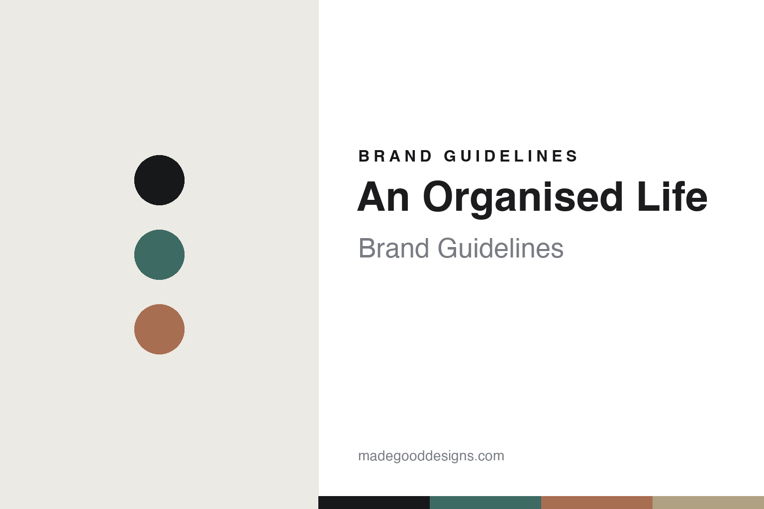
An Organised Life Brand Guidelines
The minimalist diary.
Aa
Two constants: a muted-monochrome palette and a minimal sans register. Abstract homage — not the An Organised Life layouts or packaging.
The minimalist diary
An Organised Life made planning look calm.
An Organised Life is a lesson in calm as the identity. Founded in 2013 in Sydney by Beck Wadworth, it made minimalist, monochrome diaries and planners — functional planning tools that were also quietly beautiful.
Its identity was the minimalist diary. An Organised Life made diaries, planners, notebooks and calendars in a restrained, monochrome register — “less is more,” carried by clean typography and a timeless look rather than trend. Planning tools you actually wanted to use. Order, made elegant.
(Honest notes: An Organised Life was founded in 2013 — not 2015 — by Beck Wadworth (a New Zealand-born graphic-design graduate) in Sydney; we describe it in the past tense because it closed in early 2023 after about a decade, when its founder stepped back. Its identity was minimalist, monochrome planning stationery, and we describe that enduring design rather than a live shop. On production, where its diaries were made isn’t documented (only that a printer and bookbinder were found for the first run), so we don’t assert a country or eco credential. It was founder-led and woman-owned; its stockist and celebrity mentions are reported. There’s no official brand hex, and we reproduce no layout or logo — these tones are an unofficial interpretation. This is design commentary and does not promote any product.)
Colour
An Organised Life lives in a muted-monochrome palette. Click a swatch to copy the hex.
An Organised Life’s identity is minimal, monochrome and calm — a muted teal, an ink, a clay, a sand, and a chalk. The palette leans muted monochrome — the register of a minimalist diary. It signals restraint and order rather than novelty. The honest caveat: with no published brand hex, these tones are an original, unofficial interpretation, not first-party values.
The lesson is muted monochrome signals a minimalist planning brand. An Organised Life’s world was a calm, ordered page. For designers, it is a reminder that a restrained, monochrome palette and clean typography can make even a diary feel considered — that “less is more” is a whole positioning. Because a mid teal can fail as small text, keep type dark and let the colour live in the accents, palette and band. The takeaways: strip it back; lead with type; keep it timeless; and treat any single hex as unofficial.
Typography
The register is a minimal sans — restrained, clean, timeless.
An Organised Life’s identity carried a restrained, clean, timeless spirit — a minimal, ordered object. A quiet, legible sans captures the mood: it is calm and modern, the register of a minimalist planning brand. Set in a muted-monochrome palette, the minimal sans feels restrained and clean — exactly the personality An Organised Life carried. It is understated rather than loud, mirroring a monochrome diary. (An Organised Life’s real layouts and wordmark are works we describe but do not reproduce, and the exact typeface is not ours to use.) Because it is not ours to use, the honest description is “a minimal sans spirit,” shown here in a stand-in. The type behaves like the brand: restrained, clean and timeless.
Aa
A minimal sans spirit — restrained and clean. (Specimen set in Lexend, a quiet legible sans STAND-IN; NOT the An Organised Life packaging.)
Calm as the identity
An Organised Life stood for the minimalist diary.
An Organised Life is a lesson in making calm the identity. A muted-monochrome palette, a minimal sans and an ordered diary made minimalism the whole brand — minimal, monochrome, calm. The restraint was the differentiator. The differentiator was treating a planner as an object of taste, not just utility.
Put to work, the identity is elegance through subtraction. A designer building in this spirit would strip a functional object back to type and a tight tonal palette, and trust that calm, timeless restraint reads as premium in a category full of busy, dated layouts. The lesson An Organised Life teaches is that the most ordinary tools reward good taste: by making a diary monochrome and considered, it turned planning into a lifestyle brand — and its closure in 2023 is a reminder that even a strong founder-led brand is a chapter, its design identity worth studying after the shop is gone.
For designers and brand-builders, An Organised Life offers a clear takeaway: make the ordinary elegant. The lessons: strip it back; lead with type; keep it timeless; and be honest about the story. It is also a reminder to stay accurate: it was founded in 2013 by Beck Wadworth in Sydney, its identity was minimalist monochrome planning stationery, and it closed in early 2023 — the palette here is an unofficial interpretation. And it is a reminder that an identity can outlast the business that made it: the monochrome, type-led look is still worth studying precisely because it made an unglamorous object feel designed, and that lesson does not expire when the shop does. An Organised Life made calm the brand — proof that restraint can be the difference.
Explore & save
Keep An Organised Life’s identity on hand — save it to a board in the Made Good inspiration library.
An Organised Life identity set
Pin the muted-monochrome palette and the minimal-sans register to your own board.


