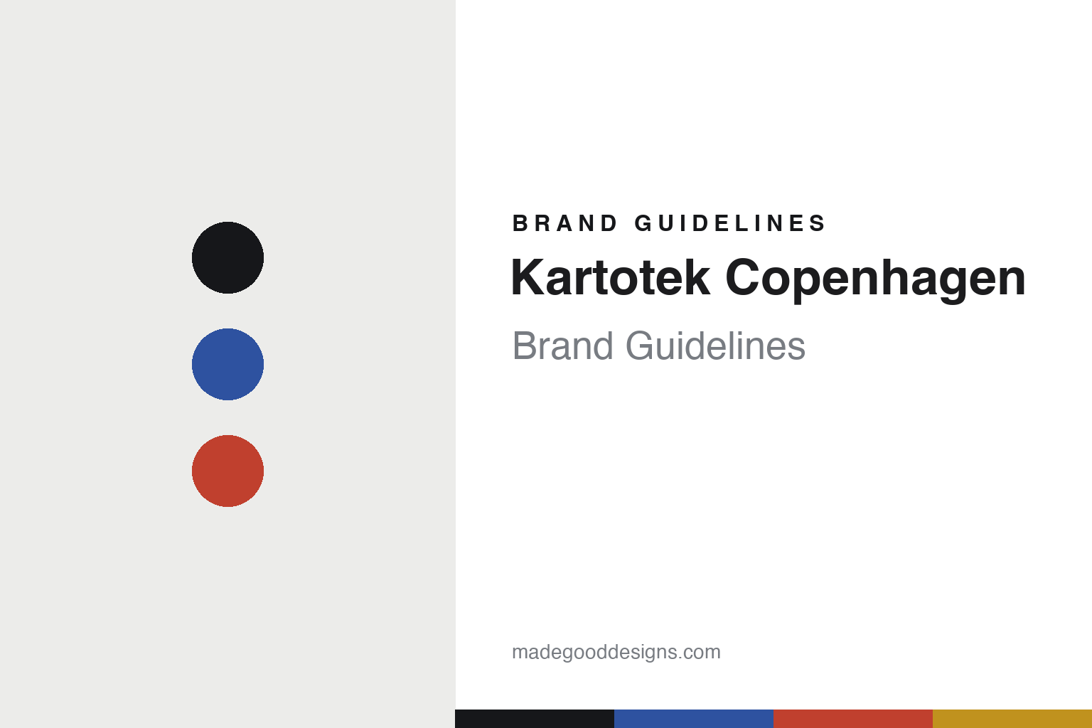
Kartotek Copenhagen Brand Guidelines
The simple stationery.
Aa
Two constants: a graphic-primaries palette and a simple sans register. Abstract homage — not the Kartotek designs or packaging.
The simple stationery
Kartotek keeps asking: can it be simpler?
Kartotek Copenhagen is a lesson in simplicity as the identity. Founded in 2016 in Copenhagen by Julie Warberg — a trained psychologist turned creative director — it makes clean, colour-forward Scandinavian stationery guided by one question: could we make it more simple?
Its identity is the simple stationery. Kartotek makes notebooks, planners, calendars, cards, stamps and desk goods, plus posters and frames, in a functional, colour-forward register — with a playful streak, from tidy grids to cheerful animal motifs. Its name is the Danish word for a card index. Simplicity, offered as calm. Analog pauses in a digital day.
(Honest notes: Kartotek Copenhagen was founded in 2016 — not 2015 — by Julie Warberg in Copenhagen; “Kartotek” is Danish for a card index or filing system (we note the meaning, not a documented rationale). It is a stationery and posters/frames brand — we don’t claim a candle or general homeware line, which its own site doesn’t show. Its guiding line is “could we make it more simple?” Its paper products, it says, are made in Europe on Scandinavian/Swedish paper — so we say made in Europe, not “made in Denmark.” It is founder-led and small; its “600 shops” figure is self-reported. There’s no official brand hex, and we reproduce no poster or logo — these tones are an unofficial interpretation. This is design commentary and does not promote any product.)
Colour
Kartotek lives in a graphic-primaries palette. Click a swatch to copy the hex.
Kartotek’s identity is graphic, calm and Scandinavian — a cobalt, an ink, a red, a mustard, and a chalk. The palette pairs a cobalt with a red — the register of clean, colour-forward Scandinavian stationery. It signals simplicity and colour rather than novelty. The honest caveat: with no published brand hex, these tones are an original, unofficial interpretation, not first-party values.
The lesson is a cobalt with a red signals a simple stationery house. Kartotek’s world is a clean, cheerful object. For designers, it is a reminder that relentless simplification — asking “could this be simpler?” — can itself be an identity, and that simple need not mean austere (there is room for a cat or a panda). Because a mid cobalt can fail as small text, keep type dark and let the colour live in the accents, palette and band. The takeaways: simplify relentlessly; keep it colourful; stay functional; and treat any single hex as unofficial.
Typography
The register is a simple sans — clean, functional, Scandinavian.
Kartotek’s identity carries a clean, functional, Scandinavian spirit — a simple, colour-forward object. A quiet geometric sans captures the mood: it is calm and modern, the register of a Danish design studio. Set in a graphic-primaries palette, the simple sans feels clean and functional — exactly the personality Kartotek carries. It is calm rather than loud, mirroring simplified design. (Kartotek’s real posters, designs and wordmark are works we describe but do not reproduce, and the exact typeface is not ours to use.) Because it is not ours to use, the honest description is “a simple sans spirit,” shown here in a stand-in. The type behaves like the brand: clean, functional and Scandinavian.
Aa
A simple sans spirit — clean and functional. (Specimen set in Questrial, a quiet geometric sans STAND-IN; NOT the Kartotek packaging.)
Simplicity as the identity
Kartotek stands for the simple stationery.
Kartotek Copenhagen is a lesson in making simplicity the identity. A graphic-primaries palette, a simple sans and a clean object make simplification the whole brand — graphic, calm, Scandinavian. The simplicity is the differentiator. The differentiator is a discipline of asking, every time, whether a thing could be simpler.
Put to work, the identity is subtraction as a habit. A designer building in this spirit would treat “could this be simpler?” as the governing question — fewer elements, clear grids, a tight colour set — while leaving deliberate room for warmth so the result reads as calm rather than cold. The lesson Kartotek teaches, informed by its founder’s psychology background, is that simplicity is a feeling as much as a form: paper goods that offer small moments of focus in a noisy digital day, and a brand whose whole promise is that using it feels a little calmer.
For designers and brand-builders, Kartotek offers a clear takeaway: make simplicity a discipline. The lessons: simplify relentlessly; keep it colourful; stay functional; and be honest about the story. It is also a reminder to stay accurate: it was founded in 2016 by Julie Warberg in Copenhagen, it makes stationery and posters, and its paper is made in Europe on Scandinavian stock — the palette here is an unofficial interpretation. And it is a reminder that “make it simpler” is not a one-time brief but a standing constraint: the brands that feel calm are usually the ones that keep subtracting long after most teams would have already called the work finished and moved on. Kartotek made simplicity the brand — proof that “simpler” can be the difference.
Explore & save
Keep Kartotek Copenhagen’s identity on hand — save it to a board in the Made Good inspiration library.
Kartotek Copenhagen identity set
Pin the graphic-primaries palette and the simple-sans register to your own board.