What Font Does GMC Use?
Searches for the gmc font almost always point at one thing: those bold red block letters that say “professional grade” before a single word of copy is read. Like other automakers, GMC’s lettering is bespoke brand artwork rather than an off-the-shelf typeface. This guide explains the wordmark, the reported brand typeface, and the free fonts that best capture its heavy, truck-tough character. For more breakdowns, see our famous brand fonts hub, and compare the more premium Buick font guide from the same General Motors family.
What font is the GMC logo?
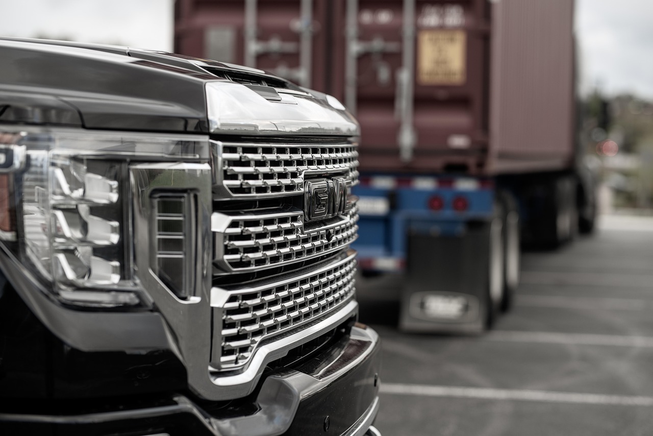
The GMC logo sets the three letters “GMC” in heavy, upright capitals, traditionally rendered in white or chrome inside a red rectangular badge. The letterforms are thick and blocky with minimal contrast, square-ish corners and tight, sturdy proportions that read as solid and dependable. There is nothing delicate here: the strokes carry weight evenly, and the overall silhouette feels engineered to look strong even at a distance on a grille or tailgate. This is custom, trademarked lettering, so no exact retail font reproduces it, but the closest category is a heavy industrial sans-serif.
What is GMC’s brand typeface?
For headlines, advertising and supporting copy, GMC appears to use a strong, condensed-leaning sans-serif that complements the muscular wordmark. The exact font varies across campaigns and dealer materials, so any specific name should be treated as reported rather than confirmed. What stays consistent is attitude: bold weights, confident capitals and clean legibility that matches the brand’s rugged, capable image. The type rarely gets decorative, because GMC’s message is about strength and utility, and the typography is built to underline that.
Free fonts that look like the GMC font
You cannot legally recreate the trademarked badge, but you can capture its heavy, industrial presence with free fonts. The key qualities are thick strokes, tight spacing and a no-frills, capable feel. Here is a practical mapping.
| Use case | GMC uses | Free alternative |
|---|---|---|
| Logo / wordmark | Heavy red block capitals | Archivo Black or Anton |
| Headlines | Bold, rugged sans | Oswald (bold) or Teko |
| Body / UI | Strong, legible sans | Inter or Roboto |
Archivo Black is the standout free pick for the wordmark feel: its extreme weight and squared letters mirror the solid, grille-badge impression, while Anton offers a more condensed, poster-style take. To complete the effect, place the heavy capitals on a red field and keep the spacing tight so the letters feel packed and immovable, the way a stamped metal badge does. Resist the urge to add outlines or bevels; the modern GMC look is flat and confident, and piling on effects pushes it toward retro pastiche rather than the clean, capable image the brand projects today.
Why does GMC use this kind of type?
GMC sells trucks, SUVs and the promise of toughness, so its typography has to look as capable as the vehicles. Heavy, blocky capitals communicate strength, durability and confidence instantly, the visual equivalent of a firm handshake. The red badge adds urgency and visibility, helping the mark stand out in a parking lot full of competitors. By keeping the letters simple and industrial rather than ornate, GMC ensures the logo stays readable and imposing whether it is on a tailgate, a billboard or a phone screen. Form follows the brand’s function-first promise.
It is worth contrasting this with the rest of the General Motors family. Where Buick leans light and premium and Cadillac trades on crests and shields, GMC deliberately keeps its lettering blunt and muscular, because its customers are buying capability rather than refinement. That positioning lets the typography skip subtlety entirely. The three short letters are an advantage here too: with only “GMC” to render, the brand can afford to make each character as heavy and assertive as possible without ever risking legibility.
Can I use the GMC font for my own project?
No. The GMC wordmark and red badge are protected trademarks owned by General Motors, so reproducing them, or building a similar-looking mark, is not allowed regardless of which font you start from. Font licensing covers the letterforms only, never the right to copy a brand’s identity. The right move is to choose a licensed heavy sans such as Archivo Black or Anton and create your own original logo. Our font licensing guide explains exactly what desktop, web and embedding licenses cover so your project stays compliant.
Frequently Asked Questions
Is the GMC font available to download?
Not officially. The “GMC” wordmark is custom, trademarked lettering rather than a retail font, so there is no authorized download. To recreate the look, designers use a heavy free sans such as Archivo Black or Anton in uppercase, which approximates the thick, block-letter character without copying the protected badge.
What font is closest to the GMC logo?
Archivo Black is the closest easy, free match because of its very heavy weight and squared, solid capitals. Anton offers a more condensed alternative with a similar bold attitude. For headline pairings, bold Oswald or Teko extend the rugged, industrial feel while staying fully licensable for commercial work.
Why is the GMC logo red?
Red signals energy, confidence and visibility, helping the badge stand out on grilles and in advertising. Combined with the heavy block capitals, the color reinforces GMC’s tough, professional-grade positioning. It is a deliberate identity choice rather than a typographic one, but it works hand in hand with the bold lettering to project strength.
Is the GMC font a slab serif or a sans-serif?
The wordmark is best described as a heavy sans-serif rather than a true slab serif, though its thick, even strokes give it a slab-like solidity. Free heavy sans options like Archivo Black capture that weight; if you want a more overt slab feel, a bold slab serif can also evoke the rugged, industrial mood.
What body font pairs with a GMC-style headline?
Pair a heavy Archivo Black or Anton headline with a clean, neutral body font such as Inter or Roboto. The contrast keeps the bold, industrial impact up top while making longer text easy to read. This mirrors how truck and utility brands separate aggressive display type from quiet, functional running copy.