What Font Does Old Navy Use?
Old Navy built a billion-dollar brand on affordable basics and cheerful, all-American energy, and its typography sells that promise in a single glance. If you are after the old navy font to recreate that bold, budget-friendly look, this guide breaks down the wordmark, the brand type, and the free alternatives that match. As another member of the Gap family, Old Navy uses type very differently from its upscale siblings. For more breakdowns, see our famous brand fonts hub.
What font is the Old Navy logo?
The Old Navy logo is a bold, all-caps wordmark with sturdy, condensed letterforms set in the brand’s familiar navy blue. The heavy weight and tighter width give the name a punchy, confident presence that works equally well on a storefront, a sale sign, or a tiny mobile banner. Like other major retailers, Old Navy treats this lettering as a trademarked asset, and it has been custom-drawn rather than typed from a stock font. So while plenty of sites list “the Old Navy font,” none is the literal logo. What you can copy is the recipe: bold, condensed, friendly capitals.
What is Old Navy’s brand typeface?
In its advertising, packaging, and website, Old Navy generally pairs bold, approachable sans serifs for headlines and promotions with a clean, neutral sans for prices and product copy. The specific families have changed across campaigns and rebrands, so the safest description is by character rather than a fixed name. Expect chunky, rounded-friendly weights for the big “deal” messaging that defines the brand, supported by a straightforward workhorse sans for everything functional. The system is built for clarity and cheerfulness, never for luxury or restraint.
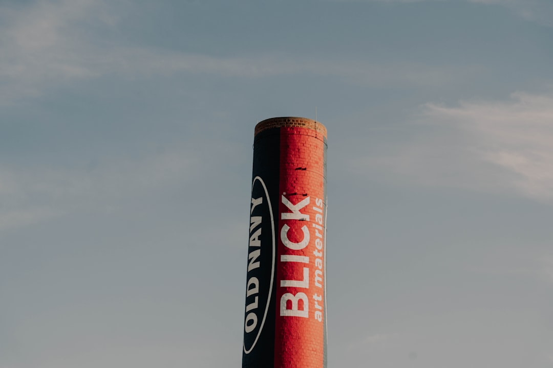
Color is inseparable from the type here. The deep navy that gives the brand its name, frequently paired with bright accents, makes the bold lettering pop on signage and in ads. That high-contrast, flag-inspired palette reinforces the cheerful Americana theme and helps the wordmark register instantly, even in a busy shopping center or a fast-scrolling feed. When you imitate the Old Navy look, treat the navy-and-bright combination as part of the typography, not a separate decision; the two work together to deliver that friendly, value-first signal.
Free fonts that look like the Old Navy font
The bold-condensed Americana look is easy to recreate with free fonts. The table maps each role to an open-source Google Fonts alternative.
| Use case | Old Navy uses | Free alternative |
|---|---|---|
| Logo / wordmark | Bold condensed caps | Oswald (bold) or Anton |
| Headlines | Punchy condensed sans | Saira Condensed or Archivo Narrow |
| Body / UI | Clean neutral sans | Inter or Mulish |
Oswald in a bold weight is the most flexible single match for both wordmark and headlines, while Anton delivers extra heft if you want maximum impact. For deeper exploration, see our roundup of the best sans serif fonts. If you like this style, our Anthropologie font guide shows the opposite, more delicate end of retail type.
Why does Old Navy use this kind of type?
Old Navy’s entire pitch is great basics at low prices, and bold condensed type communicates exactly that with zero ambiguity. Heavy capitals shout deals and read clearly from a distance, while the condensed width fits long promotional messages onto signs, bags, and phone screens without shrinking the letters. The friendly, unpretentious weight signals value and fun rather than exclusivity, which is precisely the audience the brand wants. Compared with upscale siblings that whisper through elegant serifs, Old Navy speaks up, and its typography is the megaphone.
The family connection is instructive. Banana Republic, Gap, and Old Navy all sit under the same parent company, yet each uses type to carve out a distinct price tier and personality. Banana Republic leans refined and serif-influenced, Gap stays minimal and clean, and Old Navy goes bold, condensed, and cheerful. Studying the three side by side is a clear lesson in how typography alone can separate a budget banner from a premium one, even when the underlying product categories overlap.
Can I use the Old Navy font for my own project?
You can freely imitate the bold-condensed style, but you cannot legally reuse the actual Old Navy wordmark, which is trademark-protected regardless of which font resembles it. Build your own identity with open-source fonts like Oswald, Anton, or Saira Condensed, all of which permit commercial use. Avoid any design implying an official connection, and verify each font’s license before publishing. Our font licensing guide covers the rules in plain language.
Frequently Asked Questions
What font is the Old Navy logo?
The logo uses bold, condensed all-caps lettering in the brand’s signature navy. It is custom-drawn rather than a stock font, so no exact download exists. A heavy condensed sans like Oswald bold or Anton is the closest free approximation of its weight and proportion.
What free font looks most like Old Navy?
Oswald in a bold weight is the most practical free match because its condensed, capital-friendly forms echo the wordmark and scale into matching headlines. Anton is a strong alternative when you want even heavier, blockier letters for maximum on-screen impact.
Is the Old Navy font condensed?
Yes. The letters are noticeably condensed, meaning narrower than a standard sans, which lets bold promotional text and the brand name fit compactly while staying highly legible. That condensed width is a defining trait of the value-retail typographic style Old Navy uses.
What fonts pair well with the Old Navy look?
Pair a bold condensed display sans such as Oswald or Anton for headlines with a clean neutral body sans like Inter or Mulish. This contrast keeps deal messaging loud and punchy while product details and longer copy remain comfortable and easy to scan.
Can I use these fonts commercially?
Yes. Oswald, Anton, Saira Condensed, Archivo Narrow, and Inter are open-source and licensed for commercial use. Download from an official source and review the license file, and you can use them in signage, packaging, and online stores without paying a fee.