What Font Does Capcom Use?
Few gaming logos are as iconic as Capcom’s chunky yellow lettering, burned into memory by Street Fighter and Resident Evil boot screens. The capcom font is all about weight and presence: thick, blocky capitals built to dominate an arcade cabinet or a title card. This guide breaks down the wordmark, the surrounding brand type, and the free fonts that come closest. It joins our other gaming features in the famous brand fonts hub, including a companion piece on Valve.
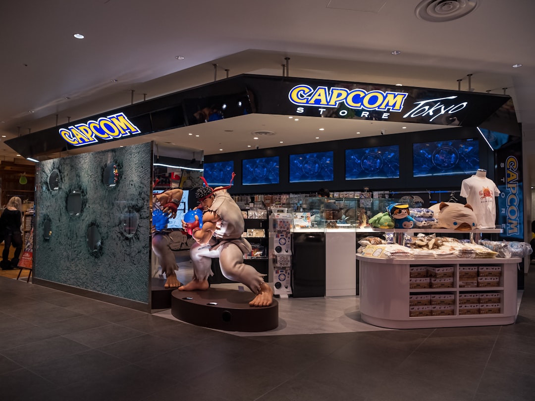
What font is the Capcom logo?
The Capcom logo sets the name in heavy, all-caps lettering with thick, even strokes and a bold, blocky stance. Over the years the mark has often carried a slightly angular, dimensional treatment that gives the yellow letters a tactile, almost embossed presence, the kind of look that pops on a dark loading screen. The letterforms are simple and geometric at their core but drawn with extra weight and confidence. As with all major brands, this wordmark is custom and trademarked, so there is no downloadable “Capcom” font. The impact comes from sheer boldness and that unmistakable yellow.
What is Capcom’s brand typeface?
Beyond the logo, Capcom’s corporate and marketing materials appear to use clean, modern sans-serifs that contrast with the heavy wordmark, while individual franchises carry their own dramatic, custom title type. Street Fighter, Resident Evil, and Monster Hunter each have distinct, heavily stylized logos that have little to do with the corporate mark, which is typical for a publisher whose games span wildly different genres. We have not seen Capcom publish a public type specimen naming its exact corporate family, so any single attribution is best treated as educated guessing. The constant is contrast: a loud, bold corporate wordmark balanced by cleaner supporting type. This division of labor is deliberate and common among long-running publishers, because it lets the parent logo stay fixed and trusted while each franchise’s title art is free to be as dramatic, ornate, or experimental as its world demands. For more on that supporting category, see the best sans-serif fonts.
Free fonts that look like the Capcom font
The exact wordmark is off-limits, but its heavy, blocky capitals are easy to approximate with free, open-source fonts. The table maps each part of a Capcom-style identity to a no-cost alternative cleared for commercial use.
| Use case | Capcom uses | Free alternative |
|---|---|---|
| Logo / wordmark | Heavy custom 3D-style caps | Archivo Black or Anton |
| Headlines | Bold display sans | Montserrat (Black) or Anton |
| Body / UI | Clean readable sans | Inter or Archivo (Regular) |
Archivo Black is the standout match because its ultra-bold weight and squared structure echo the wordmark’s heavy, blocky feel. Anton delivers a tall, condensed punch if you want maximum impact in a tight space, while Montserrat Black gives a rounder, geometric take that is broadly available across design tools.
Why does Capcom use this kind of type?
Heavy, bold capitals are built for impact, and that suits a company forged in the arcade and console era, where a logo had to grab attention from across a room and look powerful on a cartridge or cabinet. The thick yellow lettering reads as energetic, confident, and a little retro, qualities that fit a brand whose history is intertwined with fighting games and action franchises. The dimensional, embossed-style treatment adds tactility and nostalgia, reinforcing Capcom’s heritage. Keeping the corporate mark loud and simple also lets each game’s bespoke title art shine without competing. The heavy weight serves a technical purpose as well. In the early arcade and cartridge years, logos had to survive low-resolution displays, print on small labels, and remain readable through scuffs and glare, and thick, blocky letters held up far better under those conditions than delicate ones would. That practical heritage is baked into the mark, which is part of why it still feels so solid and dependable today.
Can I use the Capcom font for my own project?
No. The Capcom wordmark is trademarked custom lettering, and reproducing it for your own brand would create legal exposure and read as imitation. Build your own bold identity instead: set your name in Archivo Black or Anton, push the weight, and add a strong accent color to capture that arcade energy without copying the mark. Always confirm the license for any font before commercial use; our font licensing guide explains exactly what desktop, web, and embedding licenses allow.
Frequently Asked Questions
Is the Capcom font free to download?
No. The exact Capcom wordmark is custom, trademarked lettering and is not available as a font file. You can recreate its heavy, blocky look for free using open-source fonts such as Archivo Black or Anton, both licensed for personal and commercial projects.
What font is closest to the Capcom logo?
Archivo Black is the closest readily available match for the wordmark’s ultra-bold, squared capitals. For a taller, more condensed punch, Anton is an excellent free alternative, and Montserrat Black offers a rounder geometric option that captures the same heavy presence.
Does Street Fighter use the same font as Capcom?
No. Street Fighter, like most Capcom franchises, has its own dramatic, custom-designed title logo that is separate from the corporate CAPCOM wordmark. Capcom keeps its corporate mark consistent while letting each game develop a distinct visual identity suited to its genre and tone.
Why is the Capcom logo yellow?
The bold yellow gives the wordmark high visibility and energy, standing out vividly against the dark backgrounds of game boot screens and packaging. Combined with the heavy, dimensional lettering, the color reinforces Capcom’s confident, arcade-rooted heritage and makes the mark instantly recognizable to longtime players.
What free font suits a bold arcade-style brand?
For a heavy, arcade-inspired identity, pair an ultra-bold display face like Archivo Black or Anton for your logo and headlines with a clean workhorse such as Inter for body and interface text. This gives you maximum impact up top and comfortable readability everywhere else.