What Font Does HSBC Use?
The hsbc font question comes up a lot because the bank operates in dozens of countries, yet its type always feels consistent: orderly, international and quietly engineered. As with the other entries in our famous brand fonts library, HSBC’s look comes from a trademarked wordmark plus a disciplined typeface system rather than one font you can download. Here is the breakdown.
What font is the HSBC logo?
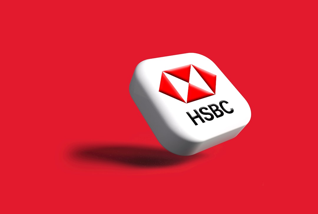
The HSBC logo is the four letters “HSBC” set in clean, even uppercase characters positioned beside the red-and-white hexagon, a shape derived from a Scottish flag and refined into a sharp, symmetrical mark. The lettering is a precise sans serif with consistent stroke weight, generous spacing and rational, almost engineered proportions. It is a fixed, trademarked treatment, so the exact letterforms and the relationship to the hexagon are protected. The overall impression is Swiss modernism: neutral, global and unmistakably banking.
What is HSBC’s brand typeface?
HSBC has historically been linked to Univers, the classic Adrian Frutiger grotesque, and the brand’s wider system reflects that lineage with clean, evenly weighted sans serifs used for headlines, body copy and interface text. In practice the bank uses custom and Univers-derived faces tuned for its specific needs across scripts and screen sizes. Treat any single font name as approximate rather than official, but the family resemblance, a rational, low-contrast grotesque, is consistent. To capture that mood from open-source options, browse our picks for the best sans serif fonts.
One reason Univers fits HSBC so well is its sheer breadth. Frutiger designed the family on a numbered grid of weights and widths so that designers could mix many variants while keeping everything visually related. For a bank that produces material in English, Chinese, Arabic and dozens of other scripts, that systematic structure is invaluable: bold headlines, light captions, condensed tables and regular body text can all coexist without clashing. The brand’s everyday materials lean on the quieter weights, reserving heavier ones for emphasis, which keeps the tone calm and orderly even on a dense financial page.
Free fonts that look like the HSBC font
You cannot license HSBC’s exact wordmark, but the Univers-style feeling, structured, neutral and international, is very reproducible with free fonts. This is how the layers line up.
| Use case | HSBC uses | Free alternative |
|---|---|---|
| Logo / wordmark | Custom uppercase sans (Univers-style) | Archivo or Arimo, in caps |
| Headlines | Univers-derived grotesque | Inter or Archivo (Semibold) |
| Body / UI | Clean legible sans | Inter (Regular) |
Why does HSBC use this kind of type?
HSBC markets itself as “the world’s local bank,” and a Swiss-style grotesque is the perfect typographic passport: it reads as neutral and professional in London, Hong Kong, Dubai or New York without carrying any one culture’s baggage. Univers in particular was designed as a large, systematic family, which suits an organisation that needs many weights working in harmony across languages and scripts. The result is type that disappears into reliability, letting the red hexagon do the memorable work while the lettering signals precision and trust.
The hexagon itself reinforces this. Because the symbol is so distinctive and instantly recognisable, the wordmark does not need to be expressive; it simply needs to be clear and credible. This division of labour, a bold, memorable mark paired with neutral, engineered lettering, is a hallmark of mature global brands, and HSBC executes it with unusual consistency. Whether you encounter the logo on a high-street branch in Hong Kong, an airport jet bridge advert or a banking app, the relationship between symbol and type stays identical, which is precisely how a multinational maintains one coherent identity across very different markets.
Can I use the HSBC font for my own project?
No. The “HSBC” wordmark and hexagon are registered trademarks, and recreating them, even in a similar font, to imply any connection to the bank is not allowed. You are free, however, to take inspiration from the Univers-influenced style and build something comparable with properly licensed type. If your reference point is Univers itself, note that it is a commercial font, so confirm the terms before use. Our font licensing guide explains how desktop, web and app licences differ so you choose the right one.
Frequently Asked Questions
Does HSBC use Univers?
HSBC has long been associated with Univers, the Swiss grotesque by Adrian Frutiger, and its brand type clearly draws on that style. The bank uses custom and Univers-derived versions tuned for its global needs, so it is fair to say Univers is the spiritual root even if the deployed files are bespoke.
What is the closest free font to the HSBC logo?
Archivo and Arimo are the strongest free matches for the Univers-style wordmark, while Inter works beautifully for headlines and interfaces. Set them in uppercase with slightly open letterspacing to echo the clean, engineered look of the “HSBC” lettering beside the hexagon.
Can I download the actual HSBC font?
No. HSBC’s wordmark is a proprietary, trademarked treatment and is not distributed as a downloadable font. Univers, which inspired it, is a licensed commercial typeface available from type vendors. For free projects, use open-source lookalikes such as Archivo or Inter instead of the real brand assets.
What font does the HSBC app use?
HSBC’s mobile and online banking interfaces use a clean, evenly weighted sans serif consistent with the brand’s Univers-derived system, optimised for legibility on small screens. To prototype a similar banking interface for free, Inter or Archivo at regular and medium weights will closely match the tone.
Why do global banks favour Swiss-style sans serifs?
Swiss grotesques like Univers feel neutral, systematic and international, ideal for a bank operating across many countries and scripts. They scale into large, harmonious families and stay readable everywhere. That is why HSBC, like Barclays and other major banks, leans on this engineered, low-contrast style.