What Font Does MIT Use?
MIT is the rare elite university that rejects the classic-serif playbook entirely. If you are looking for the mit font, you are looking for a sans-serif story, all clean lines, heavy weights, and engineering-minded clarity. Below we explain the famous “MIT” logotype, the institute’s broader sans-serif identity, and which free fonts capture that bold, technical character. For other brand breakdowns, visit our famous brand fonts hub.
What font is the MIT logo/wordmark?
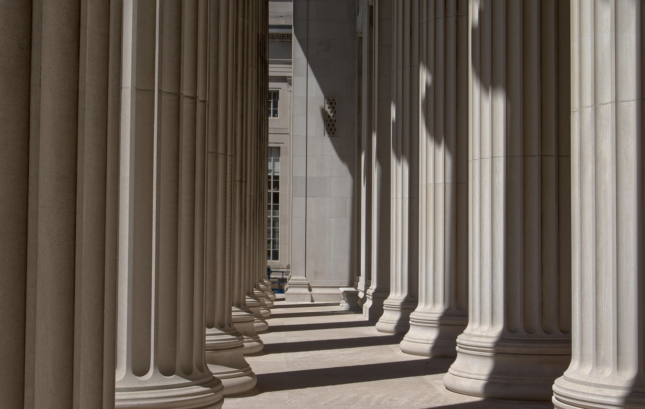
The MIT logo is the three letters “MIT” set in a heavy, almost architectural sans-serif, frequently shown with the distinctive red and gray color bars that nod to the institute’s column-inspired graphic system. The letterforms are bold, upright, and geometric, with even stroke weights and squared-off proportions that read as structural rather than decorative, fitting for an institution built on engineering and science. As with most marquee logos, the exact MIT lettering is refined custom artwork rather than a font you can type, so there is no perfect download, but its DNA is unmistakably that of a strong geometric sans. The wordmark is intentionally spare, no flourishes, no serifs, just three confident letters that function almost like a logotype for a technology company, which is exactly the association MIT is happy to invite.
What is MIT’s brand/identity typeface?
MIT’s institutional identity is built around a coordinated sans-serif system. The brand favors clean, confident grotesque and geometric sans-serifs for headlines and a highly legible humanist sans for body text and interfaces, choices that emphasize clarity, precision, and modernity over tradition. The result is a look that feels closer to a technology company than a colonial-era college, which is exactly the point. MIT Athletics (the Engineers) and various labs and departments layer their own marks on top, but the through-line is the same: sans-serif type, generous spacing, and a restrained, systematic feel reinforced by the red-and-gray palette.
Free fonts that look like the MIT font
Because MIT’s identity is sans-serif rather than bespoke serif, you can get strikingly close with free fonts, especially in their bolder weights.
| Use case | MIT uses | Free alternative |
|---|---|---|
| Logo / wordmark | Heavy geometric/grotesque sans | Archivo (Bold/Black), Montserrat (Bold) |
| Headlines | Confident geometric sans | Archivo, Inter (Bold) |
| Body | Humanist / neutral sans | Inter, IBM Plex Sans |
| Technical / data | Clean monospace accents | IBM Plex Mono, Space Mono |
Archivo Black and a heavy-weight Montserrat are your best bets for the logo feel, giving you that solid, geometric, engineered look. For the broader system, Inter or IBM Plex Sans deliver the neutral, technical legibility MIT prizes. Find more in our roundup of the best Google Fonts.
Why does MIT use this kind of type?
For an institute defined by engineering, computing, and science, a sans-serif identity is a perfect fit: geometric letterforms read as rational, precise, and forward-looking, the visual equivalent of clean code or a well-machined part. Where Harvard and Princeton use serifs to invoke centuries of tradition, MIT uses bold sans-serifs to signal the future, innovation, technology, and problem-solving. The heavy weights project confidence and authority, while the systematic red-and-gray graphic language reinforces the idea of a place that thinks in modular, structural terms. It is a brand built to look like the engineering it produces. The contrast with its peers is intentional: where most elite universities reach backward for legitimacy, MIT reaches forward, treating its identity as a designed system rather than an inherited crest. That confidence is why the simple, blocky “MIT” works so well; it needs no ornament to feel authoritative, only clarity and weight.
Can I use the MIT font for my own project?
The geometric-sans style is free to emulate, and fonts like Archivo, Montserrat, and Inter are open-source and commercially usable. But MIT’s name, the “MIT” logotype, the red-and-gray column system, and related marks are trademarks of the Massachusetts Institute of Technology. You can build a clean, technical brand with free geometric sans-serifs, but you cannot reproduce MIT’s logo or imply any affiliation. Verify each font’s license before commercial use, our font licensing guide explains how, and contrast MIT’s modern approach with the traditional serifs in our Stanford font guide.
Frequently Asked Questions
What font is the MIT logo?
The MIT logo uses a heavy, geometric sans-serif for the three letters “MIT,” typically shown with red and gray column bars. It is custom artwork rather than a downloadable font, but its bold, structural character is closely matched by free faces like Archivo Black or a heavy-weight Montserrat.
Is the MIT font free to download?
The exact MIT logotype is not available for download, but you can recreate its look with free, open-source geometric sans-serifs. Archivo and Montserrat in bold weights are the closest free matches for the logo, while Inter or IBM Plex Sans suit MIT’s broader text identity.
Why doesn’t MIT use a serif font like other universities?
As a science and engineering institute, MIT chose a sans-serif identity to signal modernity, precision, and innovation rather than colonial tradition. Geometric sans-serifs feel rational and technical, aligning with MIT’s focus on computing, engineering, and the future instead of evoking the past with classic serifs.
What is the best free alternative to the MIT font?
For the logo, Archivo Black or Montserrat Bold are the best free alternatives, capturing MIT’s heavy geometric character. For the full identity system, pair Inter or IBM Plex Sans for body text. All are open-source and commercially usable, letting you build an MIT-style brand for free.
What are MIT’s brand colors?
MIT’s primary brand colors are a bright red and a cool gray, often presented as vertical column bars beside the logotype. The colors are a key part of the identity but are separate from the typography, so pairing them with a free geometric sans recreates the MIT mood without trademark issues.


