What Font Does Bank of America Use?
If you have ever wondered exactly which typeface gives Bank of America its calm, dependable look, the honest answer is that the bank of america font is best described as a family of choices rather than one downloadable file. Like most of the brands in our famous brand fonts hub, the company combines a trademarked logo treatment with a flexible everyday type system. Below we break down what the wordmark looks like, what the marketing typeface appears to be, and which free fonts get you closest.
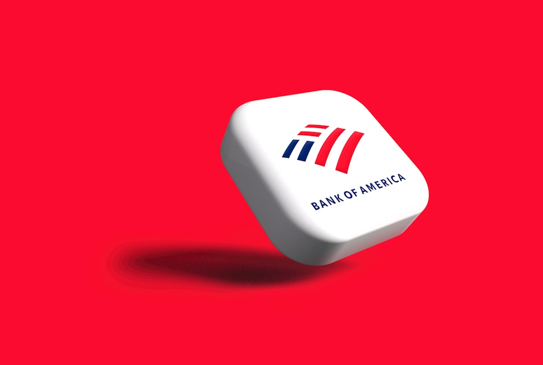
What font is the Bank of America logo?
The Bank of America logo wordmark is set in a clean, geometric-leaning sans serif with open counters, uniform stroke weight and squared-off terminals. It is the kind of lettering that signals stability without drawing attention to itself, which is exactly the point for a retail bank. The characters are not from a font you can simply type out; they have been drawn or refined as a trademarked wordmark, so the spacing, the proportions of the capital “B” and “A,” and the relationship to the flagscape symbol are fixed and protected. Visually it sits in the same neighbourhood as Helvetica and other mid-century grotesques.
What is Bank of America’s brand typeface?
For headlines, statements, app screens and advertising, Bank of America appears to rely on a restrained sans serif system rather than a single signature display face. Reporting and brand observation suggest the company has used custom and Helvetica-adjacent sans serifs over the years, prioritising legibility at small sizes and across devices. We would treat any specific font name as unconfirmed, but the direction is clear: neutral, highly readable grotesques that carry numbers, legal copy and interface labels cleanly. If you want the texture without the trademark, a face from our roundup of the best sans serif fonts will land in the same register.
It is worth noting how rarely Bank of America lets type take centre stage. Across decades of rebrands the company has trimmed flourishes rather than added them, gradually simplifying its mark and tightening its palette around red, white and blue. The typography follows the same discipline: a small number of weights, consistent spacing, and almost no decorative variation. That restraint is itself a strategic choice, because for a bank with tens of millions of customers, any visual quirk that ages badly or reads differently across regions becomes a liability. A plain, durable grotesque is the safest long-term bet, and the brand treats it accordingly.
Free fonts that look like the Bank of America font
You will not be able to license the exact wordmark, but you can recreate the overall feel, trustworthy, plain-spoken and modern, with freely available open-source fonts. Here is how the pieces map together.
| Use case | Bank of America uses | Free alternative |
|---|---|---|
| Logo / wordmark | Custom drawn sans serif (Helvetica-like) | Arimo or Roboto, manually tracked |
| Headlines | Neutral grotesque sans | Inter (Semibold / Bold) |
| Body / UI | Legible everyday sans | Inter or Roboto (Regular) |
Why does Bank of America use this kind of type?
Banks sell confidence, and type is one of the quietest ways to communicate it. A neutral grotesque feels institutional and even-handed; it does not editorialise, flirt or shout. That matters when the same typeface has to present an interest rate, a fraud warning and a marketing offer with equal authority. Even-weight sans serifs also perform extremely well on small screens and dense statements, where decorative details would muddy the numbers. By keeping the wordmark plain and pairing it with the recognisable flagscape, Bank of America lets the colour and symbol carry the personality while the lettering carries the trust.
There is also a consistency argument. Bank of America spans branches, ATMs, a vast mobile app, paper statements, sponsorship signage and television advertising. A neutral grotesque is one of the few typographic styles that holds up identically across all of those surfaces, from a tiny app notification to a stadium banner. When the same letterforms appear everywhere without ever looking out of place, customers absorb a sense of reliability without consciously registering why, which is exactly the quiet, cumulative effect a retail bank is after.
Can I use the Bank of America font for my own project?
No, you cannot use the actual Bank of America logo or wordmark for your own brand, products or marketing. The logo lettering is a registered trademark, and even if you reconstructed it in a similar font, using it to suggest affiliation would be a legal problem. What you can do is study the style and build a similar mood with properly licensed or open-source fonts. Before you ship anything, check the terms for each typeface, our font licensing guide walks through desktop, web and embedding rights so you stay on the right side of the line.
Frequently Asked Questions
Is the Bank of America font Helvetica?
Not exactly, but you are in the right area. The wordmark and brand system read as Helvetica-adjacent: clean, neutral grotesque letterforms with even stroke weight. The company appears to use custom or refined lettering rather than stock Helvetica, but if you want to approximate it, Helvetica or a close free relative like Arimo will get you most of the way there.
What is the closest free font to the Bank of America logo?
Inter, Arimo and Roboto are the strongest free matches. Arimo is metrically compatible with the Helvetica-style proportions of the wordmark, while Inter offers cleaner screen rendering for headlines and UI. Tighten the letterspacing slightly and use a semibold weight to echo the logo’s confident, even tone.
Can I download the actual Bank of America font?
No. The logo lettering is a proprietary, trademarked treatment and is not sold or distributed as a font file. Any site claiming to offer “the Bank of America font” is really offering a lookalike. Stick to legitimate open-source alternatives like Inter or Roboto for your own projects and reserve the real wordmark for the bank itself.
What font does the Bank of America app use?
The mobile app and online banking interface use a clean, legible sans serif tuned for small screens and dense data. It follows the same neutral grotesque direction as the rest of the brand. A free equivalent for prototyping a similar banking interface would be Inter or Roboto at regular and medium weights.
Why do so many banks use plain sans serif fonts?
Plain sans serifs feel impartial, modern and trustworthy, qualities every bank wants attached to its name. They also stay readable across statements, apps and signage. That is why Bank of America, along with peers like HSBC and Barclays, all converge on understated grotesque type rather than expressive display fonts.


