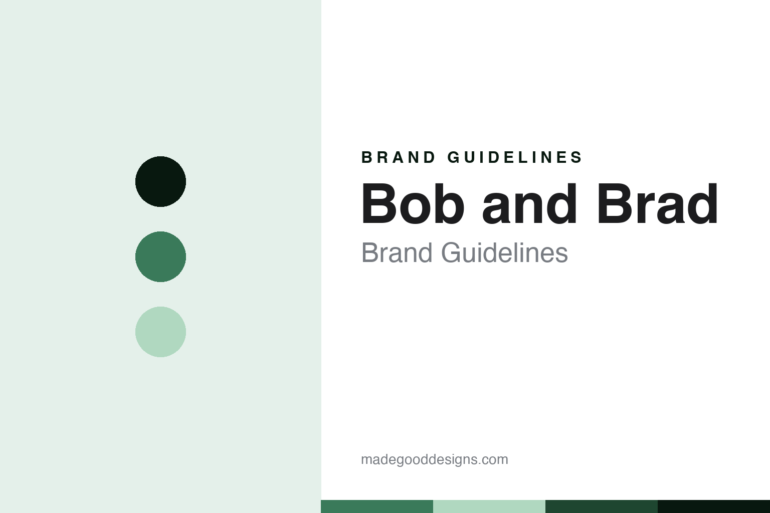
Bob and Brad Brand Guidelines
The physical therapists’ brand.
Aa
Two constants: a clinical-green palette and a therapy-sans register. Abstract homage — not a Bob and Brad product or mark; no massage gun, handle or logo is reproduced.
The physical therapists’ brand
Bob and Brad’s identity is the value recovery brand built on two American physical therapists’ hugely popular YouTube channel.
Bob and Brad brings the massage-gun round its creator node — a recovery brand built not on a lab or a factory but on two real physical therapists and their audience. Bob Schrupp and Brad Heineck are American physical therapists whose YouTube channel, started in 2011, made them, in their own tongue-in-cheek words, “the two most famous physical therapists on the internet.” Their brand makes and sells recovery products, and its answer to a round about who owns recovery tech is a creator-brand one: US physical therapists lending their name and expertise to a China-made product line.
Its identity is the physical therapists’ brand. The physical-therapist credibility, the YouTube origin and the value products are the story here. A brand, expert-led. The physical therapists’ brand.
(Honest notes, so the people, the ownership and one difficult fact are handled with care. The brand sells the products as its heroes — massage guns like the C2, Q2 Mini, D6 Pro and X6 PRO, plus air-compression massagers, eye massagers and TENS units — and we report its language as the brand’s own. On the people: Bob Schrupp and Brad Heineck are American licensed physical therapists whose channel, from 2011, built the audience the brand rests on, and their “most famous” tagline is a self-deprecating joke they flag as opinion. On a difficult and important fact: Bob Schrupp died in 2025, and the brand and channel continue under the name, so we never write as if both founders are currently active, and we state the name continues after his death. On ownership, which is genuinely murky: several related entities appear in the record, including the trademark holder and the product operation, and their exact relationships are not disclosed, so we do not assert a corporate chart. On the model: the physical therapists are creators and endorsers who lend their name and design input; the physical products are manufactured in China, so we do not imply the therapists manufacture anything. On positioning: it is creator- and expert-endorsed value recovery, affordable and strong on Amazon and Walmart. Its designs and the Bob and Brad name are IP we describe but do not reproduce; there is no official brand hex; these tones are an unofficial interpretation.)
Colour
Bob and Brad lives in a clinical green. Click a swatch to copy the hex.
Bob and Brad’s identity is expert-led, approachable and value — a clinical green, an ink, a pale sage, a deep pine, and a paper. The palette leans clinical green and pale sage: a calm, clinical register that nods to physical therapy and trustworthy advice rather than a loud logo colour. It signals the physical therapists’ brand — expert, approachable and affordable. The honest caveat: with no published brand hex, these values are an original, unofficial interpretation, not first-party colours.
The lesson is a clinical green signals an expert-led, approachable identity. Bob and Brad’s world is a physical therapist explaining a device on YouTube. For designers, it is a reminder that a calm clinical green and a soft pale sage can carry a maker brand — a trustworthy tone held as colour, not a product shot. Because these tones can fail as small text, keep type dark and let the colour live in the accents, palette and band. The takeaways: name the two PTs and the 2011 channel; note Bob Schrupp’s death and that the brand continues; keep the ownership murky rather than invent it; place manufacturing in China; and separate creators from the manufacturer.
Typography
The register is a therapy sans — expert, approachable, affordable.
Bob and Brad’s identity carries an expert, approachable, affordable spirit — a creator brand built on real clinical credibility, not a faceless label. A therapy sans captures the mood: clean, friendly and clear, the register of a physical therapist you trust. Set in a clinical-green palette, the therapy sans feels expert and approachable — exactly the personality Bob and Brad carries. It behaves like a made, practical thing rather than a loud logo, mirroring a percussion arc and a muscle-fiber wave. (Bob and Brad’s real products and the name are things we describe but do not reproduce, and the exact typeface is not ours to use.) Because it is not ours to use, the honest description is “a therapy-sans brand,” shown here in a stand-in. The type behaves like the brand: expert, approachable and affordable.
Aa
A therapy-sans brand — expert and approachable. (Specimen set in Archivo, a therapy-sans STAND-IN; NOT the Bob and Brad logo or any product.)
The massage gun
Bob and Brad stands for the physical therapists’ brand.
Bob and Brad brings the round its creator node. A clinical-green palette, a therapy sans and a 2011 channel make one thing — the physical therapists’ brand — the whole identity: expert-led, approachable and value. The physical-therapist credibility is the pitch, and the huge YouTube audience is the engine. The point is a recovery brand built on two real therapists, in a round about who owns recovery tech and where it is made.
Put to work, the identity is the brand told straight, the people credited and one hard fact handled with care. A maker in this spirit would name the two PTs and the 2011 channel, note Bob Schrupp’s death and that the brand continues, and keep the ownership murky rather than invent it. A reader in this spirit would keep the facts right: the brand sells value massage guns and recovery gear as its heroes; it is built on Bob Schrupp and Brad Heineck, American physical therapists, and their 2011 YouTube channel; Bob Schrupp died in 2025 and the brand continues; its corporate ownership is not clearly disclosed; and its products are made in China. Bob and Brad sits fifth in the round, after Achedaway. The honest editorial moves are to name the PTs, to handle the death with care, to keep the ownership murky, to place manufacturing in China, and to separate creators from the manufacturer.
For designers and brand-builders, Bob and Brad continues the massage gun: build a brand on real expert credibility — and handle the people behind it honestly. The lessons: turn genuine expertise and an audience into a product brand; separate creators and endorsers from the manufacturer; handle a founder’s death with care and accuracy; hedge an ownership structure you cannot confirm; place manufacturing honestly; and never reproduce a logo. It is also a reminder to stay precise: Bob and Brad’s identity is the value recovery brand built on two American physical therapists’ hugely popular YouTube channel — with the palette here an unofficial interpretation. The hook is that trust: two Minnesota physical therapists spent years explaining recovery on YouTube, earned millions of viewers, and turned that trust into affordable recovery products — a creator brand whose credential is clinical, whose hardware is made in China, and whose story now carries on after the death of one of its two namesakes. Read that way, Bob and Brad is less a factory brand than earned trust: expert, approachable, affordable. The lesson for a brand is that real expertise and honest handling reinforce each other, and treating the people with care keeps the story earned. Bob and Brad made the-physical-therapists’-brand the identity — proof that trust carries a round.
Explore & save
Keep Bob and Brad’s identity on hand — save it to a board in the Made Good inspiration library.
Bob and Brad identity set
Pin the clinical-green palette and the therapy-sans register to your own board.


