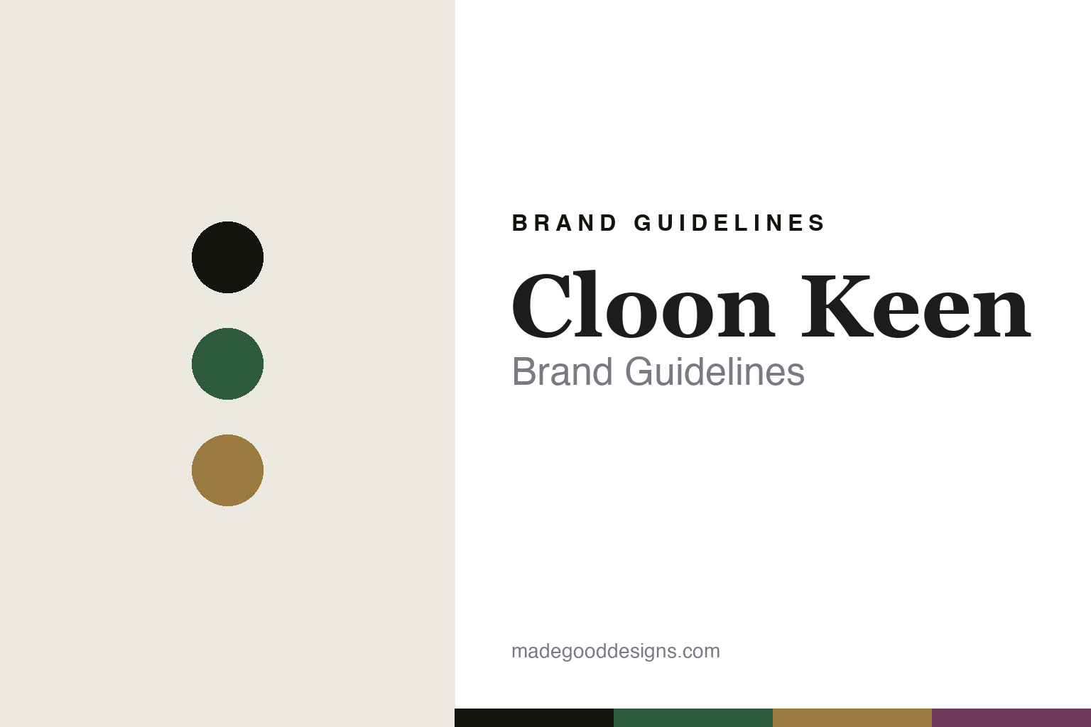
Cloon Keen Brand Guidelines
Luxury, in Irish.
Aa
Two constants: a green-and-gold palette and a literary serif register. Abstract homage — not the Cloon Keen packaging.
Luxury, in Irish
Cloon Keen makes Irish luxury perfume and candles.
Cloon Keen is a lesson in a national identity as identity. A founder-led Irish house based in Galway — its legal name still carries the original “Atelier” — it describes itself simply as “luxury Irish handmade perfumes,” with a candle craft alongside.
Its identity is Irish luxury: fine fragrance and hand-poured candles tied to Irish places, heritage and literature, in an understated, quiet-luxury register. The narratives are literary — the Antique Library candle, for instance, evokes the Long Room at Trinity College Dublin. And the design shows most clearly in the naming: heavy use of Irish-language and Irish-place names — Báinín (homespun wool), Lá Bealtaine (May Day), Róisín Dubh (little black rose), Énbarr and Étaín from Irish myth, Spanish Arch for the Galway landmark — beside a few refined names like Castaña and Sybarite.
(Honest notes: the house is founder-led and reads as independent, but we don’t assert specific founder names or a founding year we couldn’t verify. “Atelier” survives in the corporate name — the consumer brand is a shortening, not a full rename. There’s no official brand hex, so these tones are an unofficial interpretation. This is design commentary and does not promote fragrance use.)
Colour
Cloon Keen lives in a green-and-gold palette. Click a swatch to copy the hex.
Cloon Keen’s identity is Irish, refined and literary — an Irish green, an ink, a gold, a heather, and a cream. The palette pairs an Irish green with a gold — the register of an Irish landscape and quiet luxury. It signals nation and craft rather than novelty. The honest caveat: with no published brand hex, these tones are an original, unofficial interpretation, not first-party values.
The lesson is an Irish green with a gold signals an Irish-luxury brand. Cloon Keen’s world is Ireland in a refined bottle. For designers, it is a reminder that a deep, land-derived palette plus gold reads as luxury and heritage — right for a house built on Irish identity. The takeaways: source the palette from the place (green, gold, heather); name in the language and landscape (Irish-language names); keep it understated; and treat any single hex as unofficial.
Typography
The register is a literary serif — refined, Irish, quiet.
Cloon Keen’s identity carries a refined, Irish, quiet spirit — a literary narrative and an Irish name. A literary serif captures the mood: it is elegant and bookish, the register of Irish letters. Set in a green-and-gold palette, the literary serif feels refined and Irish — exactly the personality Cloon Keen carries. It is quiet rather than loud, mirroring understated luxury. (Cloon Keen’s real bottles and wordmark are works we describe but do not reproduce, and the exact typeface is not ours to use.) Because it is not ours to use, the honest description is “a literary serif spirit,” shown here in a stand-in. The type behaves like the brand: refined, Irish and quiet.
Aa
A literary serif spirit — refined and Irish. (Specimen set in Cormorant Garamond, a delicate literary serif STAND-IN; NOT the Cloon Keen packaging.)
An identity as identity
Cloon Keen stands for Irish luxury.
Cloon Keen is a lesson in making a national identity the brand. A green-and-gold palette, a literary serif and Irish-language names make Irish luxury the whole brand — refined, Irish, quiet. The identity is the differentiator. The differentiator is an Irish-luxury, literary identity.
For designers and brand-builders, Cloon Keen offers a clear takeaway: build the brand on a place and its language. The lessons: root the palette in the landscape; name in the language and heritage (Irish-language, Irish places); keep the luxury quiet; and be honest about the history. It is also a reminder to stay accurate: it’s a Galway house whose corporate name keeps “Atelier,” and the palette here is an unofficial interpretation. Cloon Keen made Irish identity the brand — proof that a place and its language can be the difference.
Explore & save
Keep Cloon Keen’s identity on hand — save it to a board in the Made Good inspiration library.
Cloon Keen identity set
Pin the green-and-gold palette and the literary-serif register to your own board.


