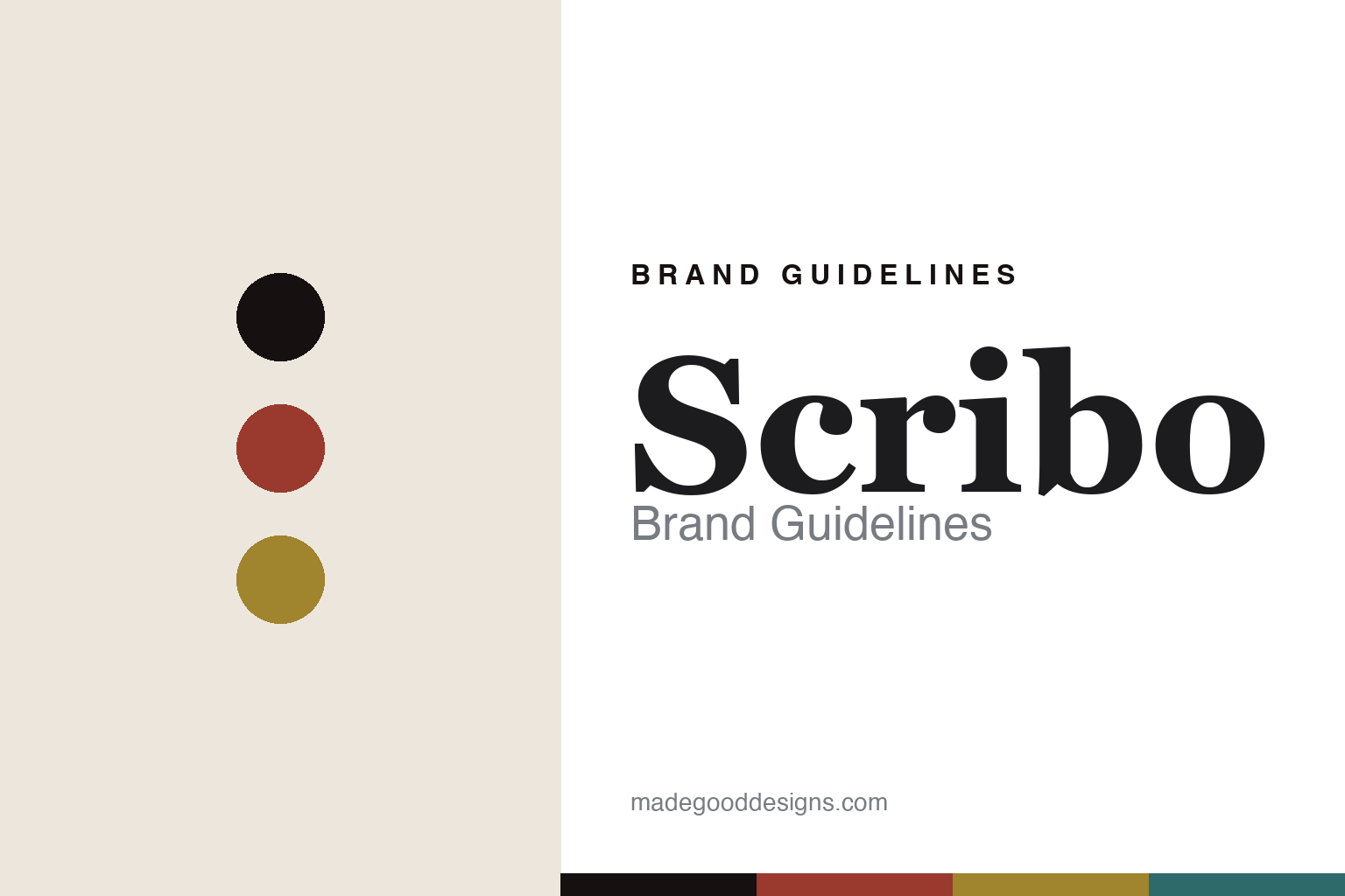
Scribo Brand Guidelines
The engraved feather.
Aa
Two constants: a red-and-amber palette and a scholar serif register. Abstract homage — not the Scribo pen or packaging.
The engraved feather
Scribo builds Bologna’s writing tradition into a feather.
Scribo is a lesson in a motif and a lineage as identity. Based in Bologna — its name, Scrittura Bolognese, means “Bolognese writing” — it makes handmade, limited-run Italian pens, and it is widely reported to have been founded around 2017 by former craftspeople of the historic Omas house.
Its identity has two threads. The engraved feather — “one of Scribo’s signature details,” a quill motif that ties to its flagship Piuma (Italian for feather) and to the very idea of writing. And the Omas-heritage celluloid: Scribo is celebrated for working celluloid (from Omas stock and expertise) and for its custom nib options, including the flexible gold nibs it’s known for. Its models nod to Bologna — the Feel, the Piuma, and La Dotta (“the learned,” one of Bologna’s traditional epithets).
(Honest notes: the Omas lineage is the heart of Scribo’s story but is widely reported rather than stated on the brand’s own pages, so we present it as reported. Omas itself — a Bologna house founded in 1925 — was liquidated in 2015–16, and shouldn’t be confused with the separate 2023 revival of the Omas name. The famous gold flex nibs are reported. There’s no official brand hex, so these tones are an unofficial interpretation. This is design commentary and does not promote any product.)
Colour
Scribo lives in a red-and-amber palette. Click a swatch to copy the hex.
Scribo’s identity is scholarly, Italian and crafted — a Bologna red, an ink, a celluloid amber, a feather teal, and a cream. The palette pairs a Bologna red with a celluloid amber — the register of Bologna’s red rooftops and vintage celluloid. It signals writing and craft rather than gloss. The honest caveat: with no published brand hex, these tones are an original, unofficial interpretation, not first-party values.
The lesson is a red with a celluloid amber signals a scholarly, Bolognese brand. Scribo’s world is a celluloid pen marked by a feather. For designers, it is a reminder that a warm, place-and-material palette reads as scholarly and crafted — right for a house named for writing. The takeaways: own a motif (the feather); work a heritage material (celluloid); name for the city (La Dotta); and treat any single hex as unofficial.
Typography
The register is a scholar serif — literary, Italian, crafted.
Scribo’s identity carries a literary, Italian, crafted spirit — a quill motif and a scholarly city. A classic scholar serif captures the mood: it is bookish and warm, the register of Bologna’s learning. Set in a red-and-amber palette, the scholar serif feels literary and Italian — exactly the personality Scribo carries. It is crafted rather than slick, mirroring a celluloid pen. (Scribo’s real pens, feather motif and wordmark are works we describe but do not reproduce, and the exact typeface is not ours to use.) Because it is not ours to use, the honest description is “a scholar serif spirit,” shown here in a stand-in. The type behaves like the brand: literary, Italian and crafted.
Aa
A scholar serif spirit — literary and Italian. (Specimen set in EB Garamond, a classic old-style serif STAND-IN; NOT the Scribo packaging.)
A motif and a lineage
Scribo stands for the feather and the Omas craft.
Scribo is a lesson in making a motif and a lineage the identity. A red-and-amber palette, a scholar serif and the engraved feather make a motif and a craft lineage the whole brand — literary, Italian, crafted. The feather is the differentiator. The differentiator is a writing-motif, Omas-heritage identity.
For designers and brand-builders, Scribo offers a clear takeaway: carry a heritage forward with a motif. The lessons: own a symbol (the feather); work a heritage material (celluloid); name for the place (La Dotta); and be honest about the lineage. It is also a reminder to stay accurate: the Omas connection is reported, Omas was liquidated in 2015–16, and the palette here is an unofficial interpretation. Scribo made a feather the brand — proof that a motif and a lineage can be the difference.
Explore & save
Keep Scribo’s identity on hand — save it to a board in the Made Good inspiration library.
Scribo identity set
Pin the red-and-amber palette and the scholar-serif register to your own board.


