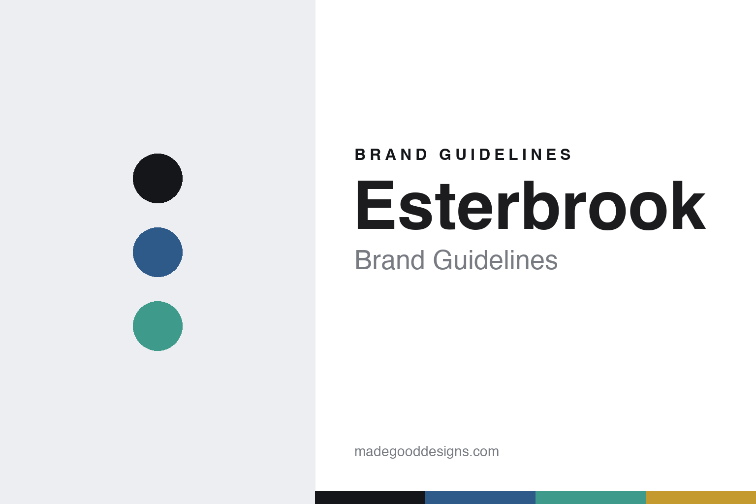
Esterbrook Brand Guidelines
The interchangeable nib.
Aa
Two constants: a blue-and-sea-glass palette and a friendly sans register. Abstract homage — not the Esterbrook pen or packaging.
The interchangeable nib
Esterbrook democratized writing with swappable steel nibs.
Esterbrook is a lesson in a democratic idea as identity. The original company was founded in 1858 in Camden, New Jersey by Richard Esterbrook, a Cornish Quaker immigrant, as a maker of steel dip-pen nibs — and it became the largest US pen manufacturer, turning out hundreds of thousands of nibs a day.
Its identity is that democratization of writing: affordable, mass-produced steel nibs, and the famous interchangeable screw-in nib units that let owners swap points at will. The revived brand carries that forward: after the original closed around 1971, the name was acquired (Harpen Brand Holdings in 2014, then Kenro Industries in 2018), and today’s flagship — the Estie — pairs colourful acrylics (Nouveau Bleu, Sea Glass, Tortoise, Honeycomb) with a nod to that interchangeable-nib heritage.
(Honest notes: keep the two eras distinct — the original 1858 Camden steel-nib company (which made fountain pens only from around 1920) is a separate business from the modern brand revived under Kenro Industries in 2018 (via Harpen in 2014). So it isn’t a “fountain-pen maker since 1858.” The interchangeable-nib details and the MV adapter are widely reported. There’s no official brand hex, so these tones are an unofficial interpretation. This is design commentary and does not promote any product.)
Colour
Esterbrook lives in a blue-and-sea-glass palette. Click a swatch to copy the hex.
Esterbrook’s identity is colourful, American and approachable — an Estie blue, an ink, a sea glass, a honeycomb, and a paper. The palette pairs an Estie blue with a sea glass — the register of colourful modern acrylic. It signals friendliness and colour rather than austerity. The honest caveat: with no published brand hex, these tones are an original, unofficial interpretation, not first-party values.
The lesson is an Estie blue with a sea glass signals a colourful, approachable brand. Esterbrook’s world is a bright acrylic pen with a democratic heritage. For designers, it is a reminder that a fresh, colourful palette reads as approachable and modern — right for a brand built on making writing accessible. The takeaways: keep the palette bright and colourful (blue, sea glass, honeycomb); honour the democratic heritage (interchangeable nibs); make the acrylics the draw; and treat any single hex as unofficial.
Typography
The register is a friendly sans — approachable, modern, warm.
Esterbrook’s identity carries an approachable, modern, warm spirit — a colourful pen and a democratic idea. A friendly geometric sans captures the mood: it is warm and accessible, the register of an approachable brand. Set in a blue-and-sea-glass palette, the friendly sans feels approachable and modern — exactly the personality Esterbrook carries. It is warm rather than austere, mirroring a colourful acrylic. (Esterbrook’s real pens and wordmark are works we describe but do not reproduce, and the exact typeface is not ours to use.) Because it is not ours to use, the honest description is “a friendly sans spirit,” shown here in a stand-in. The type behaves like the brand: approachable, modern and warm.
Aa
A friendly sans spirit — approachable and modern. (Specimen set in Poppins, a friendly geometric sans STAND-IN; NOT the Esterbrook packaging.)
A democratic idea as identity
Esterbrook stands for accessible, swappable writing.
Esterbrook is a lesson in making a democratic idea the identity. A blue-and-sea-glass palette, a friendly sans and the interchangeable nib make accessibility the whole brand — approachable, modern, warm. The idea is the differentiator. The differentiator is a democratic, interchangeable-nib identity.
For designers and brand-builders, Esterbrook offers a clear takeaway: build the brand on an accessible idea. The lessons: make the product accessible (affordable steel nibs); let owners customise it (swappable nibs); make the modern range colourful (the Estie); and be honest about the eras. It is also a reminder to stay accurate: the 1858 steel-nib original and the 2018 Kenro revival are distinct, and the palette here is an unofficial interpretation. Esterbrook made a democratic idea the brand — proof that accessibility can be the difference.
Explore & save
Keep Esterbrook’s identity on hand — save it to a board in the Made Good inspiration library.
Esterbrook identity set
Pin the blue-and-sea-glass palette and the friendly-sans register to your own board.


