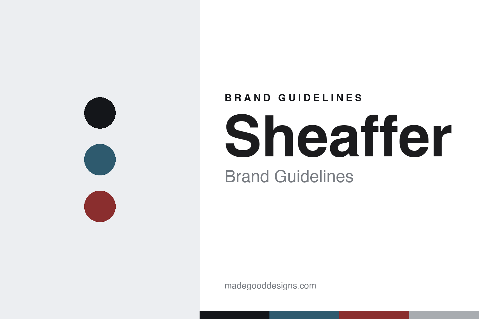
Sheaffer Brand Guidelines
The white dot.
Aa
Two constants: a petrol-and-red palette and an engineered sans register. Abstract homage — not the Sheaffer pen or packaging.
The white dot
Sheaffer built its identity on engineering and a small white dot.
Sheaffer is a lesson in engineering plus a mark as identity. Founded by Walter A. Sheaffer in Fort Madison, Iowa — production from 1912, incorporated 1913, on his 1908 lever-filling patent — it became one of the great American pen houses.
Its identity has two threads. The engineering: the founding lever filler, the famous Snorkel (a retractable ink tube that extends beneath the nib so the pen fills without inking it), and the distinctive inlaid nib — a nib set flush into the section, introduced on the 1959 “Pen For Men” (PFM) and used on high-end Sheaffers ever since. And the mark: the White Dot on the cap crown, Sheaffer’s badge of quality.
(Honest notes: founding is best given as 1912 (production) / 1913 (incorporation). The ownership chain has changed hands — BIC (1997), then A.T. Cross (2014), and since 2022 the brand is owned by William Penn Pvt. Ltd. of India — so Cross is not the current owner. The Snorkel’s exact 1952 date and the White Dot’s precise history are widely reported rather than confirmed here. There’s no official brand hex, so these tones are an unofficial interpretation. This is design commentary and does not promote any product.)
Colour
Sheaffer lives in a petrol-and-red palette. Click a swatch to copy the hex.
Sheaffer’s identity is engineered, American and precise — a petrol, an ink, a Sheaffer red, a white-dot silver, and a paper. The palette pairs a petrol with a red — the register of mid-century American engineering. It signals reliability and quality rather than flash. The honest caveat: with no published brand hex, these tones are an original, unofficial interpretation, not first-party values.
The lesson is a petrol with a red signals an engineered, heritage brand. Sheaffer’s world is a well-made pen marked by a white dot. For designers, it is a reminder that a deep, engineered palette reads as dependable and classic — right for a house built on mechanisms and a quality mark. The takeaways: compete on engineering (the Snorkel, the inlaid nib); own a quality mark (the White Dot); keep the palette classic; and treat any single hex as unofficial.
Typography
The register is an engineered sans — precise, mid-century, dependable.
Sheaffer’s identity carries a precise, mid-century, dependable spirit — a clever mechanism and a quality mark. A technical, engineered sans captures the mood: it is clean and mechanical, the register of American engineering. Set in a petrol-and-red palette, the engineered sans feels precise and mid-century — exactly the personality Sheaffer carries. It is dependable rather than ornate, mirroring a well-made pen. (Sheaffer’s real pens and White Dot mark are works we describe but do not reproduce, and the exact typeface is not ours to use.) Because it is not ours to use, the honest description is “an engineered sans spirit,” shown here in a stand-in. The type behaves like the brand: precise, mid-century and dependable.
Aa
An engineered sans spirit — precise and mid-century. (Specimen set in Space Grotesk, a technical grotesque STAND-IN; NOT the Sheaffer packaging.)
Engineering plus a mark
Sheaffer stands for engineering and the White Dot.
Sheaffer is a lesson in making engineering plus a mark the identity. A petrol-and-red palette, an engineered sans and the White Dot make engineering and a quality mark the whole brand — precise, mid-century, dependable. The mark is the differentiator. The differentiator is an engineered, White-Dot identity.
For designers and brand-builders, Sheaffer offers a clear takeaway: back the engineering with a visible mark of quality. The lessons: solve real problems (the Snorkel, the inlaid nib); adopt a badge (the White Dot); keep the palette classic; and be honest about ownership. It is also a reminder to stay accurate: founded 1912–1913, now owned by William Penn of India (not Cross), and the palette here is an unofficial interpretation. Sheaffer made engineering plus a mark the brand — proof that a badge can be the difference.
Explore & save
Keep Sheaffer’s identity on hand — save it to a board in the Made Good inspiration library.
Sheaffer identity set
Pin the petrol-and-red palette and the engineered-sans register to your own board.


