What Font Does Fall Guys Use?
The fall guys font is all about squish, the wordmark looks as soft and bouncy as the little beans tumbling through its obstacle courses. Mediatonic built the logo as bespoke lettering rather than a single installable typeface, so there is no “Fall Guys.ttf” to grab. This guide unpacks the logo, the in-game UI type, and the closest free rounded fonts. For more identities decoded the same way, see our famous brand fonts hub, and compare it with a fellow casual-game sibling in our Clash of Clans font guide.
What font is the Fall Guys logo?
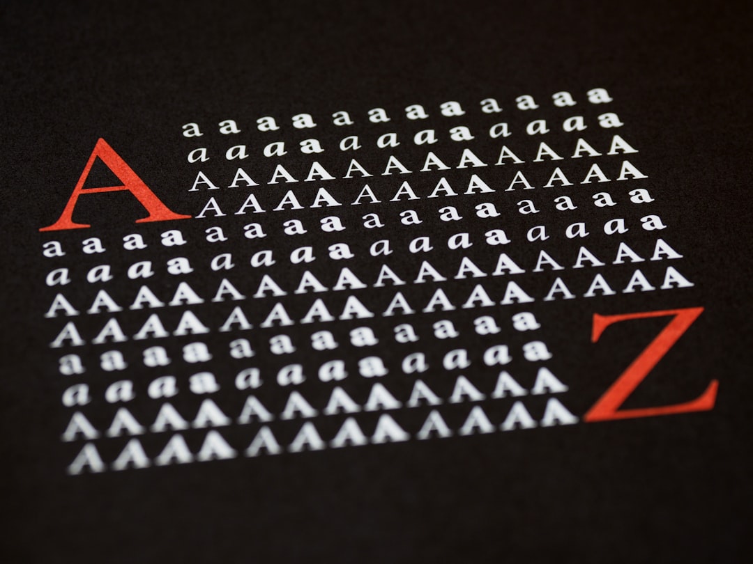
The Fall Guys logo is a custom fat rounded display. Every letter is plump and swollen with fully rounded terminals, almost no straight edges, and a soft, inflated quality that makes the word look like it is made of jelly beans or gummy candy. The letters bounce slightly along the baseline and often carry a glossy highlight or soft outline, reinforcing the goofy, joyful tone of the game. Because that puffed-up roundness and gloss are bespoke, no off-the-shelf font matches it exactly, but a heavy rounded display gets you very close to the squishy character.
What typeface does Fall Guys use in-game (UI)?
In the interface, the type stays playful but turns more readable, leaning on a bold rounded sans-serif for menus, timers, player counts and round names. Mediatonic has not published an official UI font name, so treat this as an informed observation. The approach keeps the fun, friendly personality consistent, rounded shapes everywhere, while ensuring that fast-moving information like the countdown timer and qualification status reads instantly during chaotic multiplayer rounds. Heavy weights and clear contrast help those elements stay legible over bright, busy game-show sets.
Free fonts that look like the Fall Guys font
You cannot license the original bouncy wordmark, but free rounded fonts get you close. Start with the fattest rounded display you can find, then add a soft outline and a glossy highlight to sell the jelly-bean effect.
| Use case | Fall Guys uses | Free alternative |
|---|---|---|
| Logo / title | Custom fat rounded jelly-bean display | Fredoka (Bold), Baloo 2, or Sniglet |
| In-game UI | Bold rounded sans (unconfirmed) | Nunito (ExtraBold) or Varela Round |
| Body / captions | Soft, readable sans | Quicksand or Comfortaa |
For more soft, balloon-like picks to pair with these, our best bubble fonts roundup is the perfect companion.
Why does Fall Guys use this kind of type?
The plump rounded lettering is a direct echo of the game’s whole identity. Fall Guys is a colorful, slapstick battle royale where wobbly beans stumble through inflatable obstacle courses, so a soft, bouncy, jelly-bean wordmark sells that joyful chaos instantly. Rounded letters feel friendly, harmless and fun, exactly the low-stakes, anyone-can-play vibe the game wants, and the squishy forms visually rhyme with the bean characters themselves. Practically, fat rounded lettering stays bold and recognizable when shrunk to an app icon, and it pops cheerfully in store thumbnails against bright backgrounds.
Can I use the Fall Guys font for my own project?
You can build a similar squishy, rounded look with free, licensed fonts, but you cannot reproduce the actual Fall Guys wordmark. The Fall Guys name and logo are trademarks of Mediatonic and Epic Games, so copying the styled title, or making something confusingly similar for a product, is off-limits even if you redraw it yourself. A bouncy rounded headline for a fan project, a party invite or a mood board is fine; anything commercial needs cleared fonts. Read our font licensing guide first and confirm each free font allows your intended use.
Frequently Asked Questions
Is there a free Fall Guys font download?
No official Fall Guys font is available to download, because the logo is custom rounded lettering rather than a released typeface. Files claiming to be “the Fall Guys font” are lookalikes or fan recreations. Use a properly licensed rounded font like Fredoka or Sniglet and add a gloss and outline yourself for a safe, close match.
What font is closest to the Fall Guys logo?
Fredoka in its boldest weight is the closest free match for the plump, rounded letterforms, with Baloo 2 and Sniglet as strong alternatives. None include the jelly-bean gloss out of the box, so add a soft outline, a highlight and a slight bounce in your design tool to complete the squishy effect.
Can I make Fall Guys style text online?
Yes. A “fall guys font generator” usually just applies a fat rounded font with a gloss and outline. You can do the same in Canva or Photopea by setting Fredoka or Baloo, adding a thick soft outline, a glossy highlight stripe and a gentle baseline bounce. The rounded font plus those effects produces the jelly-bean look.
Does the Fall Guys logo font change between seasons?
The core “Fall Guys” wordmark stays consistent, but each season often adds themed color treatments, textures or subtitles to match the update, like spooky or sci-fi styling. The plump rounded base lettering remains the constant brand anchor so the game stays instantly recognizable across every season.
What colors match the Fall Guys font?
The brand loves bright, candy-like colors, pinks, oranges, blues, yellows and greens, often as cheerful gradients with a glossy highlight. To match the logo, keep fills bright and saturated, add a soft white or dark outline for separation, and place the lettering over a colorful, playful background to preserve the fun party-game mood.