What Font Does Guinness Use?
The guinness font is one of brewing’s most recognizable wordmarks: solid serif capitals, the harp emblem, and a confidence built over more than 250 years. Unlike the slanted luxury of Johnnie Walker, Guinness leans on stout, grounded letterforms that mirror the drink itself. Below we break down the lettering and list free serif alternatives. For more, see our famous brand fonts hub.
What font is the Guinness logo?
The “GUINNESS” wordmark is custom serif lettering set in bold capitals, with sturdy strokes, defined serifs and even, confident spacing. Paired with the trademark harp, it forms a lockup that reads as solid and dependable. The forms are not a plain retail serif; they are bespoke, trademarked lettering refined over the brand’s long history. The weight and the squared-off serifs give the name a grounded, almost architectural presence on the label.
What gives the wordmark its presence is heft. The strokes are thick and consistent, the serifs are substantial rather than delicate, and the capitals stand evenly spaced like columns. There is no slant, no script and no ornament, the lettering simply plants itself and holds firm. That solidity is a deliberate echo of the stout: dark, dense and substantial. Even rendered in a single color, the wordmark feels heavy on the page, which is exactly the impression a serious, centuries-old brewer wants to make.
What is Guinness’s brand typeface?
Across packaging, signage and campaigns, Guinness supports its serif wordmark with classic serifs and clean supporting type that keep the heritage, no-nonsense tone consistent. The exact families have shifted across rebrands and differ by market, so any single named font should be treated as unconfirmed. The reliable constant is the register: bold, traditional and serif-led, the visual equivalent of the stout’s dark, substantial character.
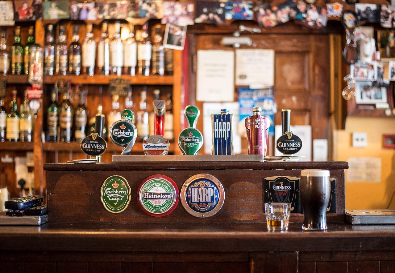
The harp does a lot of the heavy lifting alongside the type. As one of the oldest registered trademarks of its kind, it lets Guinness rely on a relatively simple bold serif wordmark and still feel instantly distinctive. The two elements share the same weight and gravity, so the lockup reads as one confident mark rather than a logo and a name bolted together. That harmony between emblem and lettering is a big part of why the identity has stayed recognizable for generations.
Free fonts that look like the Guinness font
You cannot reuse the trademarked wordmark or harp, but the sturdy bold-serif feel is easy to approximate with free, open-license fonts. Aim for weight and solid serifs rather than delicate, high-contrast forms.
| Use case | Guinness uses | Free alternative |
|---|---|---|
| Logo / wordmark | Custom bold serif capitals | Roboto Slab (bold) |
| Headlines | Sturdy traditional serif | Bitter or a classic bold serif |
| Body / label | Readable serif / clean sans | EB Garamond or Inter |
Why does Guinness use this kind of type?
The bold serif is a perfect match for the product. Heavy, grounded letterforms mirror the dark, substantial stout and signal reliability and heritage in a single glance. Where lighter brands chase trends, Guinness uses solid, traditional type to say that it is established, trusted and unchanged. Paired with the centuries-old harp, the typography becomes shorthand for Irish brewing history, an asset that newer competitors simply cannot replicate.
There is a sensory logic to it as well. Good typography can suggest a product’s texture, and a dense bold serif feels like it weighs something, which aligns neatly with a stout famous for its body and creamy head. A thin, airy font would contradict everything the drink stands for. By matching the visual weight of the type to the physical weight of the beer, Guinness creates a quiet consistency between what you see and what you taste, the kind of detail that builds deep brand loyalty.
Can I use the Guinness font for my own project?
No. The GUINNESS wordmark and the harp emblem are protected trademarks, so copying them for your own product or branding is not permitted. You can, however, borrow the look: a bold serif or slab serif in confident capitals. Roboto Slab or a classic bold serif will get you close. Before any commercial release, confirm the font’s terms in our font licensing guide.
Frequently Asked Questions
Is there an official Guinness font to download?
No. The wordmark is custom serif lettering created for the brand and never sold as a retail typeface. Any “Guinness font” download online is a fan imitation, and reproducing the trademarked wordmark or harp for commercial work carries legal risk. Use licensed lookalikes instead.
What kind of serif is the Guinness logo?
It is a bold serif in capitals with sturdy strokes, defined serifs and even spacing, closer to a substantial slab or traditional bold serif than a delicate, high-contrast face. The weight gives the wordmark a grounded, architectural feel that suits the dark stout.
What free font is closest to Guinness?
Roboto Slab in bold is a strong free match for the wordmark’s sturdy serif capitals. For supporting copy, a classic bold serif like Bitter or a readable serif such as EB Garamond rounds out a heritage look without copying the trademarked design.
Why does Guinness use a bold serif instead of a sans?
The heavy serif mirrors the dark, substantial stout and signals tradition, reliability and Irish brewing heritage. A solid serif feels established and trustworthy, reinforcing that Guinness is a centuries-old brand rather than a modern newcomer.
Can I use free serif fonts to mimic Guinness commercially?
Yes, as long as you avoid copying the trademarked wordmark and harp. Use open-license serifs like Roboto Slab or Bitter, design your own distinct lettering, and confirm each font allows commercial embedding before you publish or sell anything.