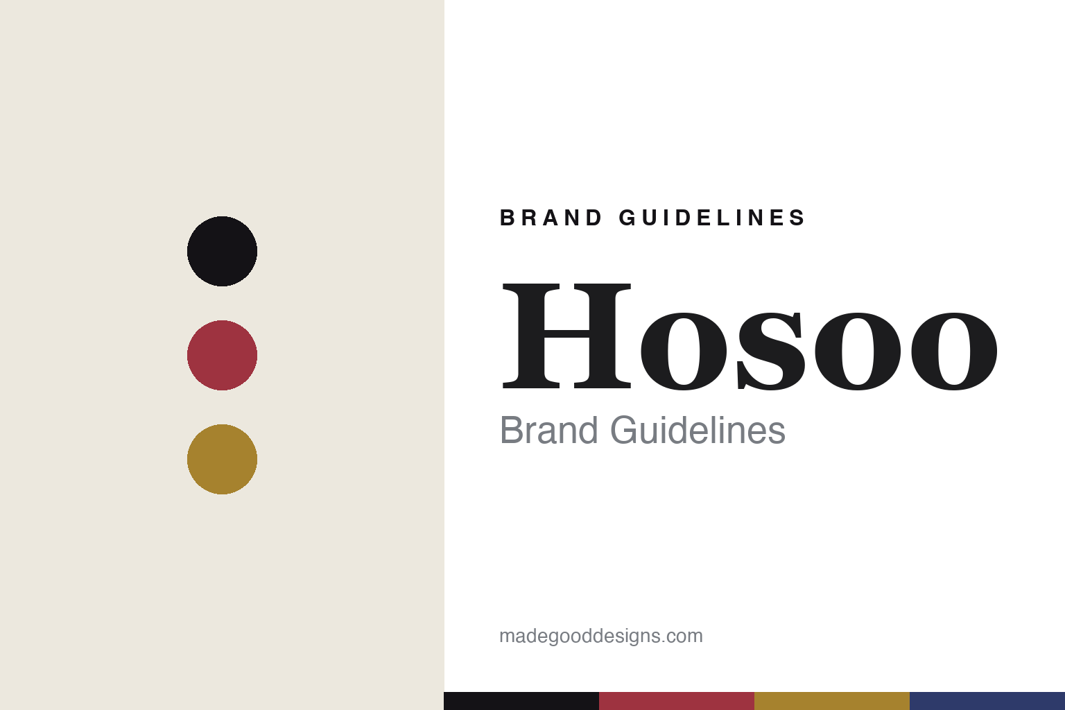
Hosoo Brand Guidelines
The Nishijin weave.
Aa
Two constants: a crimson-and-gold palette and a Nishijin serif register. Abstract homage — not the Hosoo textiles, Nishijin patterns or packaging.
The Nishijin weave
Hosoo weaves a 300-year craft anew.
Hosoo is a lesson in heritage, rewoven. Founded in 1688 in the Nishijin district of Kyoto, Hosoo is a weaver rooted in Nishijin-ori — the brocade tradition of the kimono and obi — carried, it says, across twelve generations.
Its identity is the Nishijin weave. Hosoo takes the gilded, intricate brocade of Kyoto and extends it into contemporary interiors, fashion, art and architecture — famously developing, in 2010, a loom able to weave Nishijin cloth about 150cm wide, where the traditional obi loom wove only around 32cm. An ancient weave, made wide enough for a wall. Craft, re-engineered for now.
(Honest notes: Hosoo dates its founding to 1688 in Nishijin, Kyoto — we report that as the company’s own account rather than an independently proven date, and we keep the company’s 300-plus-year age separate from the broader, roughly 1,200-year Nishijin weaving tradition. It is a family business, reportedly in its twelfth generation, led by Masataka Hosoo as president. Its signature contemporary move is the 2010 wide-format loom. It has supplied or collaborated with luxury houses and hotels — Chanel, Dior (via architect Peter Marino), Louis Vuitton and Ritz-Carlton, plus a 2023 LVMH Métiers d’Art agreement — which we frame as “has supplied / collaborated with,” attributing specific store counts to the press. It is made in Kyoto. There’s no official brand hex, and we reproduce no actual Nishijin pattern (a protected regional craft) — these tones are an unofficial interpretation. This is design commentary and does not promote any product.)
Colour
Hosoo lives in a crimson-and-gold palette. Click a swatch to copy the hex.
Hosoo’s identity is gilded, intricate and Japanese — a crimson, a sumi ink, a gold, an indigo, and a chalk. The palette pairs a crimson with a gold — the register of Nishijin brocade. It signals craft and luxury rather than novelty. The honest caveat: with no published brand hex, these tones are an original, unofficial interpretation, not first-party values.
The lesson is a crimson with a gold signals a brocade house. Hosoo’s world is a gilded, woven cloth. For designers, it is a reminder that a centuries-old weave — re-engineered for new scale — can be the whole identity. Because loud hues can fail as small text, keep type dark and let the colour live in the accents, palette and band. The takeaways: honour the craft; re-engineer it; scale it thoughtfully; and treat any single hex as unofficial.
Typography
The register is a Nishijin serif — gilded, intricate, refined.
Hosoo’s identity carries a gilded, intricate, refined spirit — a woven, luxurious cloth. A high-contrast serif captures the mood: it is elegant and precise, the register of a heritage weaver. Set in a crimson-and-gold palette, the Nishijin serif feels gilded and intricate — exactly the personality Hosoo carries. It is refined rather than plain, mirroring brocade. (Hosoo’s real textiles, Nishijin patterns and wordmark are works we describe but do not reproduce — Nishijin is a protected craft — and the exact typeface is not ours to use.) Because it is not ours to use, the honest description is “a Nishijin serif spirit,” shown here in a stand-in. The type behaves like the brand: gilded, intricate and refined.
Aa
A Nishijin serif spirit — gilded and intricate. (Specimen set in Bodoni Moda, a high-contrast serif STAND-IN; NOT the Hosoo textiles or Nishijin patterns.)
Heritage, rewoven
Hosoo stands for the Nishijin weave.
Hosoo is a lesson in reweaving a heritage. A crimson-and-gold palette, a Nishijin serif and a gilded cloth make the ancient weave the whole brand — gilded, intricate, Japanese. The weave is the differentiator. The differentiator is a centuries-old brocade, re-engineered to a new scale.
For designers and brand-builders, Hosoo offers a clear takeaway: re-engineer a tradition. The lessons: honour the craft; re-engineer it; scale it thoughtfully; and be honest about the story. It is also a reminder to stay accurate: it dates its founding to 1688 in Nishijin, Kyoto, it is a family business reportedly in its twelfth generation, and its 2010 wide loom opened the craft to interiors — the palette here is an unofficial interpretation. Hosoo rewove the Nishijin brocade for now — proof that a heritage weave can be the difference.
In application, heritage and scale meet. The crimson-and-gold palette signals brocade, the sumi ink carries the text, the Nishijin serif sets a refined headline, and the weave is evoked as gilded texture — never a reproduced Nishijin pattern. A designer working in this spirit would treat richness as the material and restraint as the frame: one intricate, luminous surface, generous margins, type set precisely so the craft reads as luxury rather than clutter. The lesson Hosoo teaches is that a centuries-old weave can become contemporary when it is re-engineered — most literally in its wider loom — without losing what made it worth keeping. As you borrow the approach, keep the record straight: Hosoo dates its founding to 1688 in the Nishijin district of Kyoto and is reportedly in its twelfth generation; its 2010 wide-format loom opened the craft to interiors; and its luxury collaborations are best framed as having supplied rather than stated with figures — while the palette here is an unofficial interpretation rather than first-party values.
Explore & save
Keep Hosoo’s identity on hand — save it to a board in the Made Good inspiration library.
Hosoo identity set
Pin the crimson-and-gold palette and the Nishijin-serif register to your own board.


