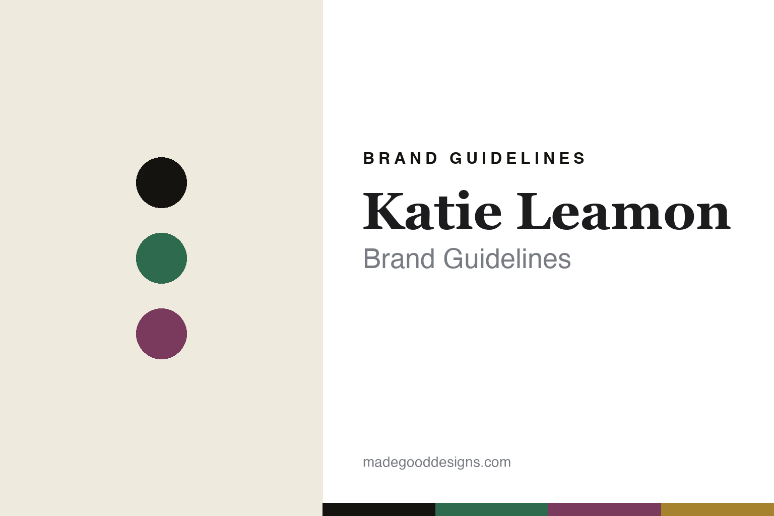
Katie Leamon Brand Guidelines
The hand-printed card.
Aa
Two constants: an emerald-and-gold palette and a luxury serif register. Abstract homage — not the Katie Leamon cards or packaging.
The hand-printed card
Katie Leamon prints luxury by hand.
Katie Leamon is a lesson in craft as luxury. Founded around 2010–11 in North London by Katie Leamon, it is a design-led British stationery brand whose signature is the individually hand-printed greeting card.
Its identity is the hand-printed card. Katie Leamon makes cards printed by hand from the studio’s own illustrations, alongside notebooks, diaries, writing sets and gift wrap, in a contemporary, luxury register — colour, foil and tactile finish over cheap gloss. Luxury built on visible hand-craft. A card as a small, made object.
(Honest notes: Katie Leamon was founded by Katie Leamon around 2010, launching in Spring 2011 — so we hedge the year. It is a design-led, luxury British brand whose signature is the hand-printed card (printed with stamps from the studio’s own illustrations). It is made in England, at a family-run production studio in Essex — “made in England” is the brand’s claim, and its materials are “responsibly sourced” rather than necessarily UK-sourced, so we don’t overstate that. It is independent and family-run (Katie with her partner, Ruairi), with a wholesale arm, and stocked by Liberty, Harrods and Fortnum & Mason. We don’t call Katie a “graphic-design graduate” (her background is reported as textile design), and we don’t assert museum collaborations. There’s no official brand hex, and we reproduce no card artwork or logo — these tones are an unofficial interpretation. This is design commentary and does not promote any product.)
Colour
Katie Leamon lives in an emerald-and-gold palette. Click a swatch to copy the hex.
Katie Leamon’s identity is luxurious, crafted and British — an emerald, an ink, a plum, a gold, and a cream. The palette pairs an emerald with a gold — the register of hand-printed luxury stationery. It signals craft and finish rather than novelty. The honest caveat: with no published brand hex, these tones are an original, unofficial interpretation, not first-party values.
The lesson is an emerald with a gold signals a luxury stationery house. Katie Leamon’s world is a rich, made card. For designers, it is a reminder that visible hand-craft — printing each card by hand, finishing it with foil and colour — can be the whole luxury proposition. Because a mid emerald can fail as small text, keep type dark and let the colour live in the accents, palette and band. The takeaways: print by hand; finish with care; make in place; and treat any single hex as unofficial.
Typography
The register is a luxury serif — elegant, tactile, British.
Katie Leamon’s identity carries a elegant, tactile, British spirit — a hand-printed, finished card. A high-contrast fashion serif captures the mood: it is refined and luxurious, the register of a design-led stationer. Set in an emerald-and-gold palette, the luxury serif feels elegant and tactile — exactly the personality Katie Leamon carries. It is polished rather than plain, mirroring a foiled card. (Katie Leamon’s real cards, illustrations and wordmark are works we describe but do not reproduce, and the exact typeface is not ours to use.) Because it is not ours to use, the honest description is “a luxury serif spirit,” shown here in a stand-in. The type behaves like the brand: elegant, tactile and British.
Aa
A luxury serif spirit — elegant and tactile. (Specimen set in Prata, a high-contrast fashion serif STAND-IN; NOT the Katie Leamon packaging.)
Craft as luxury
Katie Leamon stands for the hand-printed card.
Katie Leamon is a lesson in making craft the luxury. An emerald-and-gold palette, a luxury serif and a hand-printed card make hand-craft the whole brand — luxurious, crafted, British. The craft is the differentiator. The differentiator is a card printed and finished by hand, from the studio’s own illustrations.
Put to work, the identity is finish as value. A designer building in this spirit would treat the tactile qualities — the impression of a hand-print, a foil, a considered paper — as the luxury, and let colour and illustration carry a distinctive house style across the range. The lesson Katie Leamon teaches is that in a category flooded with mass-printed cards, doing the opposite — printing individually, by hand, in England — is itself the positioning: the visible evidence of craft is what justifies a premium, and consistency of illustration style is what turns single cards into a recognisable brand. There is a scaling lesson underneath it, too: hand-printing caps how fast you can grow, but it also builds a moat, because the look cannot be cheaply copied at volume. Katie Leamon’s decision to keep production in a small English studio is as much a brand strategy as a craft one — the constraint is the point, and it is what lets a greeting card command a premium.
For designers and brand-builders, Katie Leamon offers a clear takeaway: let the craft be the luxury. The lessons: print by hand; finish with care; make in place; and be honest about the story. It is also a reminder to stay accurate: it was founded around 2010–11 by Katie Leamon in London, its cards are hand-printed and made in England, and it is stocked by Liberty and Harrods — the palette here is an unofficial interpretation. Katie Leamon made hand-craft the brand — proof that craft can be the difference.
Explore & save
Keep Katie Leamon’s identity on hand — save it to a board in the Made Good inspiration library.
Katie Leamon identity set
Pin the emerald-and-gold palette and the luxury-serif register to your own board.


