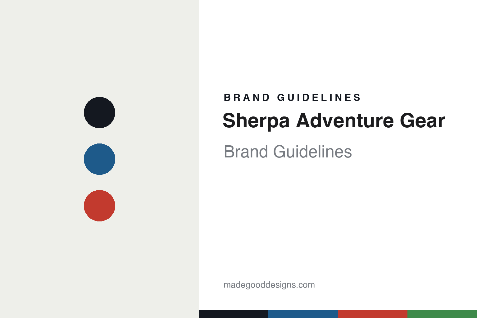
Sherpa Adventure Gear Brand Guidelines
Himalayan roots.
Aa
Two constants: a prayer-flag palette and a humanist sans register. Abstract homage — not the Sherpa Adventure Gear wordmark or logo.
Himalayan roots
Sherpa Adventure Gear carries a Nepali heritage and a give-back mission.
Sherpa Adventure Gear is a lesson in heritage as purpose. Founded in May 2003 by Tashi Sherpa — a Nepali-American of Sherpa heritage — as “a living memorial to the unsung heroes of Mt. Everest,” the brand draws on the culture of Nepal and the Himalaya.
Its brand identity is Himalayan, spiritual and socially driven — mountain culture and Buddhist symbolism woven into outdoor and lifestyle apparel. It uses prayer-flag imagery and colours and an endless-knot heritage motif; its “Tarcho” collection (Tarcho means prayer flag) is designed and made in Nepal; and its give-back is real: every purchase funds a day of school for a Nepali child through Room to Read, with a stated goal of ten million school-days by 2030.
(Honest notes: the brand honours the Sherpa people collectively — the “unsung heroes of Everest” — not one named relative. It’s no longer independent: it’s now a Bradshaw Taylor brand (a UK company). Its give-back is a per-purchase “days of school” model, not a fixed share of profits. And there’s no official brand hex, so the tones here are an unofficial interpretation.)
Colour
Sherpa Adventure Gear lives in a prayer-flag palette. Click a swatch to copy the hex.
Sherpa Adventure Gear’s identity is colourful, spiritual and warm — an ink, a prayer-flag blue, a sherpa red, a prayer green, and a sand. The palette draws on prayer-flag colours — blue, red and green over a sand ground — the register of the Himalaya and Tibetan Buddhist symbolism. It signals heritage, spirit and place rather than technical austerity. The honest caveat: with no published brand hex, these tones are an original, unofficial interpretation, not first-party values.
The lesson is prayer-flag colours signal a Himalayan-heritage brand. Sherpa Adventure Gear’s world is a mountain hung with prayer flags. For designers, it is a reminder that a prayer-flag blue with a warm red reads as heritage-rich and human — right for a Nepali-heritage brand. The takeaways: draw on a cultural palette respectfully; anchor with a warm ground; and treat any single hex as unofficial — using ink for small text so the palette stays warm.
Typography
The register is a humanist sans — warm and grounded.
Sherpa Adventure Gear’s identity carries a warm, human, heritage spirit — Himalayan culture and a social mission. A humanist sans captures the mood: it is warm and approachable, the register of a people-first, heritage brand. Set in a prayer-flag palette, the humanist sans feels warm and grounded — exactly the personality Sherpa Adventure Gear carries. It is human rather than clinical, mirroring a mission-led brand. (Sherpa Adventure Gear’s real wordmark is a trademark we describe but do not reproduce, and the exact brand typeface is not ours to use.) Because the mark is not ours to use, the honest description is “a humanist sans spirit,” shown here in a stand-in. The type behaves like the brand: warm, human and grounded.
Aa
A humanist sans spirit — warm and grounded. (Specimen set in Mulish, a humanist sans STAND-IN; NOT the Sherpa Adventure Gear wordmark, which is a trademark.)
Heritage as identity
Sherpa Adventure Gear stands for Nepali heritage and giving back.
Sherpa Adventure Gear is a lesson in making heritage the identity. A prayer-flag palette, Himalayan symbolism and a give-back mission make Nepali heritage the whole brand — spiritual, warm, purpose-led. The heritage is the differentiator. The differentiator is a Himalayan, spiritual, socially driven identity.
For designers and brand-builders, Sherpa Adventure Gear offers a clear takeaway: a culture, held respectfully, can be a brand. The lessons: root the story in real heritage (a Sherpa founder, Nepali names and craft); make giving concrete (days of school via Room to Read, women’s knitting cooperatives in Kathmandu); and use cultural cues with care (prayer flags, the endless knot). It is also a reminder to stay accurate: it honours the Sherpa people collectively (not one relative), it’s now UK-owned (Bradshaw Taylor), its give-back is per-purchase school-days (not a profit share), and the palette here is an unofficial interpretation. Sherpa Adventure Gear made heritage the brand — proof that culture, held well, can be the difference.
Explore & save
Keep Sherpa Adventure Gear’s identity on hand — save it to a board in the Made Good inspiration library.
Sherpa Adventure Gear identity set
Pin the prayer-flag palette and the humanist-sans register to your own board.


