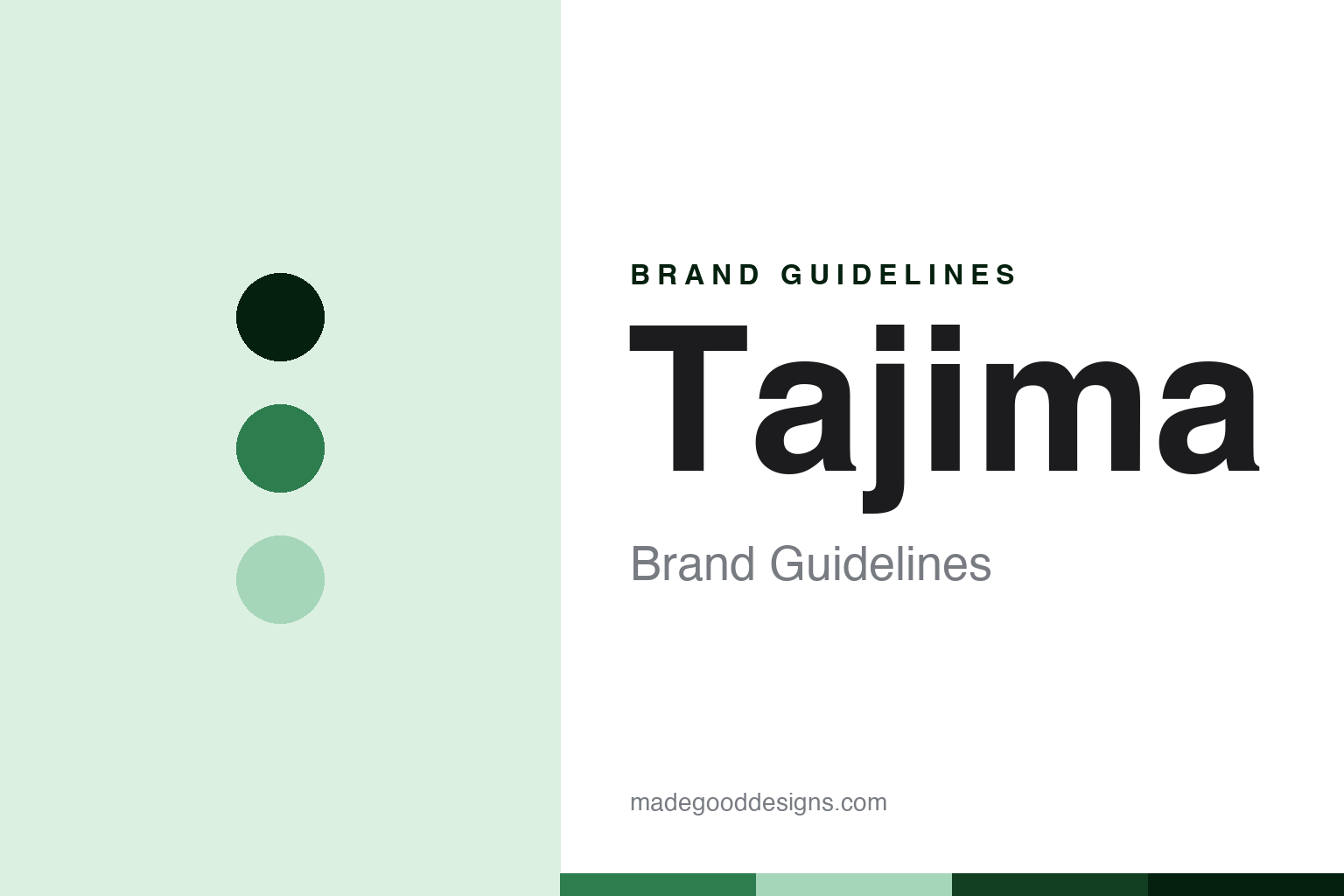
Tajima Brand Guidelines
The Japanese hand-tool house behind the Rock Hard knife.
Aa
Two constants: a Tajima-green palette and a hand-tool-sans register. Abstract homage — not a Tajima product or mark; no knife, tool or logo is reproduced.
The Japanese hand-tool house behind the Rock Hard knife
Tajima is the family-led Japanese hand-tool maker — TJM Design Corporation — whose chalk lines, tapes and Rock Hard utility knives date the business to 1909.
Tajima follows NT Cutter as the round’s hand-tool-house node — not a knife specialist but a broad construction-tool maker for which the utility knife is one line among many. Its answer to a round about who owns and where-makes the cutter is a family building house: the Japanese hand-tool house behind the Rock Hard knife.
Its identity is the Japanese hand-tool house behind the Rock Hard knife. The 1909 heritage, the TJM Design company and the Tajima family are the story here. The hand-tool house. The Japanese hand-tool house behind the Rock Hard knife.
(Honest notes, so the company, the heritage, the ownership, the product and the making are framed accurately, with a couple of points hedged. Tajima sells construction hand tools as its heroes; we report its language as the brand’s own. On the company: the Tajima brand is owned and made by TJM Design Corporation, a Japanese company headquartered in Tokyo, and Tajima Tool Corporation is the US subsidiary. On the heritage: the business dates to 1909, with the modern company incorporated in 1945, so we keep those two dates distinct. On ownership: it is private and family-led, with the Tajima family name still in its leadership, though the specific founder’s given name we do not assert. On the product: a broad range, chalk lines and marking tools, tape measures, utility knives, including the Rock Hard line, pull-stroke saws and laser levels, with chalk lines, tapes and utility knives its signature trio. On the making: Japanese-based, though per-product origin is not disclosed, which we hedge. Its designs and the Tajima name are IP we describe but do not reproduce; there is no official brand hex; these tones are an unofficial interpretation. On traps: this is the tool company, not Tajima embroidery machines, Tajima Wagyu beef or Tajima roofing.)
Colour
Tajima lives in a Tajima green. Click a swatch to copy the hex.
Tajima’s identity is Japanese, family-led and broad — a Tajima green, an ink, a pale green, a deep forest, and a paper. The palette leans Tajima green and deep forest: a clean, workmanlike register that stands in for a construction hand-tool house rather than a loud logo colour. It signals the Japanese hand-tool house behind the Rock Hard knife — Japanese, family-led and broad. The honest caveat: with no official brand hex, these values are a workmanlike, unofficial interpretation, not first-party colours. A further design lesson is that a broad house can still be known for one line, so a Tajima green can carry the whole construction-tool range while the words credit the Rock Hard knife and keep the two founding dates distinct.
The lesson is a Tajima green signals a Japanese, family-led identity. Tajima’s world is the chalk line, the tape and the Rock Hard knife. For designers, it is a reminder that a clean green and a pale green can carry a Japanese, family-led brand — a workmanlike tone held as an accent, not a product shot. Because a mid hue can fail as small text, keep type dark and let the colour live in the accents, palette and band. The takeaways: name TJM Design Corporation and place it in Tokyo; keep the 1909 heritage and 1945 incorporation distinct; keep the family leadership; and separate the tool brand from the beef and the embroidery machines.
Typography
The register is a hand-tool sans — Japanese, family-led, broad.
Tajima’s identity carries a Japanese, family-led spirit — a broad house with a jobsite heart. A hand-tool sans captures the mood: clean, workmanlike and practical, the register of a construction-tool maker. Set in a Tajima-green palette, the hand-tool sans feels dependable and current — exactly the personality Tajima carries. It behaves like a made, gripped thing rather than a loud logo, mirroring a grip-ring and a blade-dot. (Tajima’s real products and the name are things we describe but do not reproduce, and the exact typeface is not ours to use.) Because it is not ours to use, the honest description is “a hand-tool-sans brand,” shown here in a stand-in. The type behaves like the brand: Japanese, family-led and broad.
Aa
A hand-tool-sans brand — clean and workmanlike. (Specimen set in Archivo, a hand-tool-sans STAND-IN; NOT the Tajima logo or products.)
The cutter node
Tajima stands for the Japanese hand-tool house behind the Rock Hard knife.
Tajima sits third in the round as its hand-tool-house node. A Tajima-green palette, a hand-tool sans and a 1909 heritage make one thing — the Japanese hand-tool house behind the Rock Hard knife — the whole identity: Japanese, family-led and broad. The 1909 heritage is the frame, the TJM Design company is the substance, and the Tajima family is the twist. The point is a broad construction-tool maker for which the utility knife is one line, in a round about who owns and where-makes the cutter.
Put to work, the identity is the brand told straight, the company named and the dates kept distinct. A brand in this spirit would name TJM Design Corporation and place it in Tokyo, keep the 1909 heritage and 1945 incorporation distinct, keep the family leadership, and separate the tool brand from the beef and the machines. A reader in this spirit would keep the facts right: Tajima makes construction hand tools; the business dates to 1909; TJM Design makes it; and it is family-led. Tajima sits after NT Cutter and before Martor. The honest editorial moves are to name the company, to keep the dates distinct, to keep the family, and to clear the traps.
For designers and brand-builders, Tajima carries the cutter node: a broad house can still be known for one line. The lessons: a house can span a category, here Tajima and construction tools; a company is named, the Tajima brand owned and made by TJM Design Corporation of Tokyo, with Tajima Tool Corporation the US subsidiary; a heritage is dated, the business to 1909 and the modern company to 1945; an ownership is kept, private and family-led with the Tajima name in leadership; a product is placed, chalk lines, tapes, the Rock Hard utility knives, pull saws and lasers; and traps are cleared, that this is not Tajima embroidery machines, Wagyu beef or roofing. It is also a reminder to keep two founding dates distinct: Tajima is the family-led Japanese hand-tool house, 1909 in heritage and 1945 as a company — with the palette here an unofficial interpretation. The hook is that house: Tajima is the Japanese hand-tool house behind the Rock Hard knife, the family-led Japanese hand-tool maker, TJM Design Corporation, whose chalk lines, tapes and Rock Hard utility knives date the business to 1909. Read that way, Tajima is less a single cutter than the Japanese hand-tool house behind the Rock Hard knife: Japanese, family-led, broad. The lesson for a brand is that a broad house can still be known for one line, and keeping the dates distinct keeps it honest. Tajima made the-Japanese-hand-tool-house-behind-the-Rock-Hard-knife the identity — proof that a broad house can carry a node.
Explore & save
Keep Tajima’s identity on hand — save it to a board in the Made Good inspiration library.
Tajima identity set
Pin the Tajima-green palette and the hand-tool-sans register to your own board.