Land Rover Brand Guidelines
A green oval so plain it works anywhere — and a founding legend involving a greasy tin of sardines.
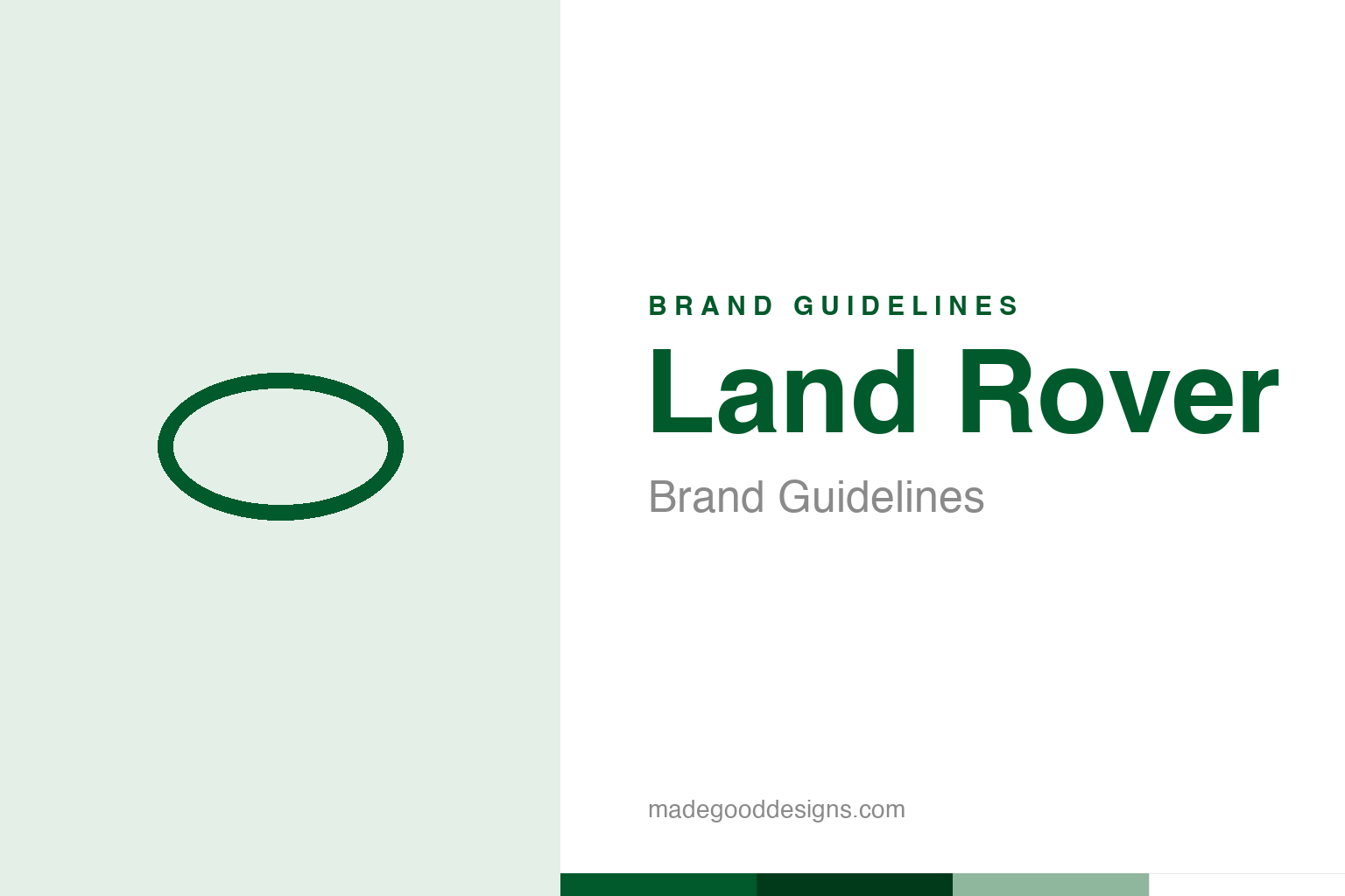
An abstract oval — the shape, not the Land Rover badge. Deliberately not the Land Rover mark.
A plain, tough green oval
Land Rover’s badge is rugged simplicity.
Land Rover’s logo is elegantly simple: the words “LAND ROVER” inside a green oval. There’s nothing fussy about it — and that plainness is the point. The clean, sturdy oval and the deep green convey exactly what the brand is about: ruggedness, capability, the outdoors, adventure and go-anywhere toughness. Green links it to nature, countryside and off-road exploration, while the simple, solid oval feels durable, honest and unpretentious — like the vehicles themselves, which built their reputation on being able to go anywhere and do anything. The badge doesn’t try to be glamorous; it tries to be dependable and capable, and it succeeds. Our homage nods to a plain oval shape.
The sardine-tin legend
Land Rover’s oval has a famous origin tale.
One of motoring’s most charming origin stories concerns that oval shape. The widely-told legend is that the distinctive oval logo was inspired by a tin of sardines (or pilchards): as the story goes, a designer left a greasy, oval-shaped imprint from a lunch tin on a drawing or drum of aluminium, and that accidental oval became the basis for the badge. It’s a wonderfully humble, appropriately practical tale for such a no-nonsense brand — but it should be flagged clearly as apocryphal. Land Rover has never officially confirmed any such origin, and the story is best treated as legend rather than documented fact. True or not, it’s become part of the brand’s folklore, and it fits perfectly: a rugged, unpretentious, workmanlike vehicle whose iconic logo supposedly came from a tin of fish is exactly the kind of down-to-earth story Land Rover people love to tell.
Born to go anywhere
Land Rover’s heritage is genuine capability.
Land Rover’s identity rests on a genuine heritage of go-anywhere capability. It was launched in 1948 by the Rover Company — conceived by Maurice Wilks, Rover’s chief designer, with his brother Spencer Wilks as managing director — originally as a rugged, utilitarian, farm-and-field vehicle inspired partly by the wartime Jeep. From that practical, agricultural beginning, Land Rover built a legendary reputation for durability, off-road ability and taking people to the most remote places on earth — expeditions, farms, militaries, deserts and mountains the world over. Later the Range Rover added luxury to that capability, creating the premium 4×4. But the core brand identity remains rooted in that authentic story of tough, capable, go-anywhere vehicles, and the plain green oval is the honest, unpretentious face of that genuine, hard-earned reputation for capability and adventure.
Honesty, capability and folklore
Land Rover shows a badge that fits its substance.
Land Rover offers lessons in building an authentic, character-rich brand. First, the strength of a simple, honest identity that matches the product: the plain green oval makes no attempt at glamour, and that unpretentious, rugged simplicity perfectly fits a brand built on real capability and toughness. When the identity honestly reflects the substance — dependable, capable, no-nonsense — it feels credible and earns trust. Second, the power of genuine heritage and capability: Land Rover’s reputation is real, earned over decades of taking people to the ends of the earth, and that authentic story is the brand’s deepest asset.
Third, the charm of folklore — honestly told. The sardine-tin origin legend is delightful and very on-brand (humble, practical, unpretentious), and it gives the brand a piece of engaging mythology; a good telling presents it as the apocryphal legend it is, which actually makes it more charming, not less. Fourth, the value of an ownable colour: Land Rover’s green is so bound to the brand and its outdoorsy, adventurous character that it does real identifying work. The takeaway is that a brand grounded in genuine substance is best served by an honest, simple identity that reflects it — and that authentic heritage plus a touch of charming folklore creates something people genuinely love. Land Rover’s plain green oval, and its tin-of-sardines legend, are the perfect, unpretentious face of a brand that really can go anywhere.
Type & the wordmark
A sturdy, honest, capable wordmark.
Land Rover sets its name in sturdy capitals within the green oval. The specimen below stands in with a strong sans.
Above & beyond
Sturdy, honest, capable — type as tough as the trucks. (Specimen set in Archivo, a neutral stand-in.)
Land Rover green
Deep, outdoorsy green. Click a swatch to copy the hex.
Land Rover’s identity is anchored by a deep forest green #005A2B, with white and silver. Lead with the green below.
Explore & save
Keep the oval idea on hand — save the homage and the green to a board.
Land Rover identity set
Pin the oval homage, the green palette and the honest-identity lesson to your own board.