Brooklinen Brand Guidelines
The internet’s favorite sheets.
Aa
Two constants: a warm neutral palette and a warm, editorial serif spirit. Abstract homage — not the Brooklinen wordmark or packaging.
Affordable luxury bedding
Brooklinen sold hotel-quality sheets, direct.
Brooklinen is a lesson in a direct-to-consumer origin story done right. Founded in 2014 by married couple Rich and Vicki Fulop in Brooklyn — after a hotel stay left them shocked at the price of great sheets — it launched via a hugely successful Kickstarter and built a brand on one promise: hotel-quality “affordable luxury” bedding, sold direct by cutting out the middleman.
Its hero products — the sateen Luxe Core and crisp percale Classic Core sheet sets — grew into comforters, towels, robes and broader home goods, all under the friendly “the internet’s favorite sheets” positioning. The identity leaned warm and approachable: neutral tones, real-bedroom lifestyle photography and the accessible-cool of the “Brooklyn” name.
(Honest notes: Brooklinen is founder-founded but now professionally managed — Rich Fulop stepped down as CEO in 2023, and Billy May (ex-Casper) is CEO; it remains private and independent, profitable with revenue management puts “north of $200 million,” and its 2020 growth investment came from Summit Partners. In 2025 it launched a brighter “Best in Bed” rebrand. No official brand hex is published.)
Colour
Brooklinen lives in warm neutrals. Click a swatch to copy the hex.
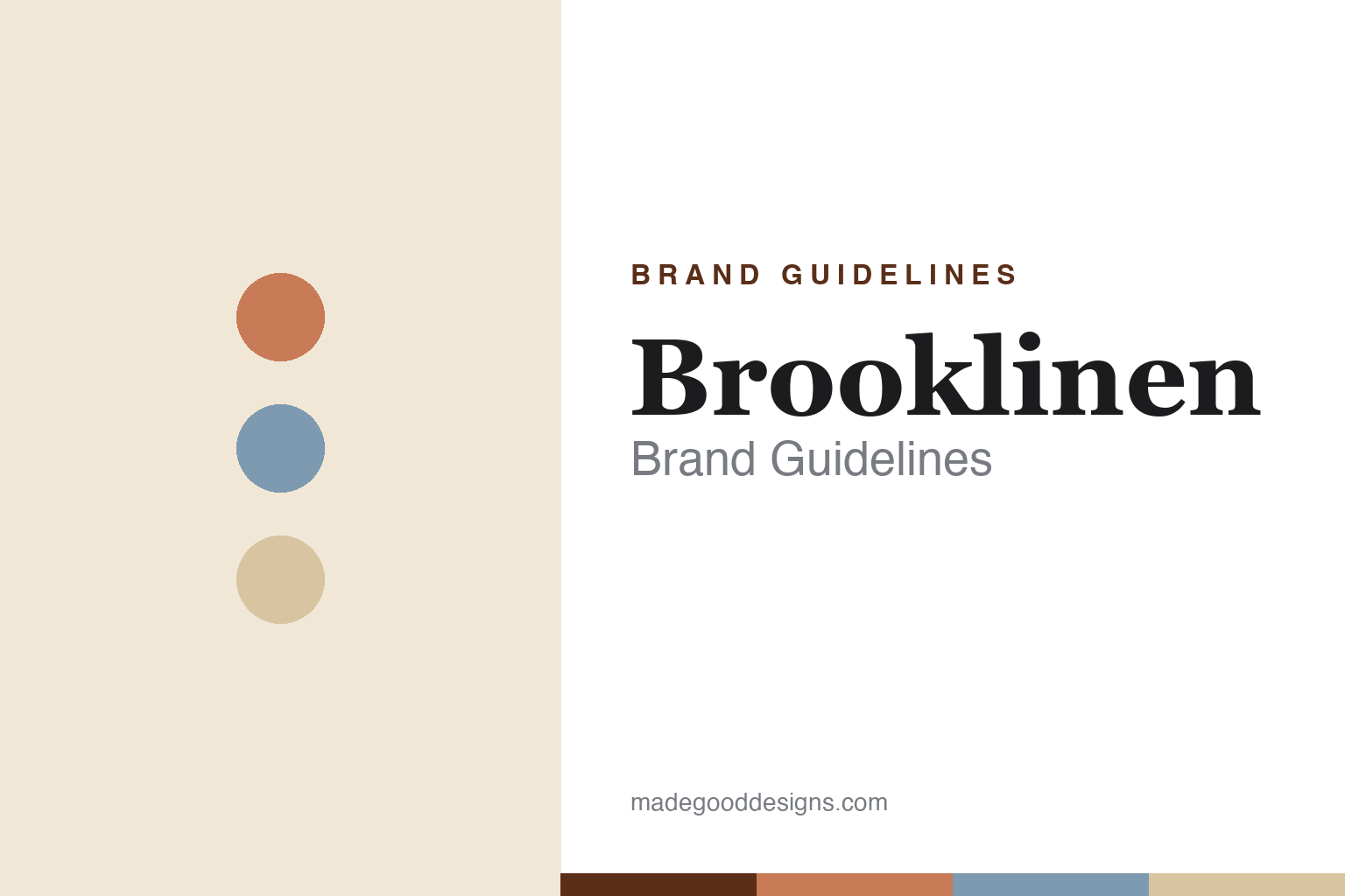
Brooklinen’s identity is warm, cosy and neutral — a terracotta, a dusty blue, a sand, a warm cream, and an ink. The palette is bedroom-soft: creams and sands with terracotta and dusty-blue accents, and the 2025 “Best in Bed” turn added brighter, more playful colour. It signals approachable comfort and “affordable luxury” rather than cold, high-end minimalism. The honest caveat: with no published brand hex, these tones are an original, unofficial interpretation, not first-party values.
The lesson is warmth sells comfort. Brooklinen’s world is a lived-in bedroom. For designers, it is a reminder that warm neutral tones and real, cosy lifestyle photography can make a home brand feel inviting and attainable — and that a well-timed shift to brighter colour (the 2025 rebrand) can re-energise a maturing brand. The takeaways: match the palette to the feeling you sell (cosy comfort); use lived-in photography over sterile studio shots; and treat any single hex as unofficial — using a deep terracotta for small text so the neutrals stay warm.
Typography
The wordmark spirit is a warm, editorial serif — cosy and confident.
Brooklinen’s identity carries a warm, approachable, quietly confident spirit — a friendly wordmark over cosy, real-bedroom photography. A warm editorial serif captures the mood of the brand’s more recent, richer direction: it is inviting and characterful, the register of a home brand that wants to feel like a comfortable bed rather than a cold showroom. Set against warm neutrals, the serif feels cosy and premium — exactly the “affordable luxury” personality Brooklinen carries. It is warm rather than clinical, mirroring soft, lived-in bedding. (Brooklinen’s real wordmark and packaging are trademarks and trade dress we describe but do not reproduce, and the exact typeface is not published, so we don’t assert it.) Because the specific mark is not ours to use, the honest description is “a warm serif spirit,” not the Brooklinen logo. The type behaves like the brand: warm, inviting and confident.
Aa
A warm serif spirit — cosy and confident. (Specimen set in Fraunces, a warm editorial serif; NOT the Brooklinen logo, which is a trademark.)
The DTC brand that grew up
Brooklinen stands for cosy, affordable luxury.
Brooklinen is a lesson in a DTC brand maturing gracefully. It nailed the early playbook — a Kickstarter, a hero product, a direct “affordable luxury” pitch — with a warm, approachable identity. Then it did what many DTC darlings couldn’t: it professionalised (a new CEO, disciplined retail) while staying independent and profitable, and refreshed its look for a second decade with the brighter “Best in Bed” campaign. The differentiator is warmth plus durability.
For designers and brand-builders, Brooklinen offers a clear takeaway: an approachable identity can carry a brand from startup to grown-up. The lessons: sell the feeling (cosy comfort) with warm tones and real photography; know when to refresh (the 2025 rebrand) to stay current; and pair brand warmth with business discipline. It is also a reminder to stay accurate: Brooklinen is founder-founded but now led by CEO Billy May, private and independent, with revenue management puts north of $200 million — and the palette here an unofficial interpretation. Brooklinen made bedding feel cosy — proof that warmth can go the distance.
Explore & save
Keep Brooklinen’s identity on hand — save it to a board in the Made Good inspiration library.
Brooklinen identity set
Pin the warm-neutral palette and the warm-serif spirit to your own board.