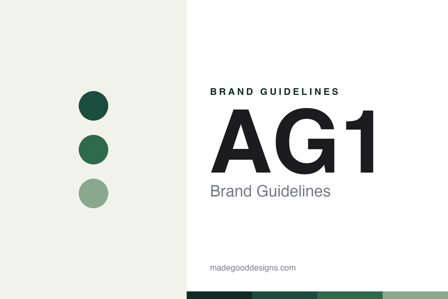
AG1 Brand Guidelines
Foundational Nutrition.
Aa
Two constants: a deep forest-green palette and a clean sans wordmark. Abstract homage — not the AG1 wordmark or packaging.
One scoop, one brand
AG1 built an empire on a single product.
AG1 is a lesson in radical focus plus internet marketing. Founded in 2010 by Chris Ashenden as Athletic Greens — and rebranded to AG1 in 2022 — it sells essentially one hero product: a comprehensive greens-and-vitamin powder (marketed as 75 ingredients), on subscription, under the line “Foundational Nutrition.” The whole company is that one green scoop.
Its growth engine is the modern internet: podcast sponsorships and creator/affiliate marketing at enormous scale (its partnership with the Huberman Lab podcast is the flagship). The design matches the discipline — a minimalist, premium look built around a deep forest-green pouch and canister, a clean “AG1” wordmark, and iconic single-serve travel packs.
(Honest notes: AG1 is private and VC-backed (a 2022 raise valued it near $1.2 billion; revenue was reported around $600 million in 2024), and founder Ashenden stepped down in 2024, succeeded by CEO Kat Cole. It is also widely criticised as an expensive greens powder with limited independent evidence for its broad claims — so this is a design-and-marketing masterclass, not a statement about clinical efficacy. No official brand hex is published.)
Colour
AG1 lives in deep forest green. Click a swatch to copy the hex.
AG1’s identity is deep, green and premium — a forest green, a pine, a sage, a cream, and an ink. The palette is almost entirely forest and pine green on off-white, the colour of the pouch itself. It signals natural, foundational, health-first simplicity — one considered green, not a rainbow of SKUs. The honest caveat: with no published brand hex, these tones are an original, unofficial interpretation, not first-party values.
The lesson is a single deep colour reinforces a single product. AG1’s world is one shade of green. For designers, it is a reminder that when a brand sells one hero product, a disciplined, near-monochrome palette makes the focus feel deliberate and premium. The takeaways: match palette discipline to product discipline; let one deep, natural colour own the shelf; and treat any single hex as unofficial — using a very dark green for small text so the forest tone stays rich.
Typography
The wordmark spirit is a clean sans — modern and functional.
AG1’s identity carries a clean, modern, functional spirit — a simple “AG1” wordmark on a deep-green pack. A clean grotesque sans captures the mood: it is precise and unfussy, the register of a brand that reduced nutrition to one considered scoop. Set against forest green, the clean type feels premium and no-nonsense — exactly the foundational personality AG1 carries. It is functional rather than decorative, mirroring a product built on “refine one proven formula.” (AG1’s real wordmark and packaging — from a 2022 rebrand — are trademarks and trade dress we describe but do not reproduce, and the exact typefaces are not ours to assert.) Because the specific mark is not ours to use, the honest description is “a clean sans spirit,” not the AG1 logo. The type behaves like the brand: modern, functional and precise.
Aa
A clean sans spirit — modern and functional. (Specimen set in Hanken Grotesk, a clean grotesque sans; NOT the AG1 logo, which is a trademark.)
Focus, and the internet
AG1 stands for one foundational green.
AG1 is a lesson in discipline plus distribution. It refused the temptation to add SKUs and instead sold one product, one colour, one promise — then amplified it through podcast and creator marketing until “AG1” was a household name among the wellness-curious. The brand’s clarity (visual and strategic) is its whole strength. The differentiator is single-product focus, marketed natively for the internet.
For designers and brand-builders, AG1 offers a two-sided takeaway: focus and channel can beat range — but caveats matter. The lessons: let a disciplined, near-monochrome identity mirror a single-product strategy; build the brand where attention actually is (podcasts, creators); and be honest about the gap between marketing polish and proven benefit. It is also a reminder to stay accurate: AG1 is a VC-backed brand with a 2024 CEO change, and its health claims outrun the independent evidence — with the palette here an unofficial interpretation. AG1 owned one green — proof that focus can be the difference.
Explore & save
Keep AG1’s identity on hand — save it to a board in the Made Good inspiration library.
AG1 identity set
Pin the forest-green palette and the clean-sans spirit to your own board.


