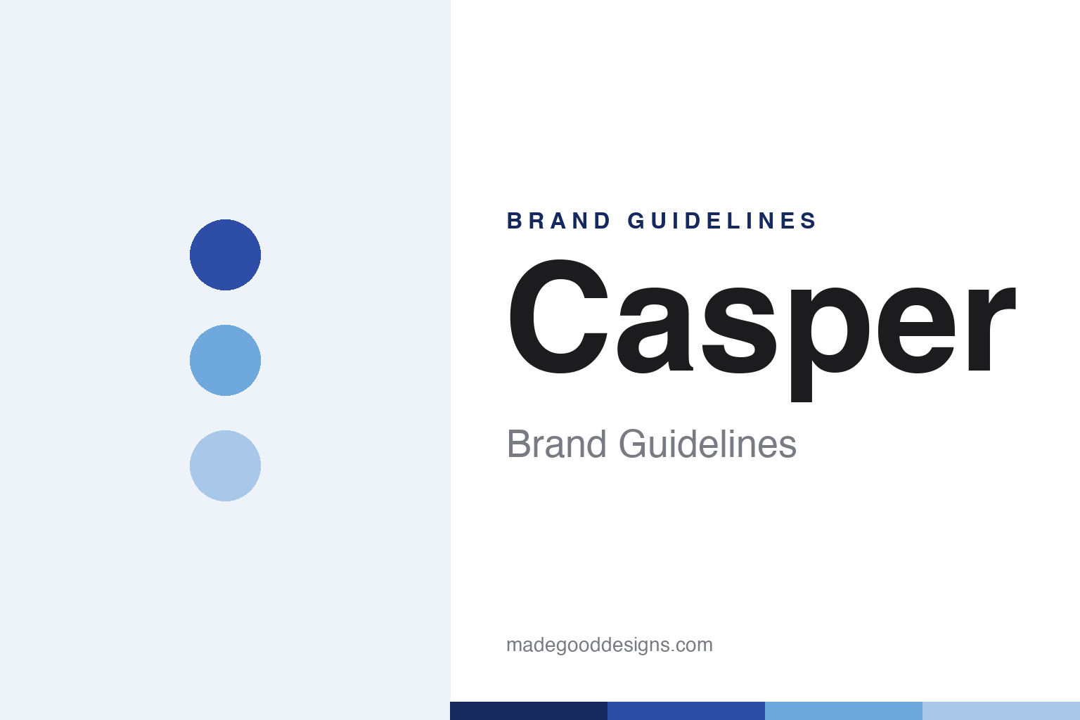
Casper Brand Guidelines
The perfect mattress for everyone.
Aa
Two constants: a soft blue-and-white palette and a friendly rounded sans wordmark. Abstract homage — not the Casper wordmark or ad art.
The mattress in a box
Casper made buying a mattress friendly.
Casper is a lesson in making a dull category friendly. Launched in 2014 in New York by five co-founders (including CEO Philip Krim and ex-IDEO designer Jeff Chapin), it popularised the “bed-in-a-box” — a foam mattress compressed into a box, shipped to your door, sold direct with a 100-night trial. It turned a stressful showroom purchase into a warm, low-risk, online one.
The brand was built on friendliness and wit: a soft blue-and-white palette, cloud-and-sleep imagery, and famously clever illustrated New York subway ads (the “Perfect Mattress for Everyone” campaign, with visual puzzles). Casper positioned itself not as a mattress seller but as a “sleep” company, expanding into pillows, sheets and frames.
(Honest notes: Casper is a cautionary DTC tale. Its 2020 IPO priced below range as losses mounted; it was taken private in 2022 (by Durational Capital), and in 2024 was acquired by Carpenter Co., a foam manufacturer — so it now operates as a subsidiary, not the buzzy unicorn of 2019, under CEO Joe Megibow. No official brand hex is published.)
Colour
Casper lives in soft blue and white. Click a swatch to copy the hex.
Casper’s identity is friendly, soft and blue — a cobalt, a sky, a soft blue, a cloud white, and an ink. The palette is calm and restful: blues and white, the colours of sky and sleep. It signals approachable, low-stress, human — the opposite of a hard-sell mattress showroom. The honest caveat: with no published brand hex, these tones are an original, unofficial interpretation, not first-party values.
The lesson is soft colour plus wit disarms a category. Casper’s world is a calm blue sky. For designers, it is a reminder that a gentle palette, friendly type and genuinely funny copy can make an intimidating purchase feel human — the subway ads did as much brand-building as the product. The takeaways: pick a calming, ownable palette; invest in voice and illustration, not just logo; and treat any single hex as unofficial — using a deep blue for small text so the sky tones stay soft.
Typography
The wordmark spirit is a friendly rounded sans — warm and human.
Casper’s identity carries a friendly, warm, human spirit — a lowercase “casper” wordmark over witty, illustrated advertising. A friendly rounded sans captures the mood: it is approachable and unintimidating, the register of a brand that made mattress-buying feel like a chat, not a negotiation. Set against soft blues and white, the friendly type feels calm and human — exactly the disarming personality Casper carries. It is warm rather than clinical, mirroring a good night’s sleep. (Casper’s real wordmark and advertising — created with agency Red Antler — are trademarks and trade dress we describe but do not reproduce, and the exact typeface is not published, so we don’t assert it.) Because the specific mark is not ours to use, the honest description is “a friendly sans spirit,” not the Casper logo. The type behaves like the brand: friendly, warm and calm.
Aa
A friendly sans spirit — warm and human. (Specimen set in Rubik, a rounded sans; NOT the Casper logo, which is a trademark.)
The friendly brand, and the hard business
Casper stands for friendly sleep.
Casper is a lesson in a brilliant brand meeting a brutal category. It made a boring, high-anxiety purchase feel friendly, witty and low-risk — the bed-in-a-box, the 100-night trial, the subway ads — and defined the modern DTC mattress. But mattresses are a low-margin, price-war business, and beloved branding could not make it profitable. The differentiator is warmth and wit in a cold category.
For designers and brand-builders, Casper offers a two-sided takeaway: voice and warmth can build a category-defining brand — but design cannot fix broken economics. The lessons: humanise an intimidating purchase; invest in copy and illustration as core identity; and separate the strength of a brand from the health of its business. It is also a reminder to stay accurate: Casper’s IPO underwhelmed, it was taken private in 2022, and it is now a subsidiary of foam-maker Carpenter Co. (2024) — with the palette here an unofficial interpretation. Casper made sleep friendly — proof that warmth can define a category.
Explore & save
Keep Casper’s identity on hand — save it to a board in the Made Good inspiration library.
Casper identity set
Pin the blue-and-white palette and the friendly-sans spirit to your own board.