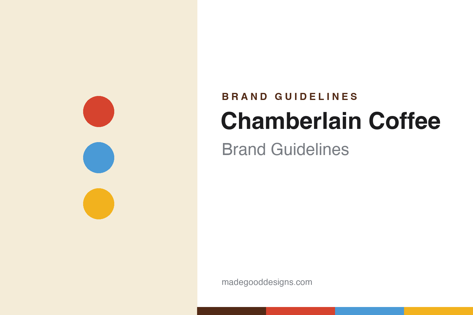
Chamberlain Coffee Brand Guidelines
Coffee for a new generation.
Aa
Two constants: a bright storybook palette and a soft rounded wordmark. Abstract homage — not the Chamberlain Coffee wordmark or mascots.
Coffee, un-snobby
Chamberlain Coffee made specialty coffee playful.
Chamberlain Coffee is a lesson in rejecting a category’s clichés. Founded in 2019 by Gen-Z YouTuber Emma Chamberlain (and relaunched with its now-signature look in 2020), it built an approachable, non-snobby coffee brand for a young audience — the opposite of intimidating, kraft-paper specialty coffee.
The design is its charm: a 2020 rebrand by studio Kontrapunkt introduced a cast of illustrated animal mascots (a rotating family — a dog, an owl, a cat, a mouse and more, one per blend), a bespoke soft-rounded typeface (“Wunderpunkt”), and bright, storybook colour blocks. The line spans whole-bean, cold brew, steeped “coffee bags,” matcha and ready-to-drink cans.
(Honest notes: Chamberlain Coffee is private and VC-backed (built with Blazar Capital and UTA; it raised a $7 million round in 2022 and more since), and Emma Chamberlain became co-CEO in 2024. It’s growing across major retailers, though reported revenue figures are projections and one 2024 report questioned its internal financials — so we describe it as growing rather than citing hard numbers. No official brand hex is published.)
Colour
Chamberlain Coffee lives in a bright storybook palette. Click a swatch to copy the hex.
Chamberlain Coffee’s identity is bright, warm and playful — a warm red, a sky blue, a sunny yellow, a cream, and an ink. The palette is a set of saturated, storybook colour blocks that vary by blend and mascot, a deliberate break from the beige-and-serif specialty-coffee cliché. It signals fun, friendly, Gen-Z-first coffee. The honest caveat: with no published brand hex, these tones are an original, unofficial interpretation, not first-party values.
The lesson is bright, illustrative colour disarms a snobby category. Chamberlain Coffee’s world is a picture book. For designers, it is a reminder that saturated colour blocks plus hand-drawn character illustration can make an intimidating category (specialty coffee) feel joyful and youthful. The takeaways: reject the category cliché with colour and illustration; give each product a character and its own colour; and treat any single hex as unofficial — using a warm brown for small text so the storybook colours stay bright.
Typography
The wordmark spirit is a soft rounded sans — friendly and storybook.
Chamberlain Coffee’s identity carries a friendly, playful, storybook spirit — a soft wordmark alongside a cast of illustrated animal mascots. A soft rounded sans (the brand’s custom face is deliberately quirky and rounded) captures the mood: it is warm and unpretentious, the register of a coffee brand that wants to be fun, not fussy. Set against bright colour blocks, the rounded type feels cheerful and youthful — exactly the un-snobby personality Chamberlain Coffee carries. It is playful rather than precious, mirroring hand-drawn characters. (Chamberlain Coffee’s real wordmark, typeface and mascots are trademarks and trade dress we describe but do not reproduce, and the exact typeface is not ours to assert.) Because the specific mark is not ours to use, the honest description is “a soft rounded spirit,” not the Chamberlain Coffee logo. The type behaves like the brand: friendly, playful and warm.
Aa
A soft rounded spirit — friendly and storybook. (Specimen set in Baloo 2, a rounded sans; NOT the Chamberlain Coffee logo, which is a trademark.)
Character as differentiation
Chamberlain Coffee stands for playful coffee.
Chamberlain Coffee is a lesson in using illustration and character to own a category corner. Coffee branding is overwhelmingly serious and rustic; Chamberlain went playful, storybook and character-driven — a cast of animal mascots and bright colour blocks — instantly claiming the young, un-snobby end of the market. A creator opened the door; the mascots made it a brand. The differentiator is joyful, illustrative, character-led design.
For designers and brand-builders, Chamberlain Coffee offers a clear takeaway: character can carve out a category corner. The lessons: reject the category cliché deliberately (playful vs rustic); build a cast of ownable characters and pair each with colour; and use a custom, friendly typeface to seal the tone. It is also a reminder to stay accurate: it is VC-backed, Emma is co-CEO since 2024, and revenue claims are projections — with the palette here an unofficial interpretation. Chamberlain made coffee playful — proof that character can be the difference.
Explore & save
Keep Chamberlain Coffee’s identity on hand — save it to a board in the Made Good inspiration library.
Chamberlain Coffee identity set
Pin the bright-storybook palette and the soft-rounded spirit to your own board.


