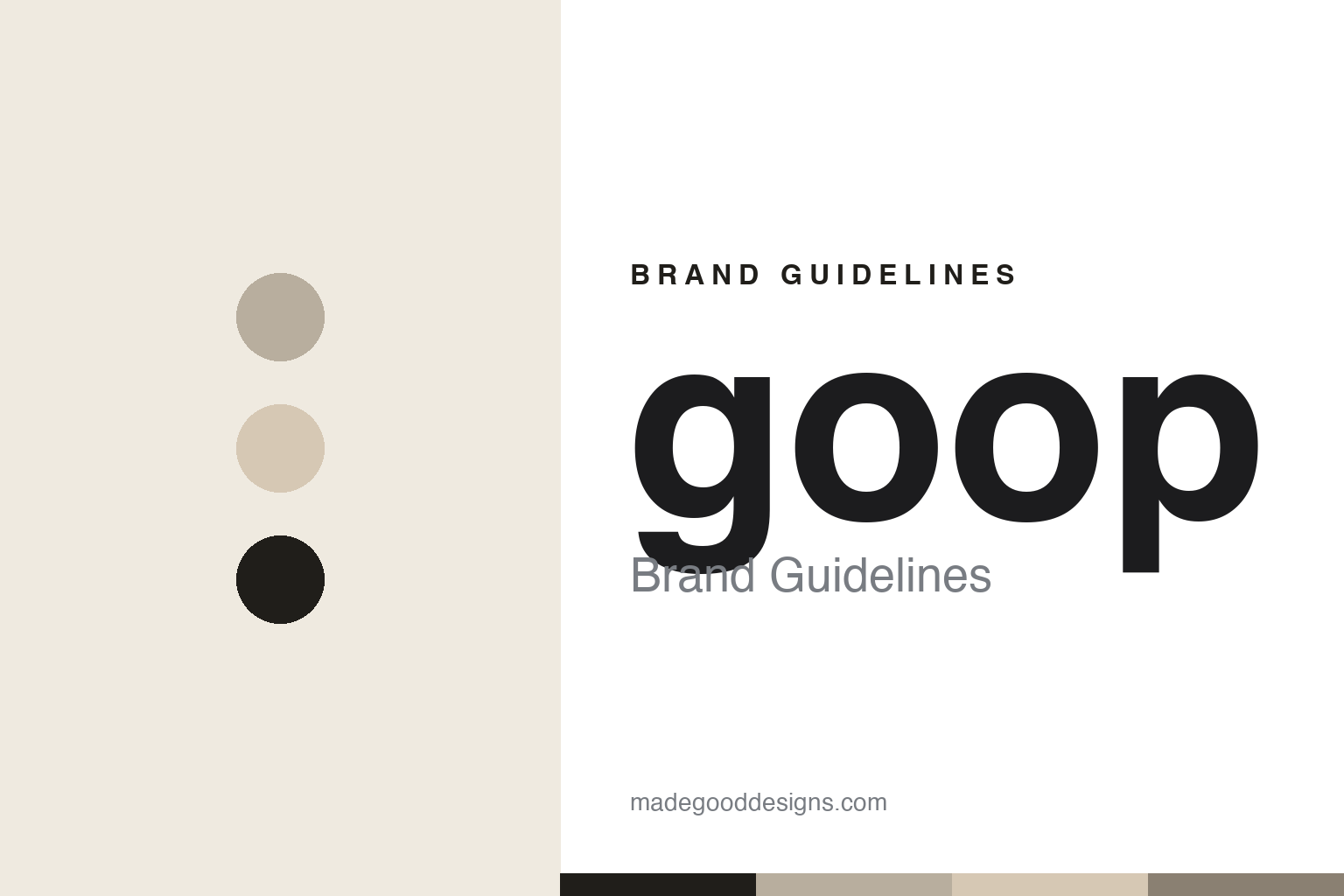
goop Brand Guidelines
Quiet-luxury wellness.
Aa
Two constants: a muted neutral palette and a minimal lowercase wordmark. Abstract homage — not the goop wordmark.
From newsletter to lifestyle empire
goop turned a mailing list into a wellness brand.
goop is a lesson in content becoming a brand. Started in 2008 as a weekly email newsletter from Gwyneth Paltrow’s kitchen, it grew into a full lifestyle-and-wellness brand — content and curated e-commerce, then goop-branded skincare (GOOPGLOW), supplements, fragrance and apparel (G. Label), plus a podcast, a Netflix series and the In goop Health summits.
The design is minimalist, editorial “quiet luxury” — lots of white space, a muted neutral palette (beige, greige, black, white), sophisticated photography, and the signature lowercase “goop” wordmark. It’s aspirational, understated and expensive-looking by design.
(Honest notes: goop is private and VC-backed; its widely-cited ~$250 million valuation dates to a 2018 round and is now old. It restructured with layoffs in late 2024, refocusing on beauty, food and fashion. And it carries real controversy: a 2018 ~$145,000 settlement with California prosecutors over unsubstantiated health claims (the “jade egg”), advertising-watchdog scrutiny, and ongoing criticism from scientists that some of its wellness content is pseudoscience — all stated here neutrally. No official brand hex is published.)
Colour
goop lives in a muted neutral palette. Click a swatch to copy the hex.
goop’s identity is muted, neutral and editorial — a greige, a warm beige, a soft black, a cream, and an ink. The palette is a restrained set of warm off-whites, beige/greige and soft black, the colours of “quiet luxury.” It signals aspirational, minimalist, expensive calm rather than loud wellness. The honest caveat: with no published brand hex, these tones are an original, unofficial interpretation, not first-party values.
The lesson is muted neutrals read as expensive calm. goop’s world is a sunlit, minimalist editorial. For designers, it is a reminder that a restrained beige-greige-black palette plus generous white space signals premium, aspirational calm — the “quiet luxury” aesthetic goop helped popularise. The takeaways: keep the palette muted and warm; use white space generously; and treat any single hex as unofficial — using a soft black for small text so the neutrals stay calm.
Typography
The wordmark spirit is a minimal lowercase sans — calm and editorial.
goop’s identity carries a calm, editorial, aspirational spirit — a lowercase “goop” wordmark in a muted, white-space-heavy world. A minimal sans captures the mood: it is quiet and refined, the register of a brand built on “quiet luxury.” Set against muted neutrals, the minimal type feels expensive and calm — exactly the aspirational-wellness personality goop carries. It is understated rather than loud, mirroring an editorial spread. (goop’s real lowercase wordmark is a trademark and trade dress we describe but do not reproduce, and the exact typeface is not published, so we don’t assert it.) Because the specific mark is not ours to use, the honest description is “a minimal lowercase spirit,” not the goop logo. The type behaves like the brand: calm, editorial and refined.
Aa
A minimal lowercase spirit — calm and editorial. (Specimen set in Outfit, a minimal sans; NOT the goop logo, which is a trademark.)
Aesthetic strength, and real caveats
goop stands for aspirational calm.
goop is a lesson in a powerful aesthetic paired with real accountability. Its minimalist, quiet-luxury design is genuinely influential — it helped define the “clean girl,” aspirational-wellness look. But the brand’s wellness claims have repeatedly drawn scrutiny (a 2018 settlement, watchdog complaints, scientific criticism), a reminder that a beautiful identity doesn’t validate the substance behind it. The differentiator is a strong aesthetic — with important caveats.
For designers and brand-builders, goop offers a two-sided takeaway: aesthetic can build an empire, but it doesn’t substantiate claims. The lessons: a muted, editorial identity can command premium and cultural influence; content can grow into a full brand; but design polish must not be mistaken for evidence. It is also a reminder to report fairly: goop settled a 2018 case over the jade egg, faced watchdog and scientific criticism, and restructured in 2024 — all stated neutrally, with the palette here an unofficial interpretation. goop looked expensive and calm — proof an aesthetic can be powerful, and a reminder that it isn’t proof.
Explore & save
Keep goop’s identity on hand — save it to a board in the Made Good inspiration library.
goop identity set
Pin the muted-neutral palette and the minimal-lowercase spirit to your own board.


