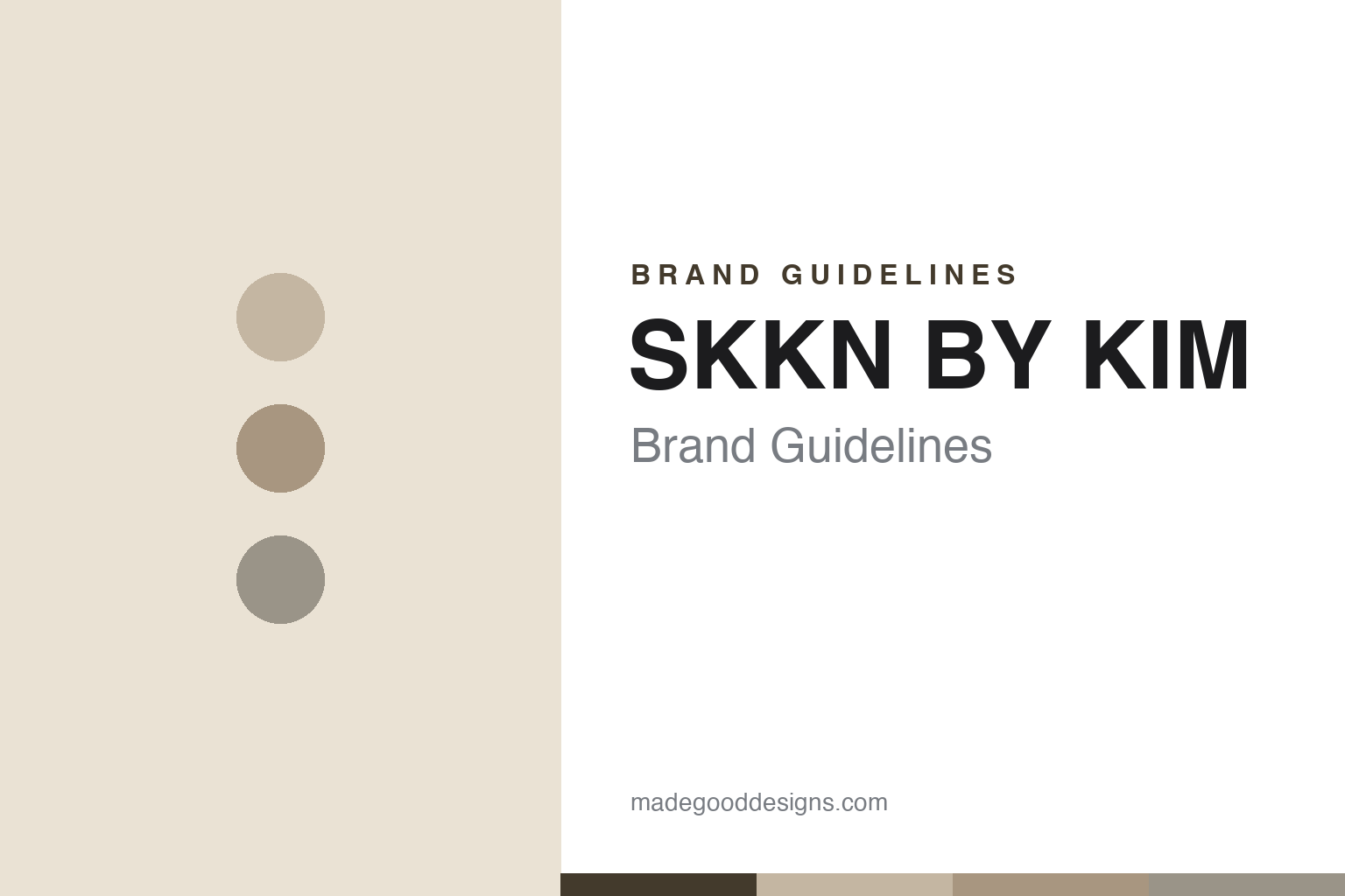
SKKN BY KIM Brand Guidelines
High-performance skincare.
Aa
Two constants: a greige/nude palette and a stark, minimal wordmark. Abstract homage — not the SKKN wordmark or packaging.
Skincare as sculpture
SKKN BY KIM made a regimen look monolithic.
SKKN BY KIM is a lesson in packaging as sculpture. Kim Kardashian first launched KKW Beauty in 2017 (cosmetics); Coty took a stake; and in 2022 she relaunched as SKKN BY KIM, a nine-product skincare regimen. Designed by studio Perron-Roettinger, its packaging looks like a set of concrete-and-stone sculptures meant to sit together on a shelf.
The identity is minimalist, monolithic and “quiet luxury” — a nude, taupe and greige neutral palette (echoing Kim’s SKIMS aesthetic), opaque sculptural containers inspired by clay, sand and rock, and a stark, minimal “SKKN” wordmark. Even its pop-up store was raw greige cement.
(Honest notes: SKKN is in transition. In 2025, SKIMS acquired SKKN BY KIM from Kim and Coty (Coty fully exited), and the brand is being absorbed into SKIMS, which is launching its own beauty and fragrance from 2026 — so SKKN’s standalone existence is winding down. Its name also drew a trademark dispute from a Black-woman-owned brand using “SKKN+” (the suit was dismissed; any settlement undisclosed). No official brand hex is published.)
Colour
SKKN lives in greige and nude. Click a swatch to copy the hex.
SKKN’s identity is muted, neutral and monolithic — a putty, a taupe, a stone grey, a bone, and an ink. The palette is a warm-grey greige/nude system — putty, sand, clay, stone-grey — matte, low-contrast and monochromatic. It signals sculptural, minimalist, expensive calm rather than colourful beauty. The honest caveat: with no published brand hex, these tones are an original, unofficial interpretation, not first-party values.
The lesson is a monochromatic neutral makes a range look like one object. SKKN’s world is a stone quarry rendered as skincare. For designers, it is a reminder that a tightly-controlled greige/nude palette, applied to sculptural packaging, can make a multi-product regimen read as a single, cohesive design object on the shelf. The takeaways: pick one tight neutral system; make the packaging sculptural and cohesive; and treat any single hex as unofficial — using a deep taupe-brown for small text so the greige stays warm.
Typography
The wordmark spirit is a stark minimal sans — architectural and quiet.
SKKN’s identity carries an architectural, quiet, luxurious spirit — a stark “SKKN” wordmark on sculptural, monochromatic packaging. A clean, structural sans captures the mood: it is minimal and precise, the register of a brand that treats skincare like sculpture. Set against greige and nude, the stark type feels architectural and calm — exactly the monolithic, quiet-luxury personality SKKN carries. It is austere rather than decorative, mirroring stone-like containers. (SKKN’s real wordmark and packaging — by Perron-Roettinger — are trademarks and trade dress we describe but do not reproduce, and the exact typeface is not ours to assert.) Because the specific mark is not ours to use, the honest description is “a stark minimal spirit,” not the SKKN logo. The type behaves like the brand: architectural, quiet and precise.
Aa
A stark minimal spirit — architectural and quiet. (Specimen set in Archivo, a structural sans; NOT the SKKN logo, which is a trademark.)
When packaging is the brand
SKKN stands for monolithic minimalism.
SKKN BY KIM is a lesson in packaging design carrying a brand. The formulas are premium skincare, but what made SKKN unmistakable is the sculptural, monochromatic, greige packaging — a regimen designed to look like a cohesive set of stone objects, an extension of Kim’s minimalist aesthetic. The design is the brand. The differentiator is monolithic, sculptural packaging in a tight neutral palette.
For designers and brand-builders, SKKN offers a clear takeaway: a cohesive, sculptural packaging system can define a brand. The lessons: use one tight neutral palette so a range reads as one object; treat packaging as sculpture, not just containers; and align the look with a founder’s broader aesthetic. It is also a reminder to stay accurate: SKKN was acquired by SKIMS in 2025 (Coty exited) and is being folded into SKIMS Beauty, and it faced a trademark dispute — with the palette here an unofficial interpretation. SKKN made skincare monolithic — proof that packaging can be the brand.
Explore & save
Keep SKKN BY KIM’s identity on hand — save it to a board in the Made Good inspiration library.
SKKN BY KIM identity set
Pin the greige-nude palette and the stark-minimal spirit to your own board.