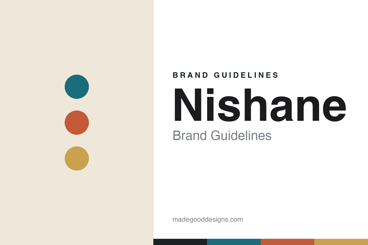
Nishane Brand Guidelines
East meets West.
Aa
Two constants: a bold, East-meets-West palette and a modern sans wordmark. Abstract homage — not the Nishane wordmark or bottle.
Istanbul, bottled
Nishane bridges East and West in scent.
Nishane is a lesson in a place as a brand. Founded in 2012 in Istanbul by Mert Güzel and Murat Katran (and launched internationally in 2015), it positions itself as Istanbul’s — and Turkey’s — first niche, artisanal perfume house, with a name that means “mark” or “sign” in Turkish. Its whole story is Istanbul as a bridge between East and West, drawing on Karagöz-and-Hacıvat shadow-play theatre, the Bosphorus and Sufi poetry.
Its breakout, Hacıvat (2017) — a fruity-chypre by perfumer Jorge Lee, often called an “Aventus alternative” — put it on the global map; Ani (2019, by Cécile Zarokian) is a collector favourite. Nishane is extrait-de-parfum-forward (high concentration), with a bench of European perfumers working to Istanbul-based briefs.
(Honest notes: the “first Turkish niche house” line is the brand’s own claim, though widely repeated. And Nishane is no longer purely self-funded — it has taken growth-capital investment from Maxis Girişim (the private-equity arm of Türkiye’s İşbank) with the Dutch firm Mada, while the founders keep creative control. No official brand hex is published — the house uses bold, varied per-fragrance colourways.)
Colour
Nishane lives in bold, East-meets-West tones. Click a swatch to copy the hex.
Nishane’s identity is bold, warm-cool and cultural — a Bosphorus teal, a terracotta, a gold, a cream, and an ink. Rather than one corporate colour, Nishane uses bold, varied per-fragrance colourways that fuse cool Bosphorus blues with warm Anatolian terracotta and gold. It signals a confident, culturally rooted niche house rather than quiet Western minimalism. The honest caveat: with no published brand hex, these tones are an original, unofficial interpretation, not first-party values.
The lesson is a bold, culturally specific palette can own a place. Nishane’s world is Istanbul at the meeting of two continents. For designers, it is a reminder that pairing cool and warm tones — sea blues with earthen reds and gold — plus real cultural references can make a brand feel rooted in a specific city and heritage. The takeaways: mix warm and cool for a place-based palette; let each product carry its own colourway; and treat any single hex as unofficial — using a deep teal for small text so the palette stays bold.
Typography
The wordmark spirit is a modern sans — confident and cultural.
Nishane’s identity carries a confident, modern, cultural spirit — a clean “NISHANE” wordmark on weighty flacons with metal caps. A modern geometric sans captures the mood: it is contemporary and self-assured, the register of a niche house bridging East and West. Set against bold, warm-cool tones, the sans feels confident and modern — exactly the Istanbul-niche personality Nishane carries. It is contemporary rather than ornate, letting the cultural story and colour lead. (Nishane’s real wordmark and bottles are trademarks and trade dress we describe but do not reproduce, and the exact typeface is not published, so we don’t assert it.) Because the specific mark is not ours to use, the honest description is “a modern sans spirit,” not the Nishane logo. The type behaves like the brand: confident, modern and cultural.
Aa
A modern sans spirit — confident and cultural. (Specimen set in Sora, a geometric sans; NOT the Nishane logo, which is a trademark.)
A city, exported
Nishane stands for Istanbul niche.
Nishane is a lesson in exporting a city’s identity. By building everything on Istanbul as an East-meets-West bridge — shadow-play, the Bosphorus, Sufi poetry — and pairing it with bold, confident design and high-concentration extraits, Nishane turned “the first Turkish niche house” into a global player. The place is the brand. The differentiator is a genuine, confident cultural rootedness.
For designers and brand-builders, Nishane offers a clear takeaway: a specific place and culture can differentiate in a crowded category. The lessons: root the brand in a real place and its stories; use a bold, warm-cool palette to signal that culture; and back it with genuine product quality (extrait concentration, a strong hero). It is also a reminder to stay accurate: the “first Turkish niche house” is the brand’s claim, and Nishane now has PE backing (İşbank’s Maxis with Mada) while remaining founder-led — with the palette here an unofficial interpretation. Nishane bottled Istanbul — proof that a place can be the difference.
Explore & save
Keep Nishane’s identity on hand — save it to a board in the Made Good inspiration library.
Nishane identity set
Pin the East-meets-West palette and the modern-sans spirit to your own board.


