What Font Does Monster Energy Use?
The monster energy font is built to look loud. Where most beverage brands chase warmth or heritage, Monster goes the other way: heavy, jagged display type under that unmistakable green claw, all engineered for extreme sports, gaming and late-night intensity. As with most major brands, the lettering is custom artwork rather than a typeface you can install. This guide is part of our famous brand fonts series, and it covers the claw, the wordmark, and free fonts that capture the aggression.
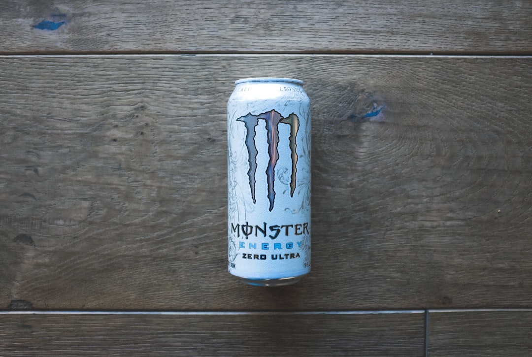
What font is the Monster Energy logo?
The Monster Energy logo is really two things: the green “M” claw mark and the wordmark. The claw, three rough vertical slashes forming an abstract M, is an illustrated symbol, not type at all, and it carries most of the brand recognition. The “Monster Energy” wordmark below it is custom, trademarked display lettering, heavy and condensed with rough, torn edges and an aggressive, almost scratched character. The letterforms are deliberately raw rather than polished, reinforcing the rebellious, high-energy positioning. Because both the claw and the wordmark are bespoke artwork, neither is available as an official downloadable font.
What is Monster Energy’s brand typeface?
Across cans, sponsorships and marketing, Monster pairs the distressed wordmark with bolder supporting type, often heavy condensed sans-serifs and uppercase treatments that keep the loud, athletic tone. The exact foundry fonts are not publicly published, so the honest description is “custom distressed display lettering for the wordmark, plus heavy condensed sans-serifs for supporting copy.” The constant is attitude: dense, dark, aggressive, usually black backgrounds with the toxic-green claw. For recreating the feel, focus on heaviness, condensation and a touch of grit rather than trying to name one official typeface.
Free fonts that look like the Monster Energy font
To approximate Monster, lean into heavy, condensed display faces and add texture. The green claw on black does as much work as the letters, so the typography just needs to feel dense and aggressive.
| Use case | Monster Energy uses | Free alternative |
|---|---|---|
| Logo / wordmark | Custom torn, heavy condensed display lettering (trademarked) | Anton, or a free grunge/distressed display face for the torn effect |
| Headlines | Heavy condensed display type | Anton or Oswald (Bold) in uppercase |
| Body / packaging | Bold condensed sans-serif | Oswald or Archivo Narrow for dense supporting copy |
Why does Monster Energy use this kind of type?
Energy drinks sell intensity, and Monster’s whole identity is engineered to feel dangerous and rebellious. Heavy, condensed, torn lettering signals aggression and adrenaline in a way a clean corporate sans never could, and pairing it with the green claw on a black can creates instant shelf presence in a crowded cooler. The roughness is the point: it reads as extreme sports, gaming and counterculture rather than polished commercialism. It is a deliberate contrast to athletic-but-sleek sports brands; compare it with our analysis of the Gatorade font, which chases speed and power with cleaner italic type.
Can I use the Monster Energy font for my own project?
Not the actual lettering or the claw. Both the wordmark and the green M claw are registered trademarks and custom artwork, and the claw in particular is aggressively protected, so copying it for your own product is a serious legal risk. For your own work, use a free heavy display face like Anton or a grunge typeface to get the energy, add your own distress texture, and design an original mark. For the full picture on trademarks versus fonts, see our font licensing guide.
Frequently Asked Questions
Is the Monster Energy claw a font?
No. The green claw, three jagged slashes forming an abstract M, is an illustrated logo mark, not type. It is custom, heavily protected trademarked artwork and carries most of the brand’s recognition on its own. The “Monster Energy” wordmark beneath it is separate custom display lettering, also not available as a downloadable font.
Is the Monster Energy font available to download?
No. The wordmark is custom, trademarked display lettering, and there is no official Monster Energy font release. Designers approximate the look with free heavy condensed faces like Anton or a grunge-style display font, then add their own torn or distressed texture. None of these will match the real letters, which are hand-built artwork.
Which free font is closest to Monster Energy?
Anton is a strong free starting point for the heavy, condensed weight, and a free grunge or distressed display face gets you the torn edges. For supporting text, Oswald or Archivo Narrow keep the dense, athletic tone. Combine a bold display face with added texture rather than expecting a single font to replicate the wordmark.
What colors define the Monster Energy brand?
Monster’s signature is a toxic, electric green claw on a black background, occasionally with white type. That high-contrast green-on-black is as recognizable as the lettering itself and is central to the aggressive, high-energy identity. If you are referencing the brand legitimately, the green-on-black relationship is the most defining visual cue.
Why does Monster Energy type look torn or distressed?
The rough, scratched lettering reinforces the brand’s rebellious, extreme-sports attitude. Clean type would feel corporate and tame, which is the opposite of what energy drinks sell. The distress signals danger, adrenaline and edge, matching the claw mark and the sponsorship of motocross, gaming and action sports that defines the brand’s culture.