What Font Does Gatorade Use?
The gatorade font is engineered to look fast. As the PepsiCo sports-drink giant, Gatorade dresses its name in heavy, leaning letters that read like motion frozen mid-stride, anchored by the famous lightning-bolt G. Like nearly every major brand, that wordmark is custom artwork rather than a font you can install. This guide, part of our famous brand fonts collection, breaks down the bolt mark, the italic wordmark, the reported brand type, and free fonts that capture the athletic energy.
What font is the Gatorade logo?
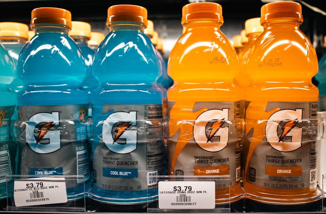
The Gatorade logo combines the lightning-bolt “G” symbol with a custom, trademarked wordmark. The “Gatorade” lettering is a bold, heavy sans-serif set in a strong forward italic, with condensed proportions that pack the letters tightly and tilt them into motion. That slant is the whole point: it signals speed, power and forward drive, perfectly matched to sports performance. The lightning bolt reinforces the same energy and has become a standalone brand asset. Because both the bolt and the wordmark are bespoke artwork, there is no official Gatorade font to download, only approximations of the heavy italic style.
What is Gatorade’s brand typeface?
Across bottles, advertising and stadium signage, Gatorade extends the athletic theme with bold, often condensed and italic sans-serifs that keep the sense of speed and strength. PepsiCo does not publicly publish the exact foundry fonts, so the accurate description is “custom heavy italic sans lettering for the wordmark, supported by bold condensed sans-serifs.” The tone is consistently powerful, modern and performance-driven. For recreating the look, the key ingredients are weight, condensation and a confident forward italic, rather than a single named typeface the brand has officially confirmed.
Free fonts that look like the Gatorade font
To approximate Gatorade, choose bold condensed sans-serifs and apply a strong italic. The lightning bolt and the forward lean do the heavy lifting, so the type just needs to feel athletic and fast.
| Use case | Gatorade uses | Free alternative |
|---|---|---|
| Logo / wordmark | Custom heavy italic condensed sans (trademarked) | Saira Condensed (Bold Italic) or Archivo (Bold Italic) |
| Headlines | Bold condensed sans, often italic | Oswald (Bold) with an applied italic, or Saira Condensed |
| Body / packaging | Strong, legible sans-serif | Archivo or a clean free sans at medium weights |
Why does Gatorade use this kind of type?
Gatorade sells athletic performance, and its typography is built to embody motion. A heavy, condensed italic reads as speed, strength and forward momentum, exactly the qualities an athlete wants to associate with what they drink mid-game. The lightning bolt amplifies that with an instant visual shorthand for energy. It is a sleeker, more polished take on aggression than the torn lettering of energy drinks; you can compare the two approaches in our breakdown of the Monster Energy font, which chases edge over athletic precision.
Can I use the Gatorade font for my own project?
Not the real wordmark or the bolt. Gatorade’s lettering and lightning-bolt G are registered trademarks and custom artwork, so there is no font to license, and copying them for your own product would invite legal trouble. For your own work, use a bold italic condensed sans like Saira Condensed or Oswald to get the athletic, fast feel, and design an original mark rather than borrowing the bolt. For the full rundown on trademarks versus fonts, read our font licensing guide.
Frequently Asked Questions
Is the Gatorade font available to download?
No. The Gatorade wordmark is custom, trademarked italic lettering, not a released font, and the lightning-bolt G is protected artwork too. There is no official Gatorade font file. To approximate the look, designers use bold italic condensed sans-serifs such as Saira Condensed, Oswald or Archivo, which capture the speed and weight without matching the exact letters.
Why is the Gatorade logo italic?
The forward italic slant signals speed, motion and athletic power, which aligns perfectly with a sports-performance drink. A leaning, condensed, heavy sans reads as momentum and drive in a way an upright font would not. Combined with the lightning bolt, the italic turns the wordmark into a symbol of energy and forward movement.
Which free font is closest to Gatorade?
Saira Condensed in a bold italic weight is one of the closest free matches for the heavy, leaning, condensed character of the Gatorade wordmark. Archivo in bold italic and Oswald with an applied italic also work well. None reproduce the custom letters exactly, since the original is hand-built, but they capture the athletic, fast tone.
What is the lightning bolt in the Gatorade logo?
The lightning-bolt “G” is Gatorade’s primary brand symbol, an abstract mark that doubles as an energy icon. It can stand alone without the full wordmark and is one of the most recognizable assets in sports marketing. As trademarked artwork, it cannot be freely reused, even when paired with lookalike italic fonts.
Who owns Gatorade and its logo?
Gatorade is owned by PepsiCo, which holds the trademarks for the wordmark and the lightning-bolt G. That ownership is why the lettering and bolt cannot be freely reused for other products. The athletic heavy-italic style itself, however, can be approximated with free condensed sans-serifs like Saira Condensed or Oswald.