Berol Brand Guidelines
The British school pen.
Aa
Two constants: a violet palette and a school-sans register. Abstract homage — not a Berol colour, label or barrel.
The British school pen
Berol is the British school-and-handwriting brand, once the Eagle Pencil Company and cousin to Prismacolor, now a Newell brand of imported goods.
Berol is a lesson in how a pencil house becomes a school-pen brand. In British classrooms Berol is the handwriting pen and the colouring fibre-tip — a school-and-education brand generations of British children learned to write with. But its roots are in pencils, and its family tree links it to Prismacolor. Its answer to how a pencil is made a business changed over a century: from the Eagle Pencil Company to a British school-stationery brand under a global owner. A name that moved from the pencil to the school pen.
Its identity is the British school brand. Berol’s handwriting pens and colouring fibre-tips are the work it is known for now. A name, carried from pencils to classrooms. A survivor of a long corporate story.
(Honest notes, so the story stays precise, because Berol’s status and history both need care. Berol survives today as a brand — it is owned by Newell Brands, with a UK head office at Lichfield in Staffordshire — but it is a brand of imported goods, not a manufacturer: its last UK factory closed in 2010, and the King’s Lynn factory before it closed in 2003. Its lineage is a genuine thread of pencil history: it began as the Eagle Pencil Company, founded in 1856 by Daniel Berolzheimer; it was renamed Berol in 1969, acquired by Empire Pencil in 1987, and then by Sanford — now part of Newell — in 1995. That same Eagle-Pencil heritage is why Berol’s old artist coloured pencils and Prismacolor are cousins: both trace to the same company. On the coloured pencils, we are honest: Berol’s artist coloured-pencil line (marketed in the UK as Karismacolor, a name we cite cautiously) was folded into Prismacolor and discontinued around the mid-2000s, so today Berol is a school-pen and handwriting brand, not an artist coloured-pencil maker. Its name and marks, and the Prismacolor name, are their owners’ IP, described but never reproduced, and there is no official brand hex — these tones are an unofficial interpretation. This is design commentary and does not promote any product.)
Colour
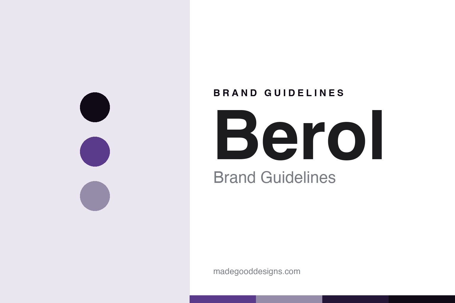
Berol lives in a violet palette. Click a swatch to copy the hex.
Berol’s identity is British, plain and scholastic — a violet, an ink, a lilac, a plum, and a paper. The palette leans violet and lilac: the register of a school handwriting pen and a classroom. It signals education and familiarity over prestige. The honest caveat: with no published brand hex, these values are an original, unofficial interpretation, not first-party colours.
The lesson is a violet palette signals a school-brand identity. Berol’s world is a scholastic, everyday, British object. For designers, it is a reminder that a school violet and a soft lilac can carry a brand built on the classroom — the colour of a handwriting pen and the calm of an exercise book. Because these tones can fail as small text, keep type dark and let the colour live in the accents, palette and band. The takeaways: know what you are now; honour the lineage; be honest about a discontinued line; and treat any single hex as unofficial.
Typography
The register is a school sans — plain, clear, educational.
Berol’s identity carries a plain, clear, educational spirit — a school brand, not a fine-art marque. A school sans captures the mood: even, legible and unpretentious, the register of a classroom staple. Set in a violet palette, the school sans feels plain and clear — exactly the personality Berol carries. It is educational rather than expressive, mirroring a handwriting pen. (Berol’s real labels and marks are things we describe but do not reproduce, and the exact typeface is not ours to use.) Because it is not ours to use, the honest description is “a school-sans spirit,” shown here in a stand-in. The type behaves like the brand: plain, clear and educational.
Aa
A school-sans spirit — plain and clear. (Specimen set in Libre Franklin, a school-sans STAND-IN; NOT the Berol wordmark or any label.)
The pencil makers, old and new
Berol stands for the pencil name that became a school brand.
Berol is a lesson in how a name outlives its factories. A violet palette, a school sans and a handwriting pen make one thing — a British school brand with a pencil-maker’s past — the whole story: British, plain and scholastic. The Eagle-Pencil lineage is the differentiator, and the honest present is the meaning. The point is a name that ran from a 19th-century pencil company through a chain of owners to a school-stationery brand, its artist coloured pencils long since folded into a cousin, Prismacolor.
Put to work, the identity is honest continuity as design. A brand in this spirit would carry a genuine lineage, be clear about what it is now — a school-pen brand of imported goods, not a manufacturer — and be honest about what has ended. A brand-builder learning from it would see that a real heritage is valuable even when the products change — that a name carrying pencil history into a classroom brand has a story a new entrant lacks — and that being precise, Eagle Pencil 1856, renamed Berol 1969, Empire 1987, Sanford/Newell 1995, factories closed, coloured pencils folded into Prismacolor, keeps that heritage honest rather than nostalgic fiction. A brand-builder learning from it would also value the family-tree fact: knowing Berol and Prismacolor are Eagle-Pencil cousins is exactly the kind of true, specific detail that makes a brand story credible. The lesson Berol teaches is that continuity can hold an identity: the lineage gives it depth, and the honesty about change keeps it credible. The heritage is the personality, and the school pen is the proof.
For designers and brand-builders, Berol holds the survivor pole in this round of the pencil makers, old and new, from Britain: carry the lineage, and be honest about what you are now. The lessons: honour the heritage; state the present plainly; disclose what was discontinued; note the family tree; and never reproduce a protected label. It is also a reminder to stay precise: Berol is a British school-and-handwriting brand, once the Eagle Pencil Company and cousin to Prismacolor, now a Newell brand of imported goods — with the palette here an unofficial interpretation. Berol made honest continuity the identity — proof that a lineage, truthfully told, can be the difference.
Explore & save
Keep Berol’s identity on hand — save it to a board in the Made Good inspiration library.
Berol identity set
Pin the violet palette and the school-sans register to your own board.