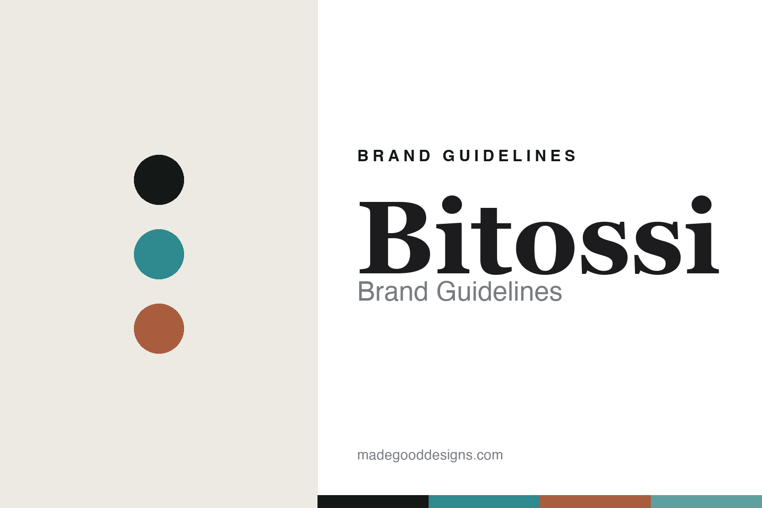
Bitossi Brand Guidelines
The Rimini blue.
Aa
Two constants: a rimini-blue-and-terracotta palette and a mid-century serif register. Abstract homage — not the Bitossi ceramics or packaging.
The Rimini blue
Bitossi makes a turquoise glaze the identity.
Bitossi is a lesson in a glaze as identity. Based in Montelupo Fiorentino, a historic Tuscan maiolica town, the modern company dates to around 1921 (Guido Bitossi), with a family ceramic lineage reaching back into the 19th century.
Its identity is the work of art director Aldo Londi, whose roughly half-century tenure defined the house. Londi created the signature “Rimini Blu” — a rich, textured turquoise-azure glaze on incised surfaces — and the beloved ceramic animals, above all the stylised blue cat (plus owls and horses). Bitossi also produced editions for Ettore Sottsass in the 1950s. The turquoise glaze and the sculptural animals are the brand.
(Honest notes: the modern company is ~1921 — the 19th-century roots are the family’s craft lineage, not the incorporated firm, so we don’t write “founded 1871.” Aldo Londi’s exact join date is reported (mid-1940s), and this is Bitossi Ceramiche — distinct from Bitossi Home and from the industrial Colorobbia/Bitossi group. There’s no official brand hex, so these tones are an unofficial interpretation. This is design commentary and does not promote any product.)
Colour
Bitossi lives in a rimini-blue-and-terracotta palette. Click a swatch to copy the hex.
Bitossi’s identity is turquoise, sculptural and Italian — a Rimini blue, an ink, a terracotta, a sea, and a cream. The palette pairs a Rimini blue with a terracotta — the register of a textured turquoise glaze on Tuscan clay. It signals glaze and craft rather than novelty. The honest caveat: with no published brand hex, these tones are an original, unofficial interpretation, not first-party values.
The lesson is a turquoise with a terracotta signals a glaze-led art ceramics house. Bitossi’s world is a textured turquoise cat. For designers, it is a reminder that one distinctive glaze, on a memorable form, can be the whole identity — right for mid-century art ceramics. Because a mid turquoise can fail as small text, keep type dark and let the colour live in the accents, palette and band. The takeaways: make the glaze the identity (Rimini Blu); attach it to a form (the animals); keep it crafted; and treat any single hex as unofficial.
Typography
The register is a mid-century serif — sculptural, Italian, crafted.
Bitossi’s identity carries a sculptural, Italian, crafted spirit — a turquoise glaze and a ceramic cat. A refined high-contrast serif captures the mood: it is elegant and mid-century, the register of a Tuscan art-ceramics house. Set in a rimini-blue-and-terracotta palette, the mid-century serif feels sculptural and Italian — exactly the personality Bitossi carries. It is crafted rather than plain, mirroring incised glaze. (Bitossi’s real ceramics and wordmark are works we describe but do not reproduce, and the exact typeface is not ours to use.) Because it is not ours to use, the honest description is “a mid-century serif spirit,” shown here in a stand-in. The type behaves like the brand: sculptural, Italian and crafted.
Aa
A mid-century serif spirit — sculptural and Italian. (Specimen set in Prata, an elegant high-contrast serif STAND-IN; NOT the Bitossi packaging.)
A glaze as identity
Bitossi stands for the Rimini Blu glaze and its animals.
Bitossi is a lesson in making a glaze the identity. A rimini-blue-and-terracotta palette, a mid-century serif and a textured turquoise animal make a glaze the whole brand — sculptural, Italian, crafted. The glaze is the differentiator. The differentiator is Aldo Londi’s Rimini Blu.
For designers and brand-builders, Bitossi offers a clear takeaway: own one glaze and one form. The lessons: make the glaze the identity (Rimini Blu); pair it with a memorable form (the animals); credit the designer (Londi, Sottsass); and be honest about the dates. It is also a reminder to stay accurate: the modern company is ~1921, it’s Bitossi Ceramiche (not the home line or the industrial group), and the palette here is an unofficial interpretation. Bitossi made a glaze the brand — proof that colour can be the difference.
Explore & save
Keep Bitossi’s identity on hand — save it to a board in the Made Good inspiration library.
Bitossi identity set
Pin the rimini-blue-and-terracotta palette and the mid-century-serif register to your own board.


