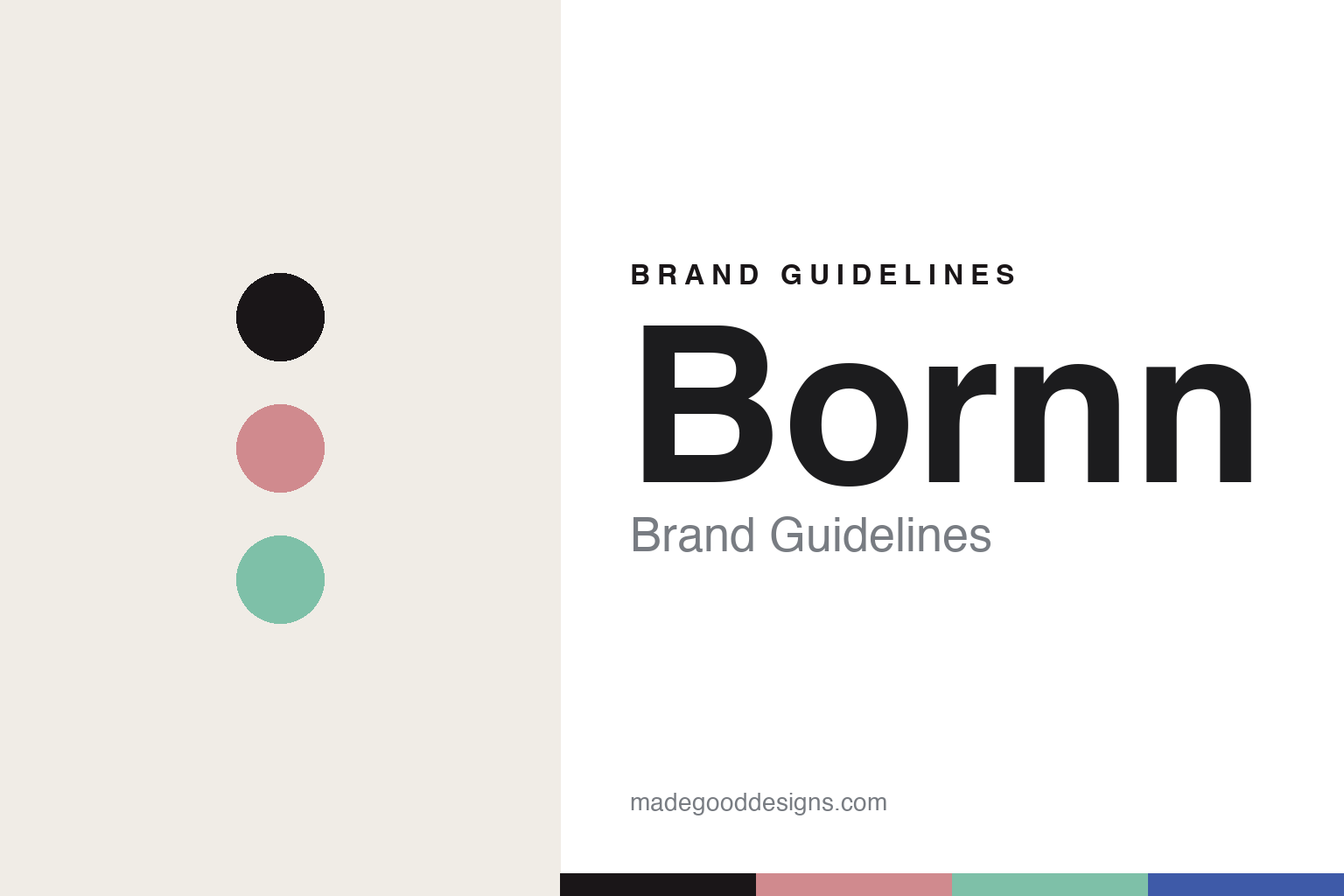
Bornn Brand Guidelines
The marbled enamel.
Aa
Two constants: a blush-and-mint palette and a playful sans register. Abstract homage — not the Bornn enamelware or packaging.
The marbled enamel
Bornn makes marbled enamel colourful again.
Bornn is a lesson in colour as identity. Founded in 2015 in Istanbul by two sisters, Başak Onay and Öykü Thurston, it set out to revive traditional Turkish enamelware — not from a family factory, but by partnering with the city’s master artisans.
Its identity is colour-forward, hand-marbled enamel on steel. Each piece is a steel body fused with a vitreous glass enamel, finished with a hand-marbled surface “where coincidence and the hand of the artisan play a strong role” — a contemporary, colour-rich reinvention of a humble material. Collections like Colorama, Island Breeze, New Marble and Primavera carry the palette, from Mint and Blush to Cobalt and Peach. It is enamel treated as modern design.
(Honest notes: this is a 2015 sister-founded design brand reviving a craft with local artisans — not a heritage manufacturing dynasty — and it is distinct from European heritage enamelware. The hand-marbled look is the verified signature; we don’t lean on any unconfirmed “splatterware” line. There’s no official brand hex — colour names are marketing, not values — so these tones are an unofficial interpretation. This is design commentary and does not promote any product.)
Colour
Bornn lives in a blush-and-mint palette. Click a swatch to copy the hex.
Bornn’s identity is colourful, modern and Turkish — a blush, an ink, a mint, a cobalt, and a cream. The palette pairs a blush with a mint — the register of hand-marbled, colour-rich enamel. It signals colour and craft rather than novelty. The honest caveat: with no published brand hex, these tones are an original, unofficial interpretation, not first-party values.
The lesson is a blush with a mint signals a colour-forward enamel brand. Bornn’s world is a bright, marbled enamel dish. For designers, it is a reminder that a soft, multi-colour palette turns a utilitarian material into design — right for modern enamelware. Because soft tones can fail as small text, keep type dark and let the colour live in the accents, palette and band. The takeaways: make colour the identity; embrace the hand-marbled variation; treat a humble material as design; and treat any single hex as unofficial.
Typography
The register is a playful sans — colourful, modern, warm.
Bornn’s identity carries a colourful, modern, warm spirit — a marbled enamel dish. A soft, rounded sans captures the mood: it is friendly and contemporary, the register of a colour-forward design brand. Set in a blush-and-mint palette, the playful sans feels colourful and modern — exactly the personality Bornn carries. It is warm rather than austere, mirroring bright enamel. (Bornn’s real enamelware and wordmark are works we describe but do not reproduce, and the exact typeface is not ours to use.) Because it is not ours to use, the honest description is “a playful sans spirit,” shown here in a stand-in. The type behaves like the brand: colourful, modern and warm.
Aa
A playful sans spirit — colourful and modern. (Specimen set in Quicksand, a soft rounded sans STAND-IN; NOT the Bornn packaging.)
Colour as identity
Bornn stands for colour-forward marbled enamel.
Bornn is a lesson in making colour the identity. A blush-and-mint palette, a playful sans and a hand-marbled enamel dish make colour the whole brand — colourful, modern, warm. The colour is the differentiator. The differentiator is modern, hand-marbled enamelware.
For designers and brand-builders, Bornn offers a clear takeaway: modernise a humble material with colour and craft. The lessons: make colour the identity; embrace hand-marbled variation; partner with artisans; and be honest about the story. It is also a reminder to stay accurate: it’s a 2015 Istanbul brand founded by two sisters reviving a craft (not a dynasty), and the palette here is an unofficial interpretation. Bornn made colour the brand — proof that a humble material can be the difference.
Explore & save
Keep Bornn’s identity on hand — save it to a board in the Made Good inspiration library.
Bornn identity set
Pin the blush-and-mint palette and the playful-sans register to your own board.


