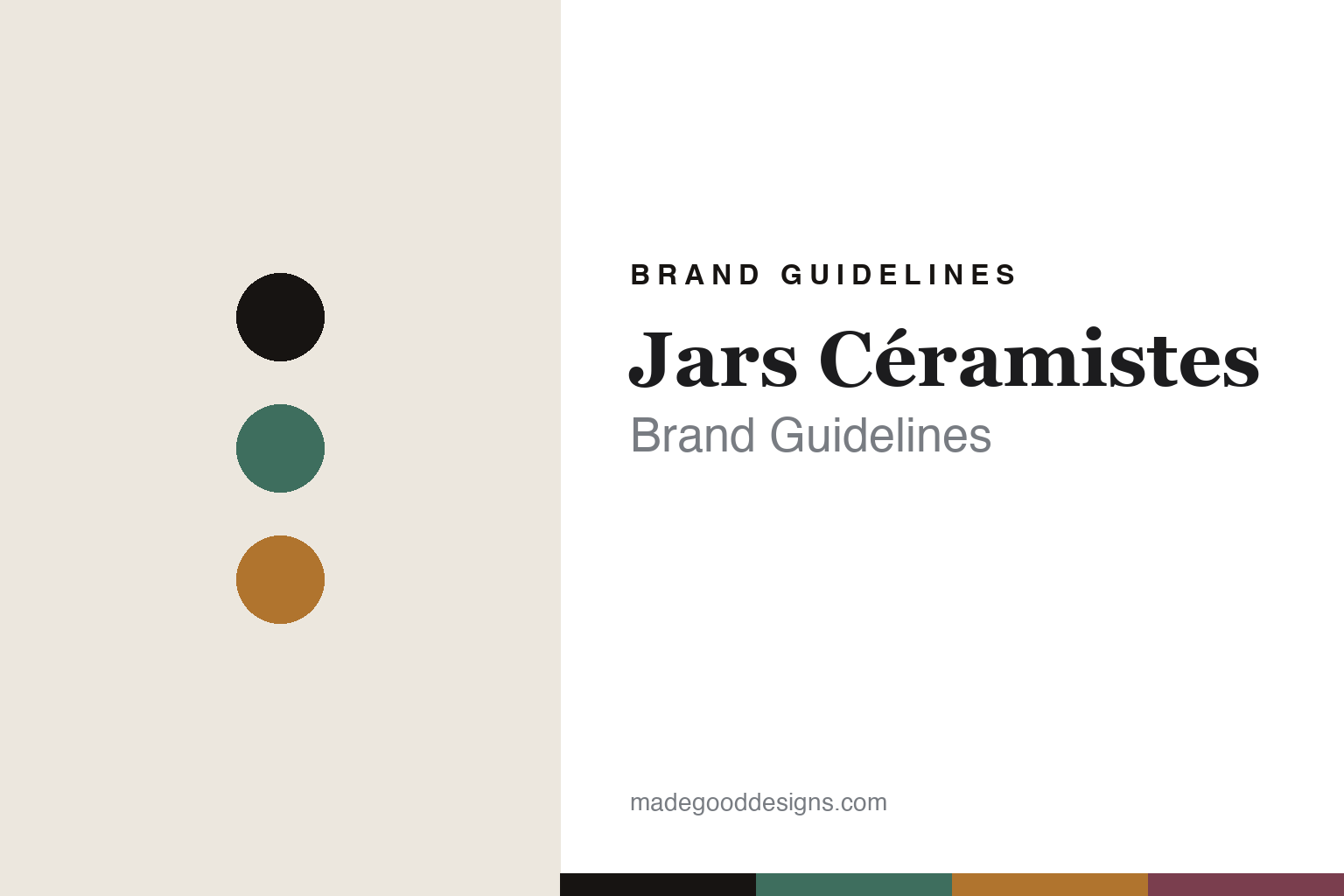
Jars Céramistes Brand Guidelines
The reactive glaze.
Aa
Two constants: a glaze-green-and-ochre palette and an artisanal serif register. Abstract homage — not the Jars stoneware or packaging.
The reactive glaze
Jars makes a living glaze the identity.
Jars Céramistes is a lesson in a glaze as identity. A French ceramics house that dates itself to 1857, it makes artisanal stoneware and has become a favourite of chefs and restaurants for the depth and character of its colour.
Its identity is reactive-glaze stoneware. Jars works in French grès émaillé — enamelled stoneware — hand-glazed with rich, deep, variegated reactive glazes, so the colour pools, breaks and shifts across each piece and no two are quite identical. It is the opposite of flat, printed colour: a living glaze that makes the material itself the design. Its “Jars & the Chefs” programme underlines the restaurant following.
(Honest notes: 1857 is confirmed on the brand’s own site; the founder “Pierre Jars,” the town of Anneyron in the Drôme, and family ownership are widely reported but weren’t confirmable this pass, so we say “founded 1857” and “made in France.” Because reactive glazes vary piece to piece, there’s no fixed brand colour — and no official hex — so these tones are an unofficial glaze-pool interpretation. This is design commentary and does not promote any product.)
Colour
Jars lives in a glaze-green-and-ochre palette. Click a swatch to copy the hex.
Jars’ identity is rich, artisanal and French — a glaze green, an ink, an ochre, a plum, and a cream. The palette pairs a glaze green with an ochre — the register of deep, variegated reactive glaze. It signals colour and craft rather than novelty. The honest caveat: with no published brand hex, these tones are an original, unofficial interpretation, not first-party values.
The lesson is a glaze green with an ochre signals a reactive-glaze stoneware house. Jars’ world is a plate where the colour lives and moves. For designers, it is a reminder that a variable, hand-glazed surface reads as rich and crafted — right for artisanal stoneware. Because a mid glaze green can fail as small text, keep type dark and let the colour live in the accents, palette and band. The takeaways: make the glaze the identity; embrace variation; go deep and rich; and treat any single hex as unofficial.
Typography
The register is an artisanal serif — rich, French, crafted.
Jars’ identity carries a rich, French, crafted spirit — a deep glazed plate. A warm contemporary serif captures the mood: it is characterful and grounded, the register of a long-lived French pottery. Set in a glaze-green-and-ochre palette, the artisanal serif feels rich and French — exactly the personality Jars carries. It is crafted rather than slick, mirroring reactive glaze. (Jars’ real stoneware and lowercase wordmark are works we describe but do not reproduce, and the exact typeface is not ours to use.) Because it is not ours to use, the honest description is “an artisanal serif spirit,” shown here in a stand-in. The type behaves like the brand: rich, French and crafted.
Aa
An artisanal serif spirit — rich and French. (Specimen set in Lora, a warm contemporary serif STAND-IN; NOT the Jars packaging.)
A glaze as identity
Jars stands for reactive-glaze stoneware.
Jars Céramistes is a lesson in making a glaze the identity. A glaze-green-and-ochre palette, an artisanal serif and a deep, variegated plate make a glaze the whole brand — rich, French, crafted. The glaze is the differentiator. The differentiator is a living, reactive surface.
For designers and brand-builders, Jars offers a clear takeaway: let variation be the signature. The lessons: make the glaze the identity; embrace piece-to-piece variation; go deep and rich; and be honest about the story. It is also a reminder to stay accurate: it dates to 1857, is French artisanal stoneware, and the palette here is an unofficial glaze-pool interpretation. Jars made a glaze the brand — proof that a living surface can be the difference.
Explore & save
Keep Jars Céramistes’s identity on hand — save it to a board in the Made Good inspiration library.
Jars Céramistes identity set
Pin the glaze-green-and-ochre palette and the artisanal-serif register to your own board.


