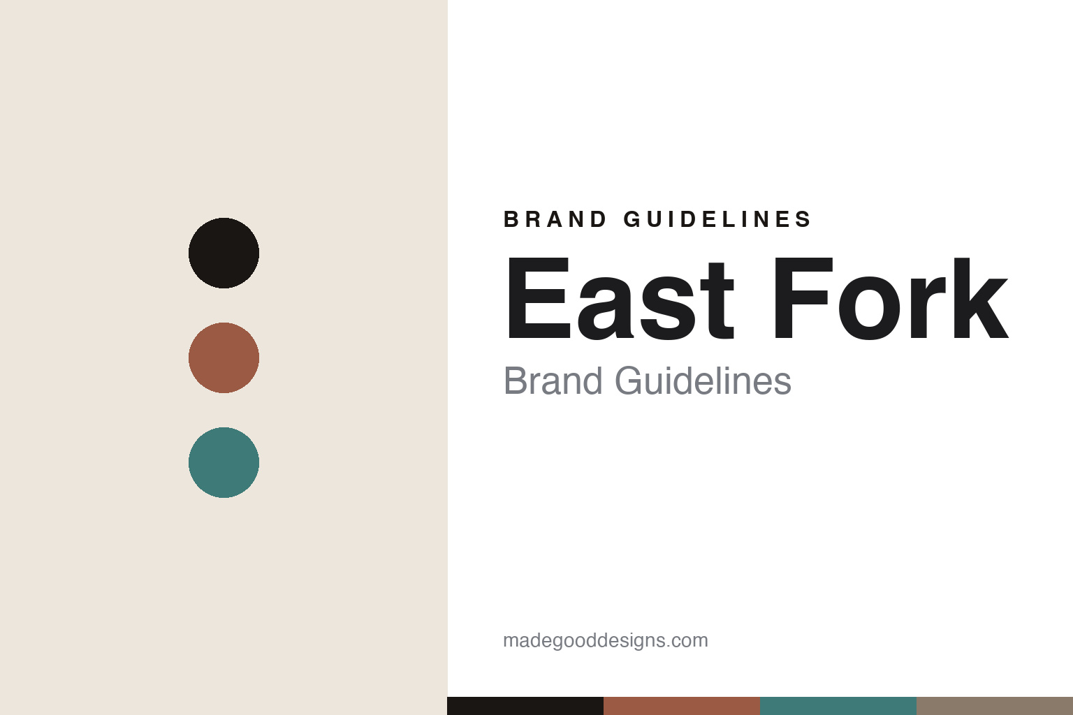
East Fork Brand Guidelines
The curated glaze.
Aa
Two constants: an amaro-and-lagoon palette and an editorial sans register. Abstract homage — not the East Fork tableware or packaging.
The curated glaze
East Fork makes a colour range the identity.
East Fork is a lesson in a curated palette as identity. Started in the early 2010s by Alex Matisse (with co-founders) as a wood-fired pottery on an old tobacco farm in the Blue Ridge Mountains of North Carolina, it grew into a factory in Asheville — a values-driven, B Corp American pottery.
Its identity is the curated glaze palette. East Fork makes simple, everyday American stoneware, cast and finished in Asheville from Southeast-sourced materials, and sells it in a tightly edited set of matte, muted, earthy glaze colours — seven year-round core hues plus seasonal releases, with names like Amaro, Lagoon and Morel. The forms are plain (“The Mug,” “The Bowl”); the colour is the story.
(Honest notes: the founding is best given as the early 2010s — the brand’s own “15 years” framing points to about 2011. Alex Matisse is reportedly a great-grandson of the painter Henri Matisse — a light aside, not the headline. “Made in USA” applies to the stoneware, not necessarily every accessory it retails; and the glaze names are marketing, not published hex, so these tones are an unofficial interpretation. This is design commentary and does not promote any product.)
Colour
East Fork lives in an amaro-and-lagoon palette. Click a swatch to copy the hex.
East Fork’s identity is earthy, curated and American — an amaro, an ink, a lagoon, a morel, and an eggshell. The palette pairs an amaro with a lagoon — the register of a tightly edited set of matte glazes. It signals colour curation and craft rather than novelty. The honest caveat: with no published brand hex, these tones are an original, unofficial interpretation, not first-party values.
The lesson is an amaro with a lagoon signals a colour-curated pottery. East Fork’s world is a shelf of muted, matte stoneware. For designers, it is a reminder that a tightly edited palette — not the form — can be the whole identity. The takeaways: curate the colours; keep the forms plain; make the palette the story; and treat any single hex as unofficial.
Typography
The register is an editorial sans — warm, curated, American.
East Fork’s identity carries a warm, curated, American spirit — a values-driven pottery. A clean editorial sans captures the mood: it is quiet and considered, the register of a modern DTC brand that lets colour lead. Set in an amaro-and-lagoon palette, the editorial sans feels warm and curated — exactly the personality East Fork carries. It is understated rather than loud, mirroring matte stoneware. (East Fork’s real tableware and wordmark are works we describe but do not reproduce, and the exact typeface is not ours to use.) Because it is not ours to use, the honest description is “an editorial sans spirit,” shown here in a stand-in. The type behaves like the brand: warm, curated and American.
Aa
An editorial sans spirit — warm and curated. (Specimen set in Hanken Grotesk, a humanist sans STAND-IN; NOT the East Fork packaging.)
A curated palette as identity
East Fork stands for the curated glaze palette.
East Fork is a lesson in making a curated palette the identity. An amaro-and-lagoon palette, an editorial sans and plain matte stoneware make colour curation the whole brand — warm, curated, American. The palette is the differentiator. The differentiator is an edited set of matte glazes.
For designers and brand-builders, East Fork offers a clear takeaway: edit the colours, not the forms. The lessons: curate a tight palette; keep the shapes plain; lead with values (B Corp, 1% of sales); and be honest about the story. It is also a reminder to stay accurate: it’s an early-2010s Asheville pottery, “Made in USA” is scoped to the stoneware, and the palette here is an unofficial interpretation. East Fork made a palette the brand — proof that curation can be the difference.
Explore & save
Keep East Fork’s identity on hand — save it to a board in the Made Good inspiration library.
East Fork identity set
Pin the amaro-and-lagoon palette and the editorial-sans register to your own board.


