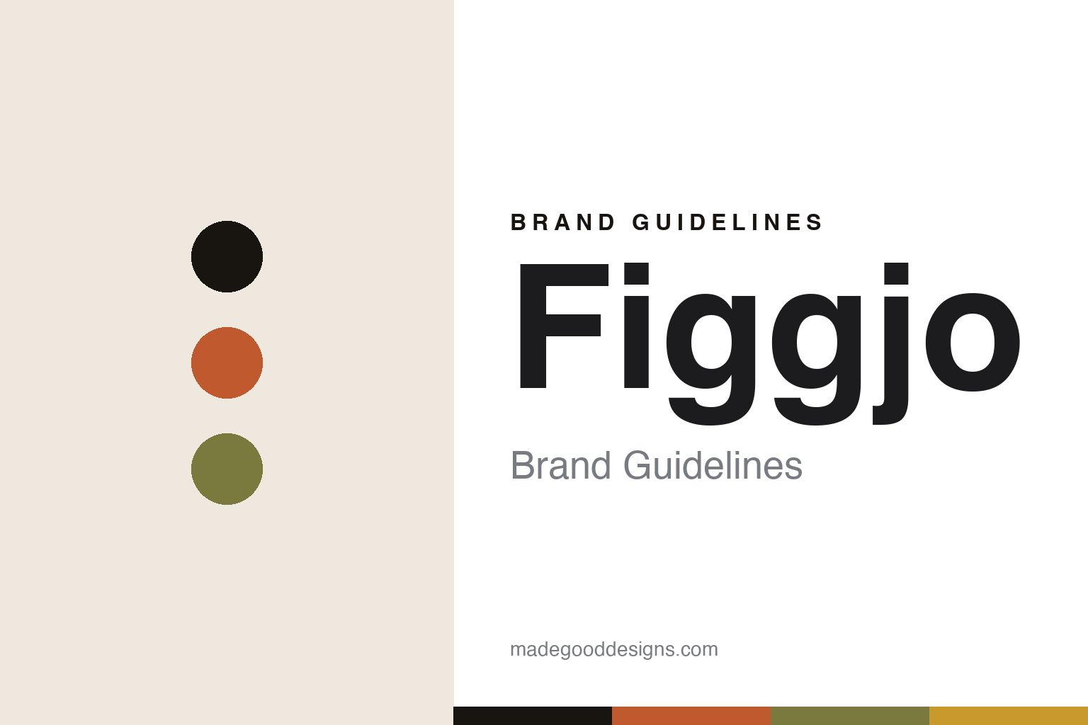
Figgjo Brand Guidelines
The folk-modern decor.
Aa
Two constants: an orange-and-olive palette and a retro sans register. Abstract homage — not the Figgjo tableware or patterns.
The folk-modern decor
Figgjo made mid-century decoration the identity.
Figgjo is a lesson in a decorated pattern as identity. Founded in 1941 (as Figgjo Fajanse) in Figgjo, near Stavanger, Norway, it is today the sole remaining domestic ceramic tableware maker in Norway — and its design fame rests on one mid-century era.
Its identity is folk-modern decoration. From 1960, the designer Turi Gramstad Oliver created many of Figgjo’s best-known decors — bold, hand-decorated, folk-modern patterns (Market, Lotte, Clupea, Tor Viking) that became icons of 1960s–70s Scandinavian tableware. Today the company makes durable professional porcelain (Bris, Tilt, Furo), still in Norway — but the design story lives in Turi’s decorated ranges.
(Honest notes: Turi Gramstad Oliver is a woman (she/her), whose decorated ranges are the collectible heritage. We keep that vintage “Turi era” distinct from the current professional porcelain lines. Pattern names beyond the verified set (Market — not “Torvpris” — Lotte, Clupea, Tor Viking) are hedged. There’s no official brand hex, so these tones are an unofficial interpretation. This is design commentary and does not promote any product.)
Colour
Figgjo lives in an orange-and-olive palette. Click a swatch to copy the hex.
Figgjo’s identity is warm, retro and Norwegian — a Turi orange, an ink, an olive, a mustard, and a cream. The palette pairs an orange with an olive — the register of 1960s–70s folk-modern decoration. It signals pattern and era rather than novelty. The honest caveat: with no published brand hex, these tones are an original, unofficial interpretation, not first-party values.
The lesson is an orange with an olive signals a mid-century decorated tableware brand. Figgjo’s world is a warm, patterned plate. For designers, it is a reminder that a bold, era-defining palette can carry a decorated-ceramics identity for decades. The takeaways: make the decoration the identity; commit to an era’s palette; credit the designer; and treat any single hex as unofficial.
Typography
The register is a retro sans — warm, folk-modern, Norwegian.
Figgjo’s identity carries a warm, folk-modern, Norwegian spirit — a mid-century decorated plate. A friendly rounded sans captures the mood: it is warm and characterful, the register of retro Scandinavian design. Set in an orange-and-olive palette, the retro sans feels warm and folk-modern — exactly the personality Figgjo carries. It is cheerful rather than austere, mirroring bold decoration. (Figgjo’s real tableware and patterns are works we describe but do not reproduce, and the exact typeface is not ours to use.) Because it is not ours to use, the honest description is “a retro sans spirit,” shown here in a stand-in. The type behaves like the brand: warm, folk-modern and Norwegian.
Aa
A retro sans spirit — warm and folk-modern. (Specimen set in Rubik, a warm rounded sans STAND-IN; NOT the Figgjo packaging.)
A decorated pattern as identity
Figgjo stands for the mid-century folk-modern decor.
Figgjo is a lesson in making a decorated pattern the identity. An orange-and-olive palette, a retro sans and a bold folk-modern decor make decoration the whole brand — warm, folk-modern, Norwegian. The decoration is the differentiator. The differentiator is Turi Gramstad Oliver’s mid-century patterns.
For designers and brand-builders, Figgjo offers a clear takeaway: let a decorated era define you. The lessons: make the pattern the identity; own an era’s palette; credit the designer; and be honest about the story. It is also a reminder to stay accurate: it’s a 1941 Norwegian maker (still Norwegian-made), Turi’s decors are the heritage, the current lines are professional porcelain, and the palette here is an unofficial interpretation. Figgjo made decoration the brand — proof that a pattern can be the difference.
Explore & save
Keep Figgjo’s identity on hand — save it to a board in the Made Good inspiration library.
Figgjo identity set
Pin the orange-and-olive palette and the retro-sans register to your own board.