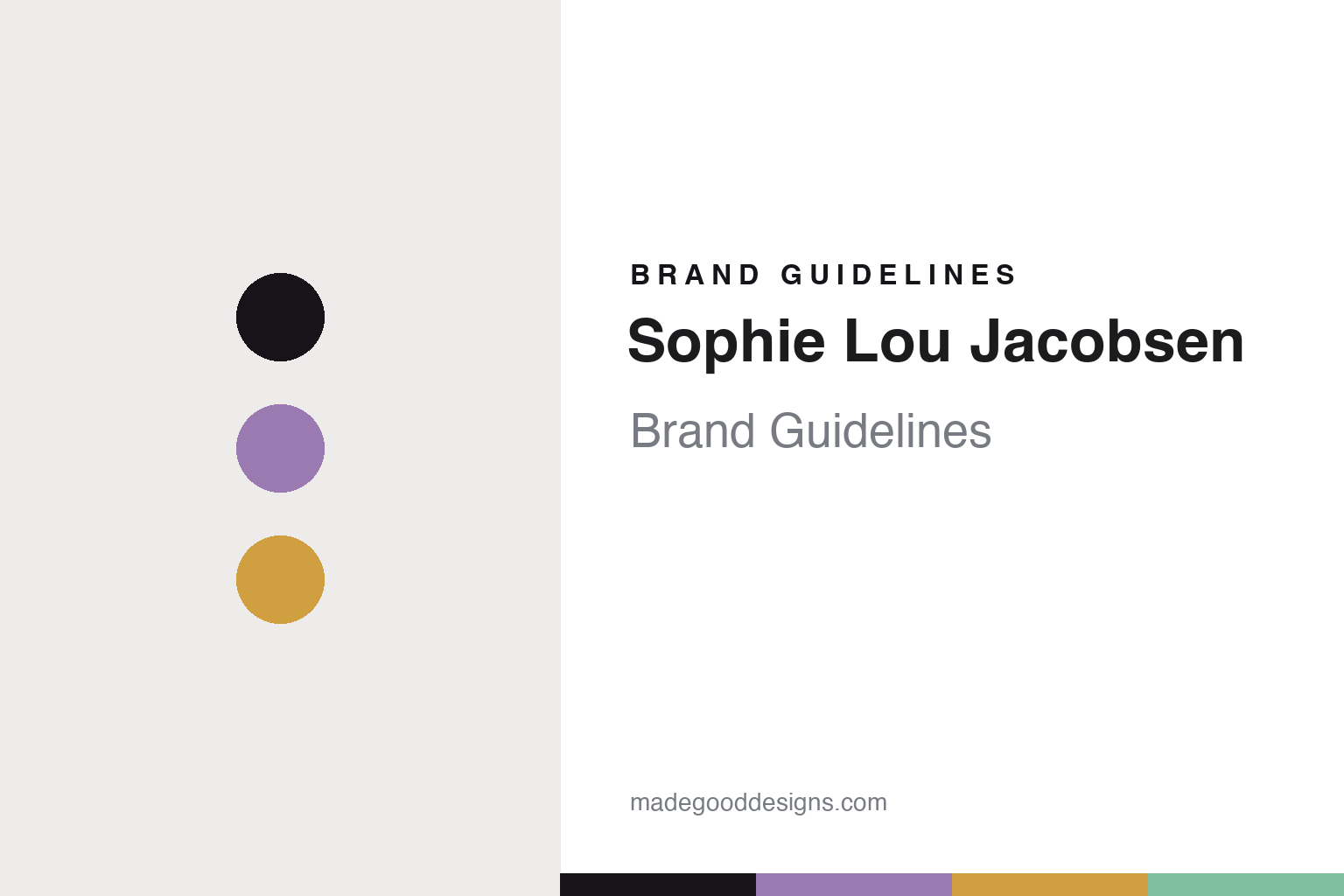
Sophie Lou Jacobsen Brand Guidelines
The colour wave.
Aa
Two constants: a lilac-and-amber palette and a playful sans register. Abstract homage — not the Sophie Lou Jacobsen glassware or packaging.
The colour wave
Sophie Lou Jacobsen makes glass joyful.
Sophie Lou Jacobsen is a lesson in colour and joy as identity. A French-American designer, artist and creative director, she established her eponymous studio in 2019 — a contemporary, independent design practice built on colour.
Its identity is colour-forward contemporary glassware. Under the tagline “old world, new rituals,” the studio makes cocktail and wine glasses, pitchers, carafes and bowls — joyful, sculptural, tinted objects, with the rippled Wave pieces (including the Wave pitcher) among its best-known. Verified collections like Disco Aperitivo and Bilboquet extend the playful, colour-driven language. It is everyday glass reimagined as something to delight in.
(Honest notes: the studio was established in 2019 (not 2020); the New York base is reported. The glass is designed in New York and handblown using Venetian/European technique with named glassblowers — so we say “handblown with artisan glassblowers,” not “made in Italy.” Some product names circulating online are unverified, so we lean on confirmed collections. There’s no official brand hex, so these tones are an unofficial interpretation. This is design commentary and does not promote any product.)
Colour
Sophie Lou Jacobsen lives in a lilac-and-amber palette. Click a swatch to copy the hex.
The studio’s identity is colourful, joyful and contemporary — a lilac, an ink, an amber, a mint, and a cream. The palette pairs a lilac with an amber — the register of tinted, playful glass. It signals colour and delight rather than novelty. The honest caveat: with no published brand hex, these tones are an original, unofficial interpretation, not first-party values.
The lesson is a lilac with an amber signals a colour-forward glass studio. Its world is a shelf of tinted, sculptural glass. For designers, it is a reminder that colour and playful form can reinvent even the humble drinking glass. Because soft tints can fail as small text, keep type dark and let the colour live in the accents, palette and band. The takeaways: make colour the identity; play with form (the wave); reimagine the everyday; and treat any single hex as unofficial.
Typography
The register is a playful sans — joyful, contemporary, colourful.
The studio’s identity carries a joyful, contemporary, colourful spirit — a tinted, rippled glass. A soft, rounded sans captures the mood: it is warm and playful, the register of a contemporary design studio. Set in a lilac-and-amber palette, the playful sans feels joyful and contemporary — exactly the personality the studio carries. It is cheerful rather than austere, mirroring colour-forward glass. (The studio’s real glassware and wordmark are works we describe but do not reproduce, and the exact typeface is not ours to use.) Because it is not ours to use, the honest description is “a playful sans spirit,” shown here in a stand-in. The type behaves like the brand: joyful, contemporary and colourful.
Aa
A playful sans spirit — joyful and contemporary. (Specimen set in Quicksand, a soft rounded sans STAND-IN; NOT the Sophie Lou Jacobsen packaging.)
Colour as identity
Sophie Lou Jacobsen stands for colour-forward glass.
Sophie Lou Jacobsen is a lesson in making colour the identity. A lilac-and-amber palette, a playful sans and a rippled, tinted glass make colour the whole brand — joyful, contemporary, colourful. The colour is the differentiator. The differentiator is playful, colour-forward glass.
For designers and brand-builders, the studio offers a clear takeaway: make the everyday joyful. The lessons: make colour the identity; play with form; reimagine the ordinary object; and be honest about the making. It is also a reminder to stay accurate: the studio was established in 2019, the glass is designed in New York and handblown with artisan glassblowers, and the palette here is an unofficial interpretation. Sophie Lou Jacobsen made colour the brand — proof that joy can be the difference.
Explore & save
Keep Sophie Lou Jacobsen’s identity on hand — save it to a board in the Made Good inspiration library.
Sophie Lou Jacobsen identity set
Pin the lilac-and-amber palette and the playful-sans register to your own board.


