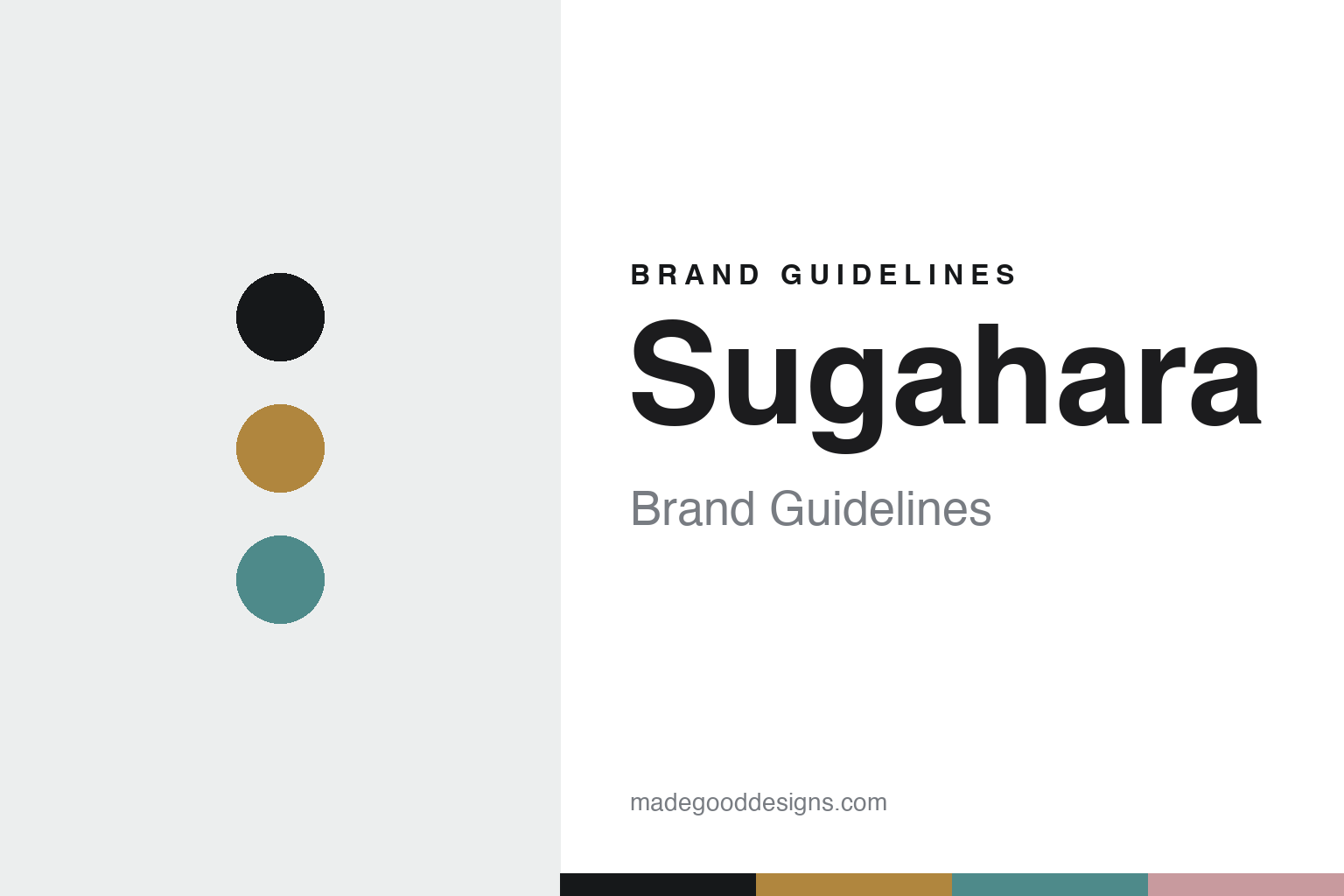
Sugahara Brand Guidelines
The handblown bubble.
Aa
Two constants: an amber-and-aqua palette and a craft sans register. Abstract homage — not the Sugahara glass or packaging.
The handblown bubble
Sugahara turns a flaw into the signature.
Sugahara is a lesson in the handmade as identity. Founded from a small Tokyo glassworks in 1932 (incorporated 1961, and making glass in Kujukuri, Chiba since 1962), it works in the Edo Glass (江戸硝子) tradition — mouth-blown by hand, by certified craft masters.
Its identity is handblown glass, warm and imperfect. Sugahara makes everyday tumblers, plates, vases and wind chimes, hand-shaped at around 1,400°C — and its signature move is to embrace what industry rejects: it turns the bubble, traditionally treated as a flaw, into an intentional design feature, alongside colour-layering and organic forms. The handmade, slightly-uneven quality is the whole point.
(Honest notes: “1932” is a sole-proprietor origin, not a corporation, so we phrase it as “1932 origins, Chiba since 1962.” Sugahara’s heritage is Japanese Edo glass, though it invited Czech master blowers in 1988 — so we don’t claim a purely unbroken indigenous lineage. There’s no official brand hex, so these tones are an unofficial interpretation. This is design commentary and does not promote any product.)
Colour
Sugahara lives in an amber-and-aqua palette. Click a swatch to copy the hex.
Sugahara’s identity is warm, handmade and Japanese — an amber, an ink, a glass aqua, a pale pink, and a mist. The palette pairs an amber with an aqua — the register of warm, colour-layered handblown glass. It signals craft and warmth rather than novelty. The honest caveat: with no published brand hex, these tones are an original, unofficial interpretation, not first-party values.
The lesson is an amber with an aqua signals a handblown-glass house. Sugahara’s world is a warm, softly-imperfect vessel. For designers, it is a reminder that embracing the handmade — even its “flaws” — can be the whole identity. The takeaways: make the handmade the identity; turn a flaw into a feature (the bubble); keep the palette warm; and treat any single hex as unofficial.
Typography
The register is a craft sans — warm, handmade, Japanese.
Sugahara’s identity carries a warm, handmade, Japanese spirit — a hand-shaped vessel. A clean, warm sans captures the mood: it is friendly and understated, the register of a craft-forward Japanese brand. Set in an amber-and-aqua palette, the craft sans feels warm and handmade — exactly the personality Sugahara carries. It is honest rather than slick, mirroring handblown glass. (Sugahara’s real glass and “Sghr” wordmark are works we describe but do not reproduce, and the exact typeface is not ours to use.) Because it is not ours to use, the honest description is “a craft sans spirit,” shown here in a stand-in. The type behaves like the brand: warm, handmade and Japanese.
Aa
A craft sans spirit — warm and handmade. (Specimen set in Manrope, a clean humanist sans STAND-IN; NOT the Sugahara packaging.)
The handmade as identity
Sugahara stands for handblown Edo glass.
Sugahara is a lesson in making the handmade the identity. An amber-and-aqua palette, a craft sans and a hand-shaped vessel make the handmade the whole brand — warm, handmade, Japanese. The handmade is the differentiator. The differentiator is warm, imperfect handblown glass.
For designers and brand-builders, Sugahara offers a clear takeaway: make the imperfection the feature. The lessons: embrace the handmade; turn a flaw into a signature (the bubble); keep the palette warm; and be honest about the story. It is also a reminder to stay accurate: it has 1932 origins and has made glass in Chiba since 1962, and the palette here is an unofficial interpretation. Sugahara made the handmade the brand — proof that warmth can be the difference.
Explore & save
Keep Sugahara’s identity on hand — save it to a board in the Made Good inspiration library.
Sugahara identity set
Pin the amber-and-aqua palette and the craft-sans register to your own board.


