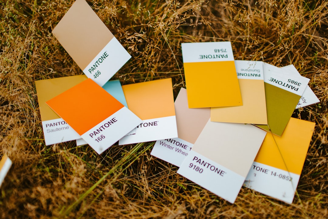
Fall Color Palettes (With Hex Codes)
Fall is the most emotionally rich color season — warm, nostalgic, and grounded in nature’s shift from green to gold. A well-built set of color palettes for fall brings that cozy, harvest mood to weddings, branding, decor, and digital design. The principle: lean on warm, slightly muted earth tones — oranges, rusts, mustards, and deep reds — balanced by a soft cream or charcoal neutral.
How to choose a fall color palette
Pick three to four colors: a warm dominant (orange, rust, or mustard), a deeper anchor (burgundy, brown, or olive), an accent, and a neutral. Autumn colors are most authentic when slightly desaturated — think pumpkin rather than neon orange. Use the 60-30-10 rule so one warm tone leads, supported by depth and a light or dark neutral. Match the mood to your use: bright golds feel cheerful, deep plums feel luxe and moody. For pairing warm hues effectively, see warm vs cool colors.
Burnt Orange & Rust
The definitive fall palette — warm, glowing, and instantly evocative of changing leaves and harvest light.
Hex: #BF5722, #9C3B1B, #E8A14A, #F3E7D3 — #BF5722 leads, #9C3B1B for depth, #E8A14A golden accent, #F3E7D3 cream background.
Mustard & Olive
Earthy, vintage, and grounded — golden mustard with muted olive feels retro and effortlessly autumnal.
Hex: #D4A017, #6B6B2E, #8C5A2B, #EFE8D6 — #D4A017 mustard leads, #6B6B2E olive grounds it, #8C5A2B warm brown, #EFE8D6 neutral base.
Burgundy & Plum
Deep, moody jewel tones — rich wine and plum bring luxe drama to late-autumn weddings and branding.
Hex: #5E1A2E, #7D3551, #C47E3F, #ECE2D0 — #5E1A2E anchors, #7D3551 plum adds range, #C47E3F amber accent, #ECE2D0 keeps it breathable.
Golden Harvest
Warm, abundant, and cheerful — amber and pumpkin with cream capture the sunny side of autumn.
Hex: #E08A1E, #C96F12, #A85323, #F6ECD8 — #E08A1E amber leads, #C96F12 and #A85323 add warmth and depth, #F6ECD8 cream background.
Forest & Rust
Woodsy and grounded — deep evergreen paired with rust evokes hikes, flannel, and crisp autumn air.
Hex: #2F4030, #56713F, #B0552C, #E8DDC7 — #2F4030 forest base, #56713F mid-green, #B0552C rust accent, #E8DDC7 oat neutral.
Cocoa & Caramel
Soft, warm, and edible — rich browns and caramel feel cozy, neutral, and perfect for fall lifestyle brands.
Hex: #4A3326, #9A6B43, #D2A679, #F3EBDD — #4A3326 cocoa for type, #9A6B43 and #D2A679 caramel mids, #F3EBDD soft cream background.
Tips for using these fall palettes
Slightly desaturate your hues — true autumn colors are warm but muted, so a pumpkin orange reads more authentic than a neon one. Anchor warm-heavy palettes with a deep brown, charcoal, or forest tone to keep them from feeling flat. Add texture in physical projects (wood, linen, dried florals) to amplify the cozy mood. For digital work, pair these warm tones with plenty of cream space so they breathe. Explore foundational pairing in our color theory guide, and see seasonal crossover in wedding color palettes.
Frequently Asked Questions
What colors represent fall?
The classic autumn colors are burnt orange, rust, mustard yellow, deep red or burgundy, olive green, and warm brown. These mirror the changing leaves and harvest season. They feel most authentic when slightly muted rather than fully saturated, evoking warmth, nostalgia, and coziness.
What is a good fall color palette for a wedding?
Burgundy and plum with gold accents is a top fall wedding choice for its rich, romantic drama, while burnt orange with cream and olive feels warmer and more relaxed. Anchor either with a soft neutral so the deep tones don’t overwhelm florals and linens.
How do I make a fall palette feel cozy not gloomy?
Balance deep, moody tones with a warm light neutral like cream or oat, and add a golden accent for glow. Keeping the dominant hue warm rather than cool prevents heaviness. In physical spaces, natural textures like wood and linen reinforce warmth over darkness.
Can I use green in a fall palette?
Absolutely — olive, sage, and deep forest greens are core autumn colors that mirror pine and fading foliage. Pairing a muted green with rust or mustard creates a grounded, woodsy palette. Avoid bright spring greens, which read as fresh rather than seasonal.
What neutral works best with fall colors?
Warm neutrals like cream, oat, taupe, and soft beige complement autumn hues far better than cool gray or stark white. For darker, moodier palettes, deep charcoal or espresso brown makes an excellent anchor. The goal is to keep the whole scheme warm-toned and cohesive.