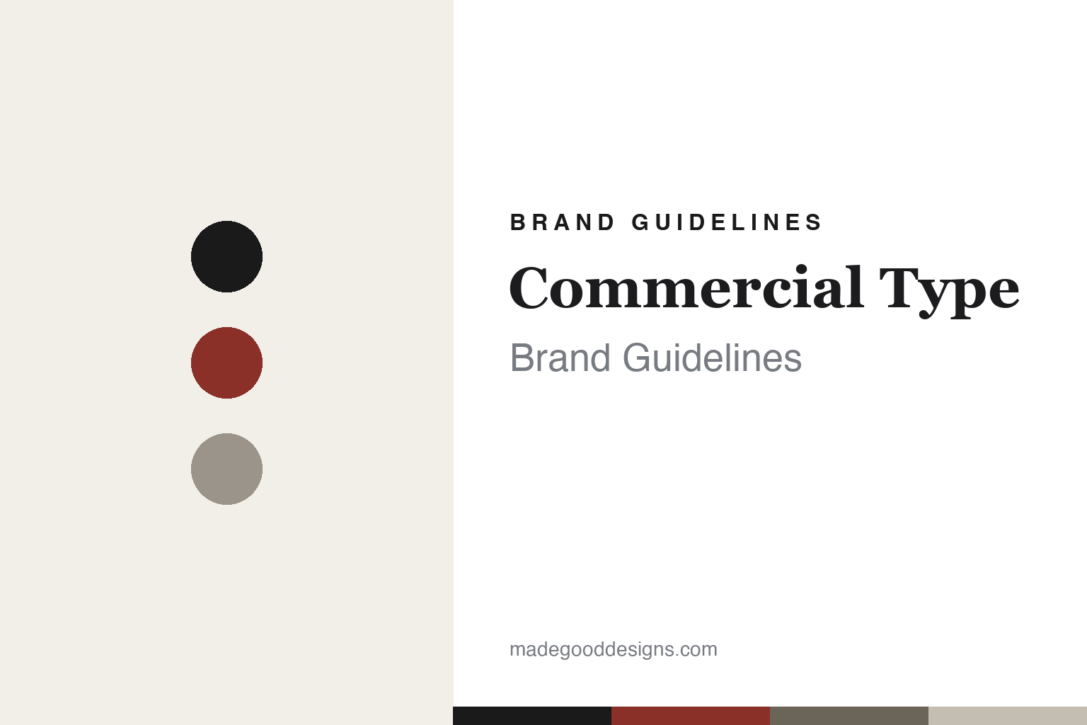
Commercial Type Brand Guidelines
Editorial heritage.
Aa
Two constants: an editorial monochrome palette and a newspaper-rooted type register. Abstract homage — not the Commercial Type wordmark or its typefaces.
Editorial heritage
Commercial Type built the modern masthead.
Commercial Type is a lesson in editorial gravity as a brand. Run by Paul Barnes and Christian Schwartz — collaborators since 2004, with the foundry established around 2007 across London and New York — it is behind some of the era’s defining type: the ubiquitous sans Graphik, the newspaper landmark Guardian / Guardian Egyptian, plus Publico, Austin, Canela, Portrait and Druk.
Its brand design is serious, editorial and heritage-rooted: a minimalist, grid-driven, rigorously typographic presentation that lets the type carry everything — the register of a high-end, publishing-grade foundry. It also runs a real revival imprint, Commercial Classics, dedicated to 19th-century British type.
(Honest notes: the founding year is reported inconsistently — the pair have collaborated since 2004, with the foundry set up around 2007–08 — so we don’t pin a single year. Lyon is designed by Kai Bernau and published by Commercial Type. And there’s no official brand hex — the palette is neutral with variable accents, so we don’t claim “red” is a signature colour; the tones here are an unofficial interpretation.)
Colour
Commercial Type lives in editorial monochrome. Click a swatch to copy the hex.
Commercial Type’s identity is serious, editorial and restrained — an ink, an editorial red, a newsprint grey, a stone, and a paper. The palette is essentially neutral monochrome — black on paper, grey supporting tones, with an occasional editorial accent — the register of a newspaper page. It signals seriousness and heritage rather than colour or play. The honest caveat: with no published brand hex, these tones are an original, unofficial interpretation, not first-party values — and we don’t assert red as an official accent.
The lesson is editorial monochrome reads as serious and authoritative. Commercial Type’s world is a well-set masthead. For designers, it is a reminder that a restrained, typographic, near-monochrome system — black type, generous grid, a single quiet accent — signals credibility and gravity, exactly right for publishing-grade work. The takeaways: use neutral monochrome for authority; let the grid and type lead; and treat any single hex (and any accent) as unofficial — using deep ink for small text so the page stays serious.
Typography
The register is a newspaper-rooted type — serious and editorial.
Commercial Type’s identity carries a serious, editorial, heritage spirit — a restrained, typographic page rooted in newspapers. A sturdy, newspaper-rooted slab captures the mood: it is authoritative and editorial, the register of a masthead built to be read. Set in editorial monochrome, the slab feels serious and editorial — exactly the publishing-grade personality Commercial Type carries. It is authoritative rather than playful, mirroring a well-set newspaper. (Commercial Type’s real wordmark and its retail typefaces — Guardian Egyptian, Graphik, Publico and the rest — are commercial products and trademarks we name but do not reproduce or set text in; the exact brand typeface is not ours to use.) Because those faces are not ours to set, the honest description is “a newspaper-rooted type spirit,” shown here in a stand-in. The type behaves like the brand: serious, authoritative and editorial.
Aa
A newspaper-rooted type spirit — serious and editorial. (Specimen set in Zilla Slab, a slab-serif STAND-IN; NOT Commercial Type’s wordmark or any Commercial Type retail typeface, which are trademarks.)
Gravity as identity
Commercial Type stands for editorial authority.
Commercial Type is a lesson in authority through restraint. A neutral monochrome palette, a rigorous grid and a catalogue of masthead-defining type make editorial gravity the whole identity — serious, credible, publishing-grade. The restraint and heritage are the differentiator. The differentiator is a serious, editorial, newspaper-rooted identity.
For designers and brand-builders, Commercial Type offers a clear takeaway: restraint plus heritage signals authority. The lessons: use neutral monochrome and a strict grid; let genuine, credentialed type carry the credibility; and keep accents quiet. It is also a reminder to stay accurate: the founding year is best given as “collaborating since 2004” (foundry ~2007–08), Lyon is Kai Bernau’s design published by them, red is not a claimed signature, and the palette here is an unofficial interpretation. Commercial Type made editorial gravity the brand — proof that authority can be the difference.
Explore & save
Keep Commercial Type’s identity on hand — save it to a board in the Made Good inspiration library.
Commercial Type identity set
Pin the editorial-monochrome palette and the newspaper-rooted register to your own board.


