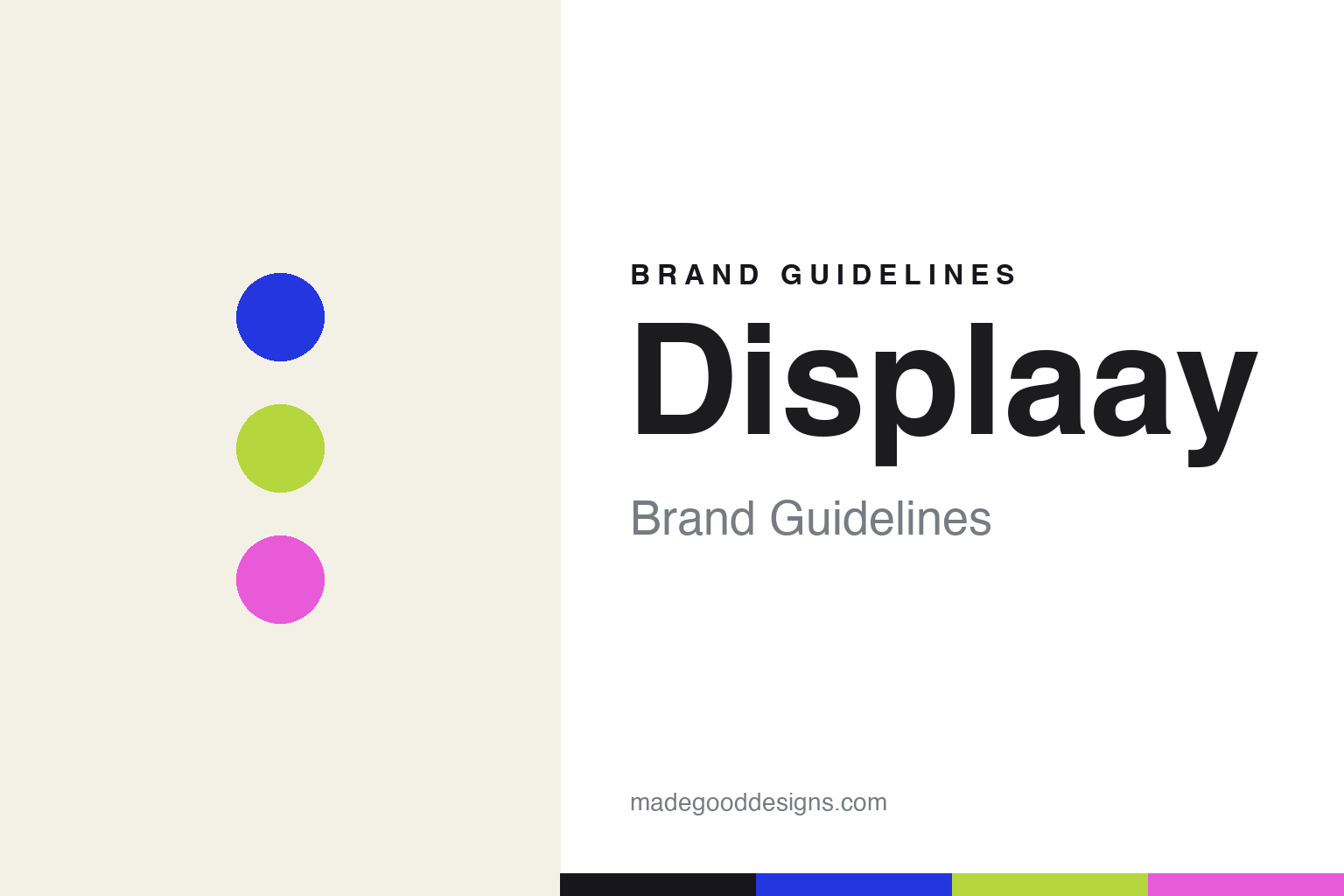
Displaay Brand Guidelines
Bold, bright, contemporary.
Aa
Two constants: a bright-accent palette and a contemporary grotesque register. Abstract homage — not the Displaay wordmark or its typefaces.
Bold, bright, contemporary
Displaay grew from one serif into a huge library.
Displaay is a lesson in bold contemporary range. Founded in 2014 by Martin Vácha in Prague, the independent, founder-owned foundry launched with the serif Reckless — now a huge system of some 144 styles — and grew into one of the most-licensed contemporary libraries, including the multi-script sans Roobert and the high-contrast serif Teodor.
Its brand design is bold, contemporary and editorial, aimed squarely at branding and editorial work, with big interactive type testers. The signature is a per-typeface bright-accent system — each family gets its own vivid colour (cobalt, lime, magenta) on an off-white or black ground.
(Honest notes: the domain is displaay.net (double-a), not a .com, and it’s Prague, not Brno. It’s independent — no Monotype tie. Several faces sometimes attributed to it aren’t theirs — Signifier is Klim’s, Neue Machina is Pangram Pangram’s, and Ohno is OH no Type Co’s. And there’s no single official brand hex, so the colours here are an unofficial interpretation.)
Colour
Displaay lives in a bright-accent palette. Click a swatch to copy the hex.
Displaay’s identity is bold, bright and contemporary — a cobalt, a lime, a magenta, a panel, and an ink. Rather than one fixed brand colour, Displaay runs a per-typeface bright-accent system — a different vivid colour per family on off-white or black. It signals a modern, branding-ready foundry with energy and range. The honest caveat: with no published brand hex, these tones are an original, unofficial interpretation, not first-party values.
The lesson is a per-typeface bright-accent system signals contemporary range. Displaay’s world is a bold, modern specimen. For designers, it is a reminder that giving each product its own vivid accent — on a neutral off-white or black base — can feel energetic and systematic at once, ideal for a branding-oriented library. The takeaways: use a bright accent per product on a neutral base; keep it bold and contemporary; and treat any single hex as unofficial — using deep ink for small text so the accents stay bright.
Typography
The register is a contemporary grotesque — bold and modern.
Displaay’s identity carries a bold, contemporary, editorial spirit — vivid accents on a neutral ground, aimed at branding. A contemporary grotesque captures the mood: it is modern and confident, the register of a branding-ready foundry. Set against a bright accent, the grotesque feels bold and modern — exactly the contemporary personality Displaay carries. It is confident rather than quiet, mirroring a bold specimen. (Displaay’s real wordmark and its retail typefaces — Reckless, Roobert and the rest — are commercial products and trademarks we name but do not reproduce or set text in; the exact brand typeface is not ours to use.) Because those faces are not ours to set, the honest description is “a contemporary grotesque spirit,” shown here in a stand-in. The type behaves like the brand: bold, contemporary and editorial.
Aa
A contemporary grotesque spirit — bold and modern. (Specimen set in Bricolage Grotesque, a contemporary STAND-IN; NOT Displaay’s wordmark or any Displaay retail typeface, which are trademarks.)
Range as identity
Displaay stands for bold, branding-ready range.
Displaay is a lesson in growing range into a brand. A per-typeface bright-accent system, big testers and a huge contemporary library make bold, branding-ready range the whole identity — modern, energetic, systematic. The bright, systematic range is the differentiator. The differentiator is a bold, contemporary, editorial identity.
For designers and brand-builders, Displaay offers a clear takeaway: a systematic accent approach can scale a brand. The lessons: give each product its own vivid accent on a neutral base; keep it bold and branding-ready; and let a growing, quality library speak to range. It is also a reminder to stay accurate: it’s Prague (displaay.net), Signifier/Neue Machina/Ohno aren’t theirs, and the palette here is an unofficial interpretation. Displaay made range the brand — proof that a systematic bright accent can be the difference.
Explore & save
Keep Displaay’s identity on hand — save it to a board in the Made Good inspiration library.
Displaay identity set
Pin the bright-accent palette and the contemporary-grotesque register to your own board.


