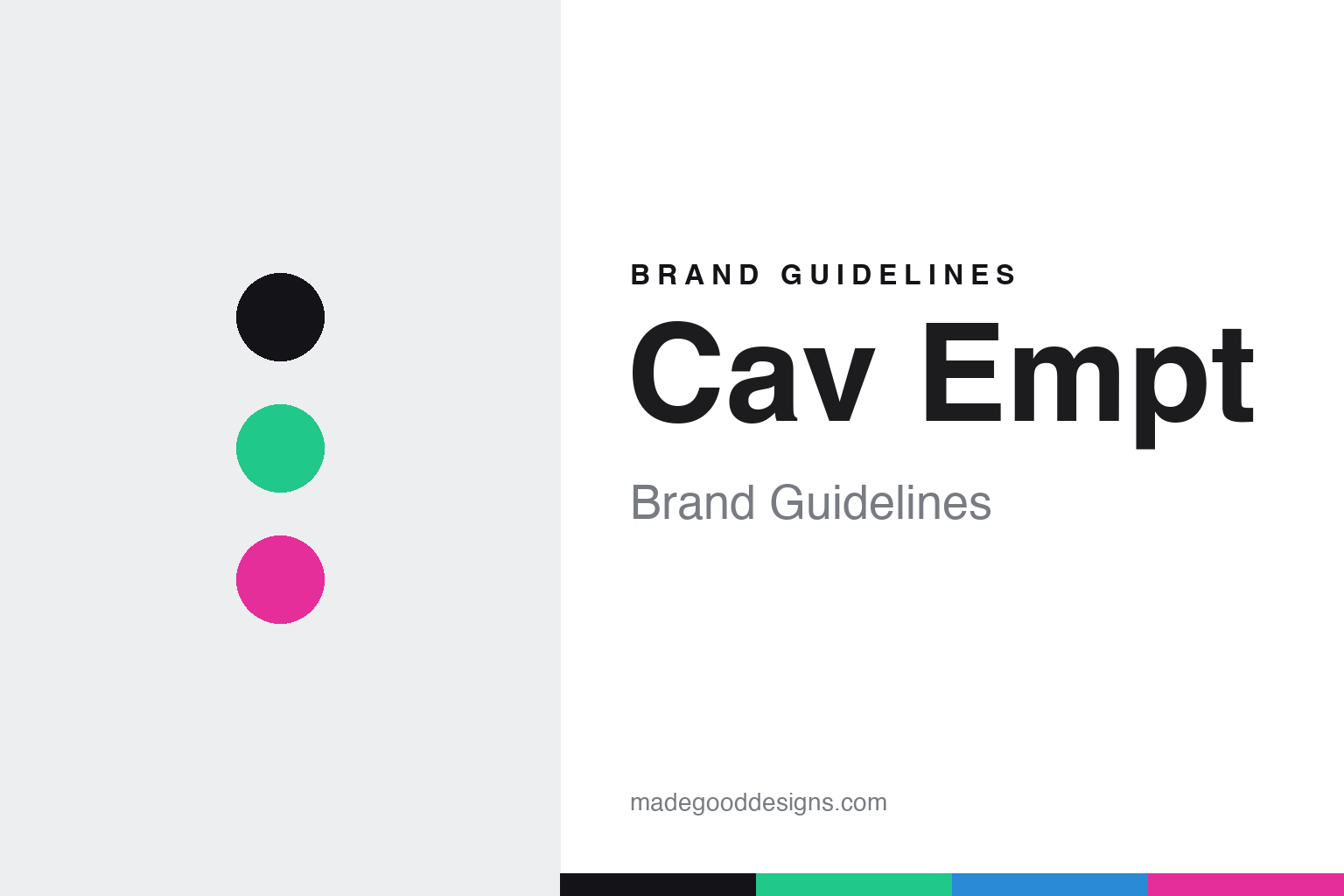
Cav Empt Brand Guidelines
Caveat emptor.
Aa
Two constants: a cyberpunk palette and a techno sans register. Abstract homage — not the Cav Empt wordmark or logo.
Caveat emptor
Cav Empt dresses a dystopian near-future.
Cav Empt is a lesson in dystopia as a design language. Founded in 2011 in Tokyo by SK8THING, Toby Feltwell and Hishiyama Yutaka (“Hishi”), the independent label — abbreviated C.E. — builds a cyberpunk, techno-paranoid world of glitchy, degraded graphics and cryptic, dystopian slogans. It even helped popularise the deliberately distressed, hole-riddled hoodie.
Its brand identity is cyberpunk, dystopian and cryptic — pixelated and degraded imagery, retro-futuristic type, and a monochrome base lit by variable neon. The name is a great origin story in itself: “Cav Empt” is short for “Caveat Emptor” (Latin for “let the buyer beware”), which SK8THING reportedly took from a tattoo in Philip K. Dick’s novel Ubik.
(Honest notes: the third founder is “Hishi” — not to be confused with Hiroshi Fujiwara — and the studio is Tokyo-based. SK8THING is a co-founder of Billionaire Boys Club and also works on Human Made in this round; he is widely credited with early BAPE graphics, which we report softly. There’s no official brand hex, so the tones here are an unofficial interpretation.)
Colour
Cav Empt lives in a cyberpunk palette. Click a swatch to copy the hex.
Cav Empt’s identity is dark, electric and dystopian — an ink, an acid green, a cyber blue, a glitch magenta, and a paper. The palette pairs a near-black base with variable neon accents — the register of terminals, static and a degraded screen. It signals techno-paranoia, glitch and near-future dread rather than comfort. The honest caveat: with no published brand hex, these tones are an original, unofficial interpretation, not first-party values.
The lesson is a dark base plus neon signals a cyberpunk world. Cav Empt’s world is a glitching monitor. For designers, it is a reminder that near-black with electric accents — acid green, cyber blue, glitch magenta — reads as dystopian and digital, right for a brand built on degraded graphics and cryptic slogans. The takeaways: build on a near-black base; add variable neon; and treat any single hex as unofficial — keeping the base ink so the neons stay electric.
Typography
The register is a techno sans — engineered and futuristic.
Cav Empt’s identity carries a cyberpunk, engineered, cryptic spirit — glitch, static and dystopian slogans. A techno, machined sans captures the mood: it is angular and futuristic, the register of an interface and a warning screen. Set on a dark base, the techno sans feels engineered and futuristic — exactly the personality Cav Empt carries. It is machined rather than warm, mirroring a degraded graphic. (Cav Empt’s real wordmark and logo are trademarks we describe but do not reproduce, and the exact brand typeface is not ours to use.) Because the mark is not ours to use, the honest description is “a techno sans spirit,” shown here in a stand-in. The type behaves like the brand: cyberpunk, engineered and cryptic.
Aa
A techno sans spirit — engineered and futuristic. (Specimen set in Chakra Petch, a techno sans STAND-IN; NOT the Cav Empt wordmark or logo, which are trademarks.)
Dystopia as identity
Cav Empt stands for cyberpunk unease.
Cav Empt is a lesson in making a world the identity. A cyberpunk palette, glitch-degraded graphics and cryptic dystopian slogans build a coherent near-future the whole brand lives inside — dark, electric, uneasy. The world is the differentiator. The differentiator is a cyberpunk, dystopian, cryptic identity.
For designers and brand-builders, Cav Empt offers a clear takeaway: a fully-built world can be a brand. The lessons: commit to a coherent atmosphere (cyberpunk, dystopian); let graphics carry the mood (glitch, degradation); and give the name meaning (“caveat emptor”). It is also a reminder to stay accurate: the third founder is “Hishi” (not Hiroshi Fujiwara), it’s Tokyo-based, and the palette here is an unofficial interpretation. Cav Empt made a dystopia the brand — proof that a world can be the difference.
Explore & save
Keep Cav Empt’s identity on hand — save it to a board in the Made Good inspiration library.
Cav Empt identity set
Pin the cyberpunk palette and the techno-sans register to your own board.


