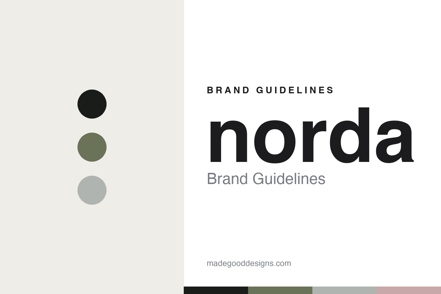
norda Brand Guidelines
Ultra-premium trail.
Aa
Two constants: a mineral, minimal palette and a premium minimal register. Abstract homage — not the norda wordmark or logo.
Ultra-premium trail
norda builds the Lamborghini of trail shoes.
norda is a lesson in essentialism as luxury. Founded around 2020 by Nick and Willa Martire (a husband-and-wife team) in Quebec, Canada, the independent brand launched its first shoe, the norda 001, in summer 2021 — an ultra-premium trail-running shoe some call “the Lamborghini of trail shoes.”
Its brand identity is minimalist, essentialist and premium — a bio-based Dyneema upper (billed as the world’s strongest fibre), Vibram Megagrip outsoles, seamless construction, and a philosophy that “true sustainability is found in durability.” Its models use Fibonacci-style numbers (000–008, 055), and the wordmark is a lowercase “norda.”
(Honest notes: it’s always lowercase “norda,” and it’s a Canadian brand — but the shoes are assembled in China (Dyneema from the USA, uppers from Europe), so it isn’t “made in Canada.” It’s trail-specific. And there’s no official brand hex, so the tones here are an unofficial interpretation.)
Colour
norda lives in a mineral, minimal palette. Click a swatch to copy the hex.
norda’s identity is mineral, minimal and premium — an obsidian, a glacier grey, a mineral moss, a kunzite, and an off-white. The palette leans on mineral and alpine tones — obsidian, glacier grey, a mineral moss — the register of rock, trail and high country. It signals durability, restraint and premium craft rather than loud sport. The honest caveat: with no published brand hex, these tones are an original, unofficial interpretation, not first-party values.
The lesson is a mineral, minimal palette signals premium trail craft. norda’s world is an alpine ridgeline. For designers, it is a reminder that mineral tones — obsidian, glacier grey, moss — read as durable and premium, right for an essentialist trail brand. The takeaways: use mineral, alpine tones; keep it minimal; and treat any single hex as unofficial — using obsidian for small text so the palette stays premium.
Typography
The register is a premium minimal — clean and essentialist.
norda’s identity carries a minimal, essentialist, premium spirit — durable, considered trail craft. A clean, premium minimal sans captures the mood: it is quiet and precise, the register of a premium product and a restrained label. Set in a mineral palette, the premium minimal feels clean and essentialist — exactly the personality norda carries. It is understated rather than loud, mirroring a considered shoe. (norda’s real wordmark is a trademark we describe but do not reproduce, and the exact brand typeface is not ours to use.) Because the mark is not ours to use, the honest description is “a premium minimal spirit,” shown here in a stand-in. The type behaves like the brand: minimal, essentialist and premium.
Aa
A premium minimal spirit — clean and essentialist. (Specimen set in Outfit, a premium minimal STAND-IN; NOT the norda wordmark, which is a trademark.)
Essentialism as identity
norda stands for durable, premium restraint.
norda is a lesson in making essentialism the identity. A mineral palette, Dyneema craft and a durability-first philosophy make restraint the whole brand — minimal, premium, built to last. The essentialism is the differentiator. The differentiator is a minimal, essentialist, premium identity.
For designers and brand-builders, norda offers a clear takeaway: restraint can be luxury. The lessons: strip to essentials (seamless, minimal); use genuinely premium materials (Dyneema, Vibram); and make durability the sustainability story. It is also a reminder to stay accurate: it’s lowercase “norda,” it’s a Canadian brand assembled in China, and the palette here is an unofficial interpretation. norda made essentialism the brand — proof that restraint can be the difference.
Explore & save
Keep norda’s identity on hand — save it to a board in the Made Good inspiration library.
norda identity set
Pin the mineral palette and the premium-minimal register to your own board.


