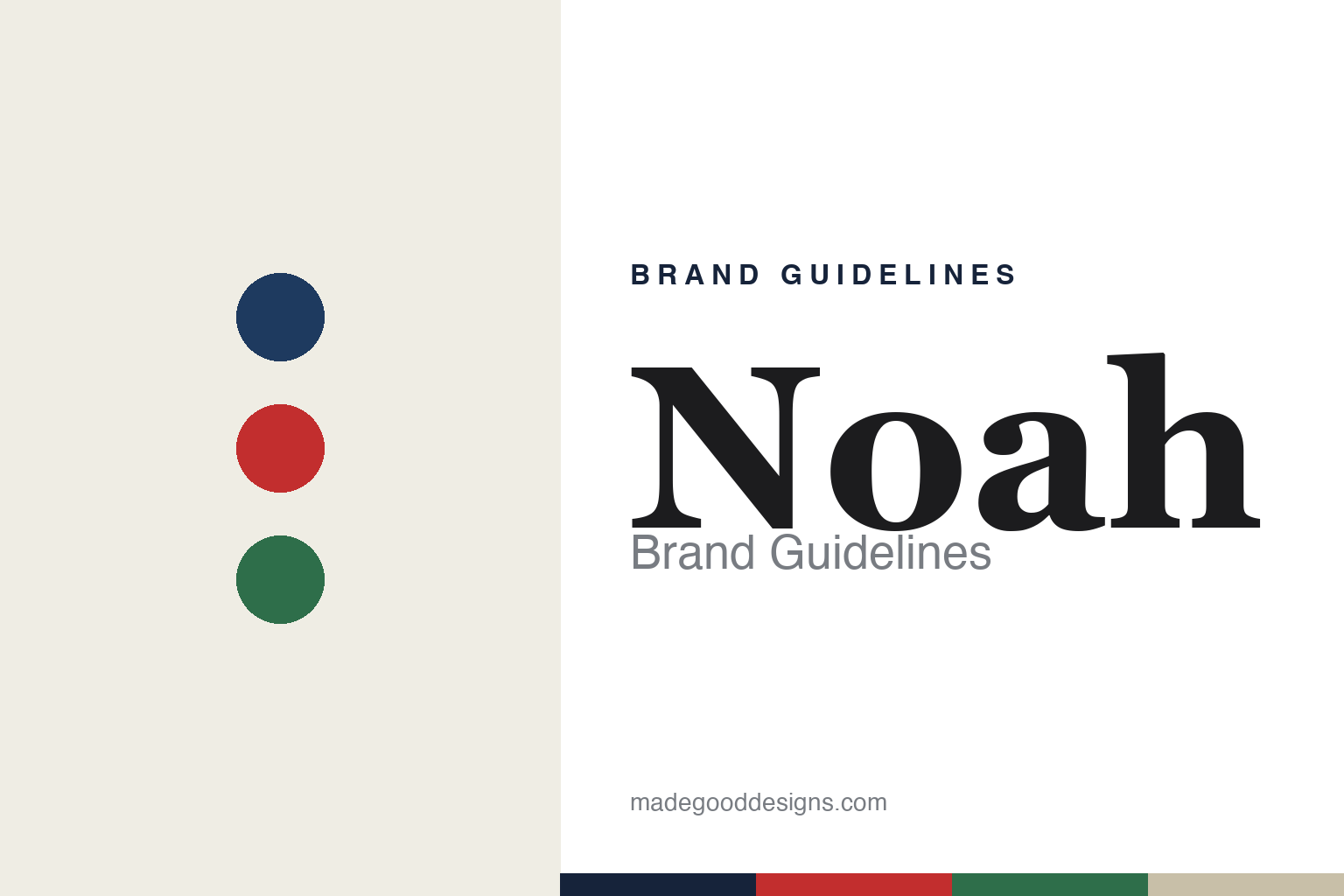
Noah Brand Guidelines
Not a streetwear brand.
Aa
Two constants: a collegiate-prep palette and an editorial serif register. Abstract homage — not the Noah wordmark or its cross logo.
Not a streetwear brand
Noah blends prep, skate and workwear with a conscience.
Noah is a lesson in values as part of the design. Founded in 2015 by Brendon Babenzien and Estelle Bailey-Babenzien in New York, the independent label blends collegiate prep, skate and workwear — and, pointedly, describes itself as “not a streetwear brand,” resisting the label even as it draws from that world.
Its brand identity is preppy, classic and conscientious — nautical navy, red and forest green, a core cross logo, and a deliberately traditional wardrobe. Babenzien is a former Supreme creative director, and Noah channels that pedigree into something older and quieter.
(Honest notes: credit both founders — Brendon Babenzien and Estelle Bailey-Babenzien. The brand genuinely rejects the “streetwear” label, and we honour that framing. Its values are part of the identity: it is a member of 1% for the Planet and publishes unusually candid essays on factories, wages and overconsumption. Babenzien’s later role heading J.Crew menswear was a separate job, not an owner of Noah. There’s no official brand hex, so the tones here are an unofficial interpretation.)
Colour
Noah lives in a collegiate-prep palette. Click a swatch to copy the hex.
Noah’s identity is preppy, classic and grounded — a navy, a red, a forest green, a sand, and a paper. The palette leans on nautical navy with red and forest green — the register of collegiate athletics, sailing and old workwear. It signals tradition, conscience and quiet confidence rather than hype. The honest caveat: with no published brand hex, these tones are an original, unofficial interpretation, not first-party values.
The lesson is a collegiate-prep palette signals classic values. Noah’s world is a considered, traditional wardrobe. For designers, it is a reminder that navy, red and forest green read as preppy and grounded — right for a brand that resists hype and foregrounds its values. The takeaways: anchor with navy and paper; add red and forest green; and treat any single hex as unofficial — using navy for small text so the palette stays classic.
Typography
The register is an editorial serif — classic and considered.
Noah’s identity carries a classic, considered, conscientious spirit — prep and workwear with a conscience. An editorial serif captures the mood: it is traditional and grown-up, the register of a well-set magazine and a crest. Set in collegiate-prep tones, the serif feels classic and considered — exactly the personality Noah carries. It is grown-up rather than hyped, mirroring a deliberately traditional wardrobe. (Noah’s real wordmark and its cross logo are trademarks we describe but do not reproduce, and the exact brand typeface is not ours to use.) Because the mark is not ours to use, the honest description is “an editorial serif spirit,” shown here in a stand-in. The type behaves like the brand: classic, considered and conscientious.
Aa
An editorial serif spirit — classic and considered. (Specimen set in DM Serif Display, an editorial serif STAND-IN; NOT the Noah wordmark or cross logo, which are trademarks.)
Values as identity
Noah stands for conscience and craft.
Noah is a lesson in making values part of the identity. A collegiate-prep palette, a classic wardrobe and unusually open positions on factories, wages and consumption make conscience the whole brand — traditional, honest, quietly confident. The values are the differentiator. The differentiator is a preppy, classic, values-forward identity.
For designers and brand-builders, Noah offers a clear takeaway: conscience can be a positioning. The lessons: build a coherent classic wardrobe; publish real values (environment, labour); and resist hype on purpose. It is also a reminder to stay accurate: both founders share the credit, the brand rejects the “streetwear” label, J.Crew was a separate role, and the palette here is an unofficial interpretation. Noah made values the brand — proof that conscience can be the difference.
Explore & save
Keep Noah’s identity on hand — save it to a board in the Made Good inspiration library.
Noah identity set
Pin the collegiate-prep palette and the editorial-serif register to your own board.


