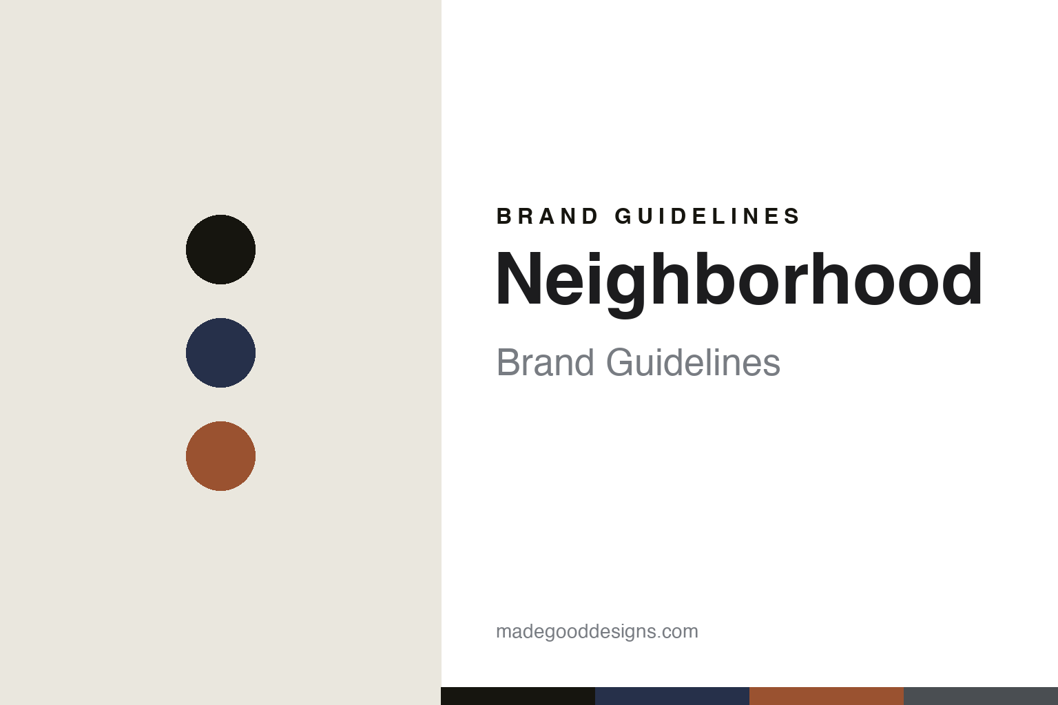
Neighborhood Brand Guidelines
Craft with pride.
Aa
Two constants: a biker-heritage palette and a rugged display register. Abstract homage — not the Neighborhood wordmark or logo.
Craft with pride
Neighborhood built biker culture into Tokyo streetwear.
Neighborhood is a lesson in subculture rendered with craft. Founded in 1994 by Shinsuke Takizawa in Tokyo’s Ura-Harajuku scene, the independent label fuses motorcycle culture, military, punk and American vintage into rugged menswear, under the motto “Craft with Pride.”
Its brand identity is biker-first, rugged and heritage-driven — leather, denim, workwear and militaria, with signature skull-and-crossbones graphics. It is one of the foundational Ura-Harajuku brands, a peer of WTAPS, UNDERCOVER and A Bathing Ape.
(Honest notes: it’s biker-first — military is one input, not the whole story (that framing fits WTAPS more). Its official motto is “Craft with Pride”; the “Save Our Soul” / S.O.S. wording is a recurring graphic, not the tagline. Don’t confuse it with the US retailer “Neighborhood Goods.” And there’s no official brand hex, so the tones here are an unofficial interpretation.)
Colour
Neighborhood lives in a biker-heritage palette. Click a swatch to copy the hex.
Neighborhood’s identity is rugged, dark and heritage-driven — a black, an indigo, a rust, an oil grey, and a bone. The palette leans on black and indigo with a rust and oil grey — the register of leather, denim, engine oil and militaria. It signals toughness, craft and biker heritage rather than polish. The honest caveat: with no published brand hex, these tones are an original, unofficial interpretation, not first-party values.
The lesson is a dark, rugged palette signals biker heritage. Neighborhood’s world is a workshop and a motorcycle. For designers, it is a reminder that black, indigo and rust read as tough and heritage-rich — right for a brand built on biker, military and vintage codes. The takeaways: anchor with black and indigo; add rust and oil grey; and treat any single hex as unofficial — using black for small text so the rust stays an accent.
Typography
The register is a rugged display — sturdy and confident.
Neighborhood’s identity carries a rugged, confident, heritage spirit — leather, militaria and biker culture. A sturdy, condensed display captures the mood: it is strong and stamped, the register of a workwear label and a motorcycle badge. Set in a biker-heritage palette, the rugged display feels sturdy and confident — exactly the personality Neighborhood carries. It is tough rather than delicate, mirroring a heavy leather piece. (Neighborhood’s real wordmark and skull-and-crossbones graphics are trademarks we describe but do not reproduce, and the exact brand typeface is not ours to use.) Because the marks are not ours to use, the honest description is “a rugged display spirit,” shown here in a stand-in. The type behaves like the brand: rugged, confident and heritage.
Aa
A rugged display spirit — sturdy and confident. (Specimen set in Fjalla One, a sturdy display STAND-IN; NOT the Neighborhood wordmark or graphics, which are trademarks.)
Heritage as identity
Neighborhood stands for craft and biker heritage.
Neighborhood is a lesson in making heritage and craft the identity. A biker-heritage palette, rugged garments and a decades-deep commitment to motorcycle, military and vintage codes make craft the whole brand — tough, authentic, foundational. The heritage is the differentiator. The differentiator is a rugged, biker-heritage, craft-driven identity.
For designers and brand-builders, Neighborhood offers a clear takeaway: craft and a real subculture can be a brand. The lessons: commit to a genuine culture (biker, military, punk); make things with real craft; and let a motto carry it (“Craft with Pride”). It is also a reminder to stay accurate: it’s biker-first (not just military), the motto is “Craft with Pride,” and the palette here is an unofficial interpretation. Neighborhood made heritage the brand — proof that craft can be the difference.
Explore & save
Keep Neighborhood’s identity on hand — save it to a board in the Made Good inspiration library.
Neighborhood identity set
Pin the biker-heritage palette and the rugged-display register to your own board.


