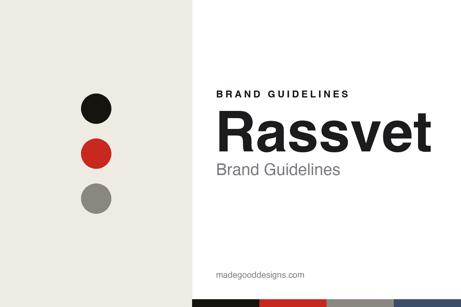
Rassvet Brand Guidelines
Russian sunrise.
Aa
Two constants: a post-Soviet palette and a constructivist caps register. Abstract homage — not the Rassvet / PACCBET wordmark or logo.
Russian sunrise
Rassvet is authentic post-Soviet skate culture.
Rassvet is a lesson in authentic subculture as a brand. Co-founded in 2016 by Gosha Rubchinskiy and Tolia (Anatoly) Titaev in Russia, the skate label’s name — РАССВЕТ, “sunrise” / “dawn” — is styled as the wordmark “PACCBET,” which is Cyrillic read with Latin eyes (pronounced “russ-VYET”).
Its brand identity is utilitarian, post-Soviet and genuinely skate — a real skate team and skate videos, workwear silhouettes, and Cyrillic graphics rooted in Eastern-European youth culture. It broke internationally around 2017 and is distributed through Dover Street Market.
(Honest notes: credit both founders — Titaev is the operational force, so it shouldn’t be over-attributed to Gosha. Rassvet is separate from the “Gosha Rubchinskiy” label, which closed in 2018 while Rassvet carried on. It’s tied to CDG’s orbit and distributed through DSM, but that’s distribution, not outright ownership. There’s no official brand hex, so the tones here are an unofficial interpretation.)
Colour
Rassvet lives in a post-Soviet palette. Click a swatch to copy the hex.
Rassvet’s identity is utilitarian, bold and post-Soviet — an ink, a Soviet red, a concrete, a steel blue, and an off-white. The palette pairs a Soviet red with ink and concrete grey — the register of constructivist posters, workwear and Eastern-European youth culture. It signals authenticity, utility and skate grit rather than gloss. The honest caveat: with no published brand hex, these tones are an original, unofficial interpretation, not first-party values.
The lesson is a post-Soviet palette signals authentic subculture. Rassvet’s world is a skate spot and a concrete plaza. For designers, it is a reminder that a Soviet red on ink and concrete reads as utilitarian and authentic — right for a genuine skate brand with Cyrillic graphics. The takeaways: use a bold red on ink and concrete; keep it utilitarian; and treat any single hex as unofficial — using ink for small text so the red stays a signal.
Typography
The register is a constructivist caps — bold and utilitarian.
Rassvet’s identity carries a utilitarian, bold, post-Soviet spirit — skate culture and Cyrillic graphics. A constructivist, condensed capital captures the mood: it is bold and stamped, the register of a Soviet poster and a workwear label. Set in a post-Soviet palette, the constructivist caps feel bold and utilitarian — exactly the personality Rassvet carries. It is stamped rather than delicate, mirroring a Cyrillic graphic. (Rassvet’s real wordmark — the Cyrillic “PACCBET” — is a trademark we describe but do not reproduce, and the exact brand typeface is not ours to use.) Because the mark is not ours to use, the honest description is “a constructivist caps spirit,” shown here in a stand-in. The type behaves like the brand: utilitarian, bold and post-Soviet.
Aa
A constructivist caps spirit — bold and utilitarian. (Specimen set in Staatliches, a constructivist caps STAND-IN; NOT the Rassvet / PACCBET wordmark, which is a trademark.)
Authenticity as identity
Rassvet stands for authentic skate culture.
Rassvet is a lesson in making authenticity the identity. A post-Soviet palette, a real skate team and Cyrillic graphics make genuine subculture the whole brand — utilitarian, credible, rooted. The authenticity is the differentiator. The differentiator is a utilitarian, post-Soviet, skate-rooted identity.
For designers and brand-builders, Rassvet offers a clear takeaway: real subculture beats borrowed cool. The lessons: build from a genuine scene (a skate team, videos); use an authentic visual language (Cyrillic, workwear); and let the name carry meaning (“sunrise”). It is also a reminder to stay accurate: credit both founders, keep it separate from the Gosha Rubchinskiy label, and treat the palette as an unofficial interpretation. Rassvet made authenticity the brand — proof that the real thing can be the difference.
Explore & save
Keep Rassvet’s identity on hand — save it to a board in the Made Good inspiration library.
Rassvet identity set
Pin the post-Soviet palette and the constructivist-caps register to your own board.


